Project Overview
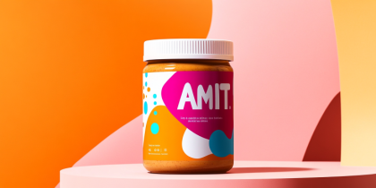
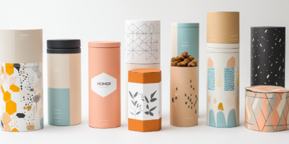
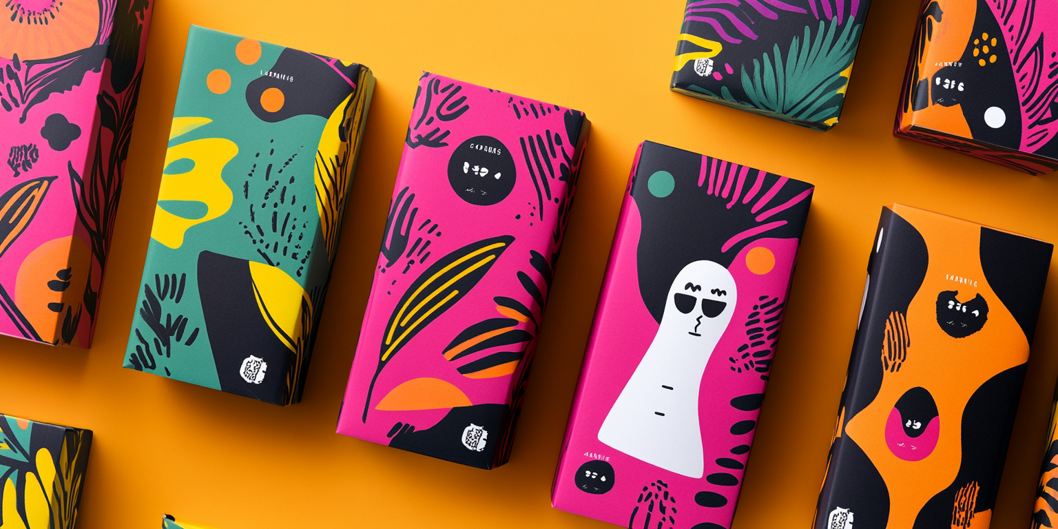
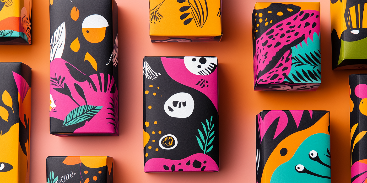
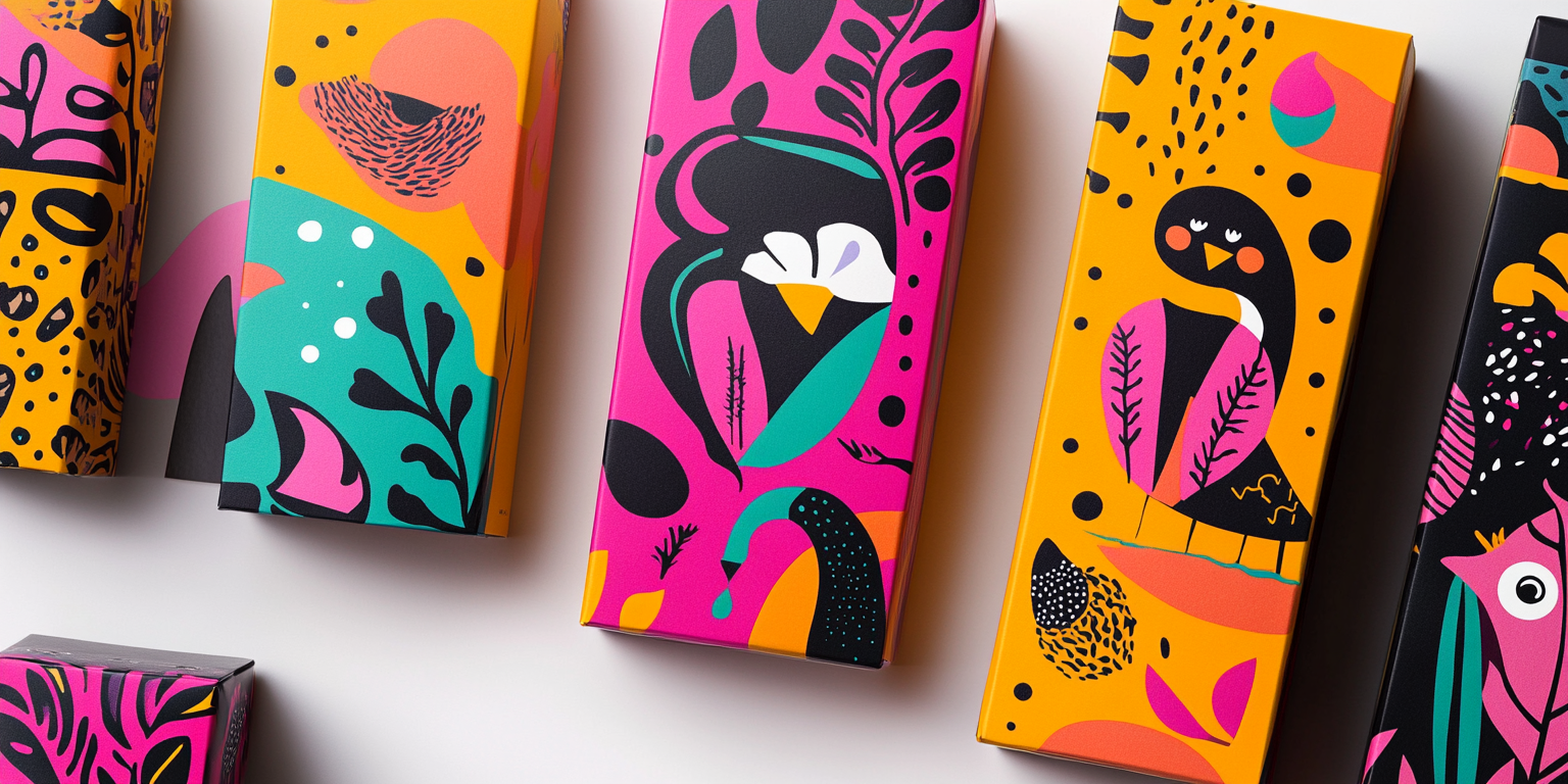
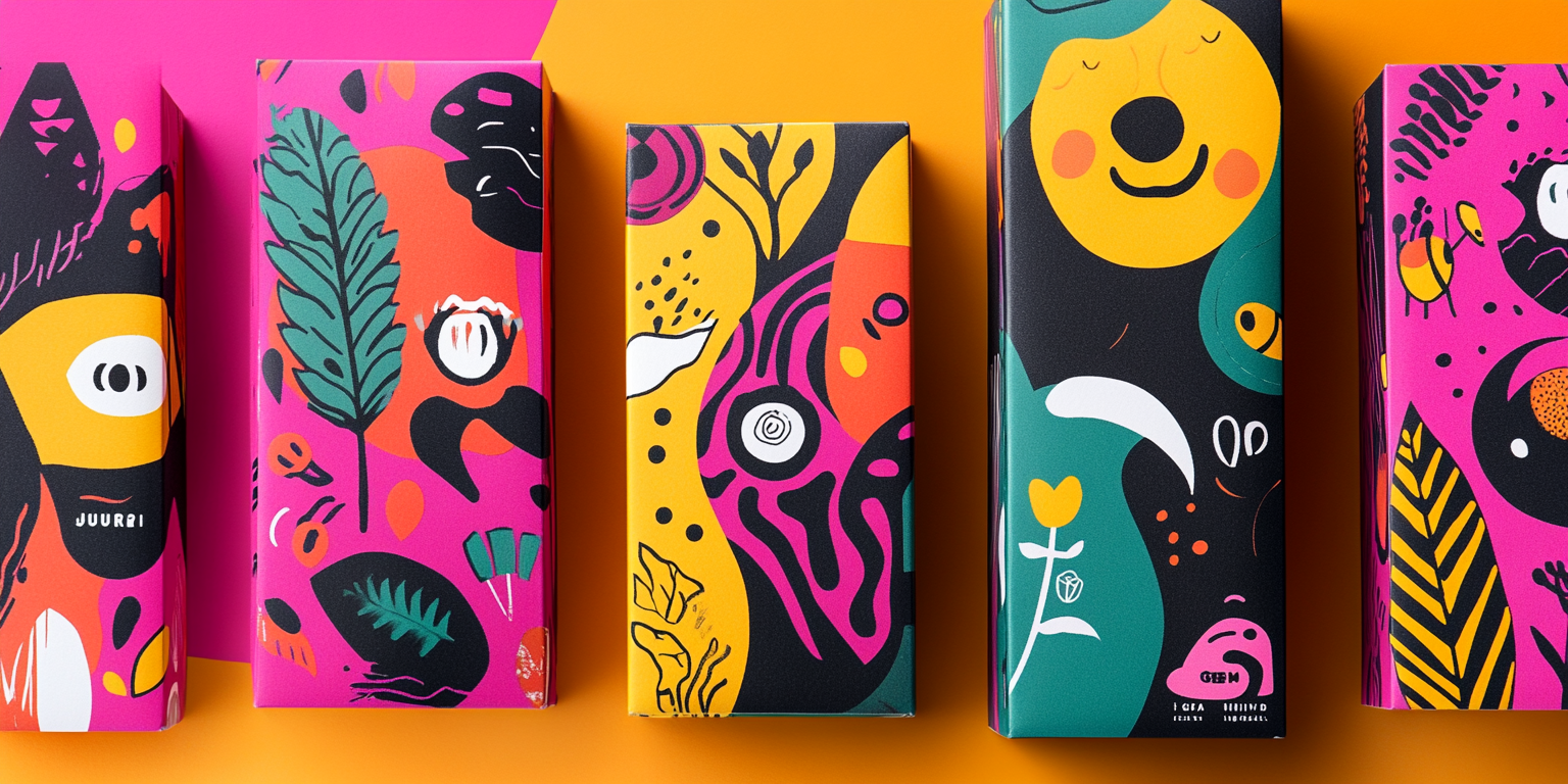
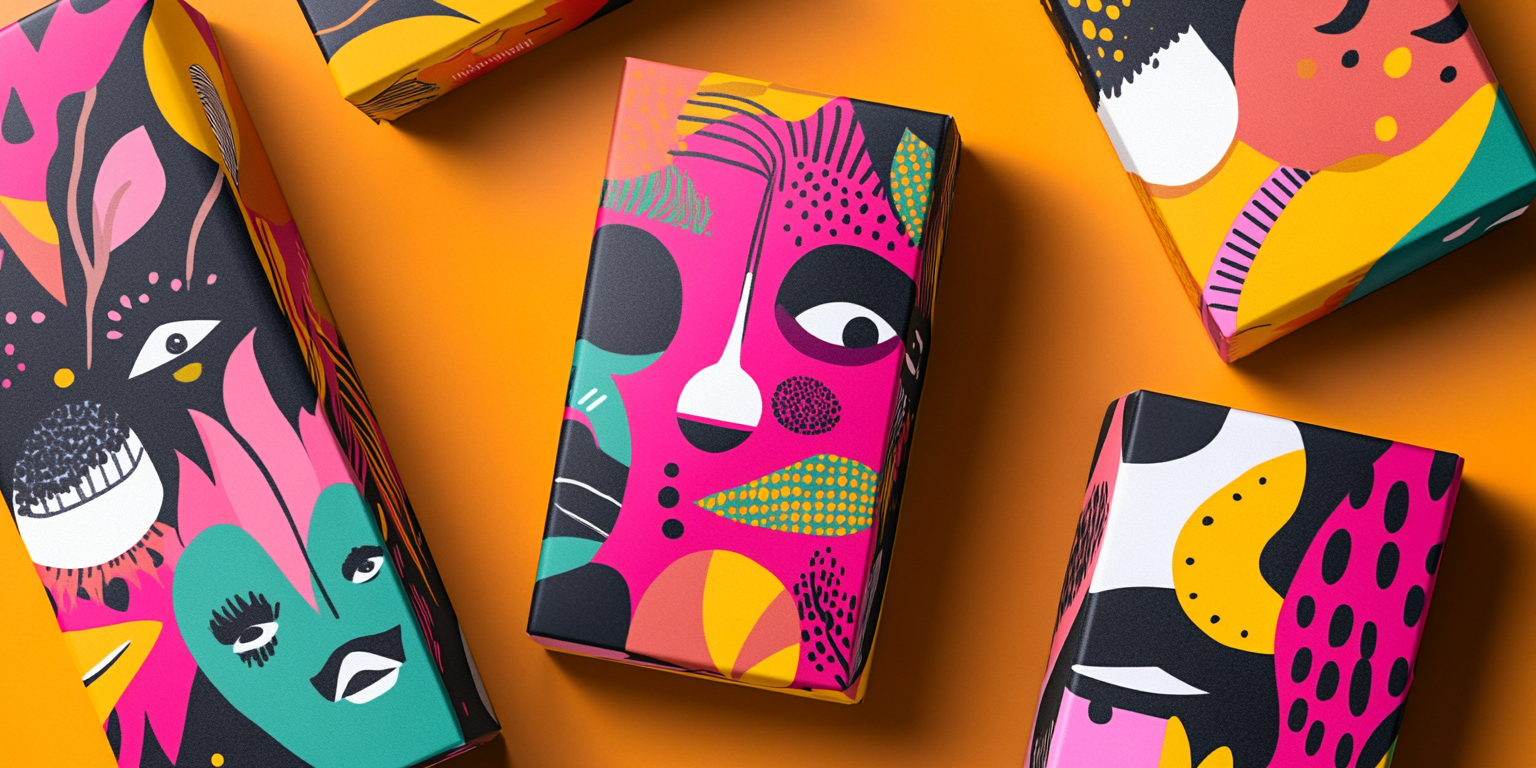
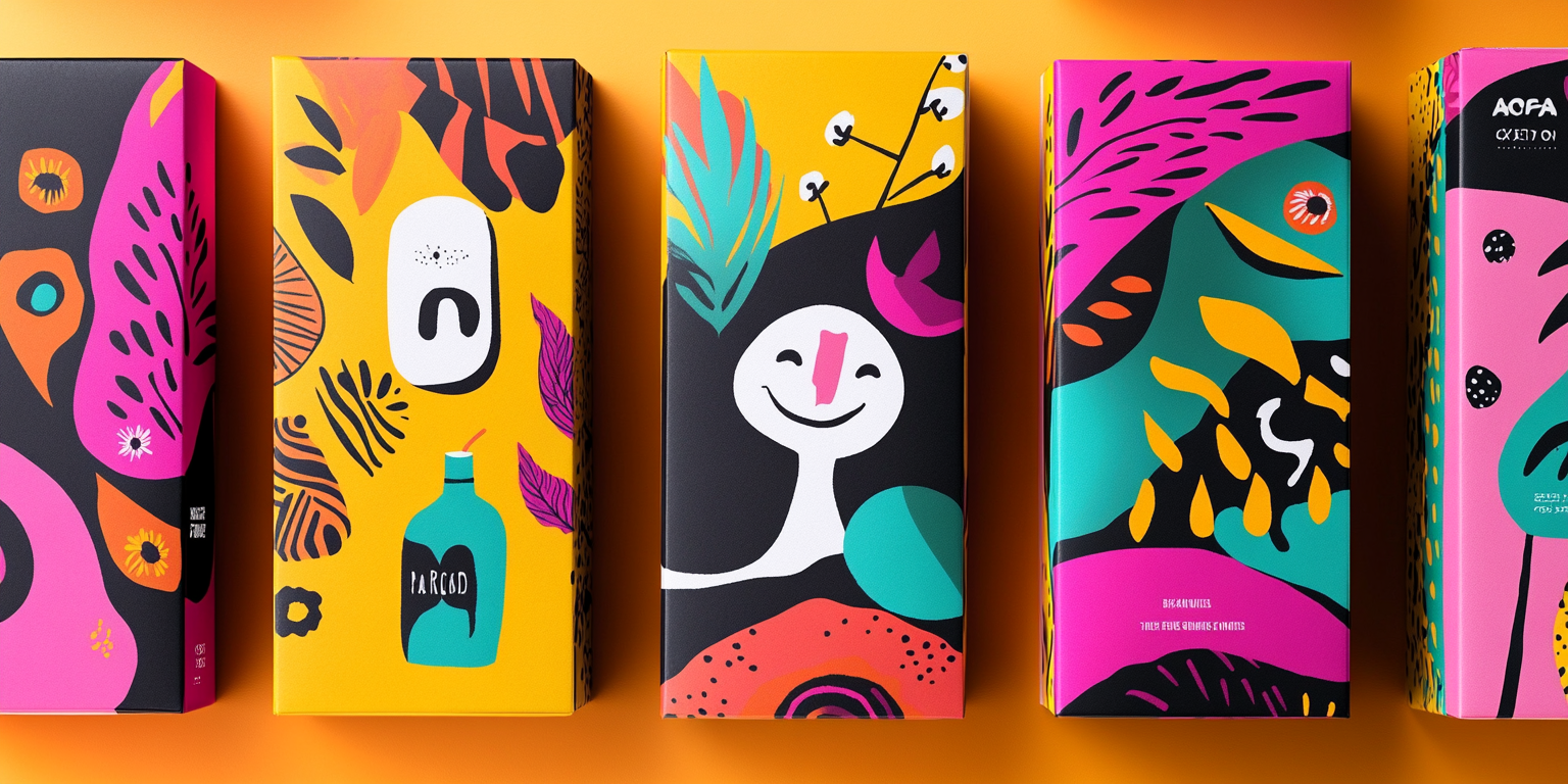
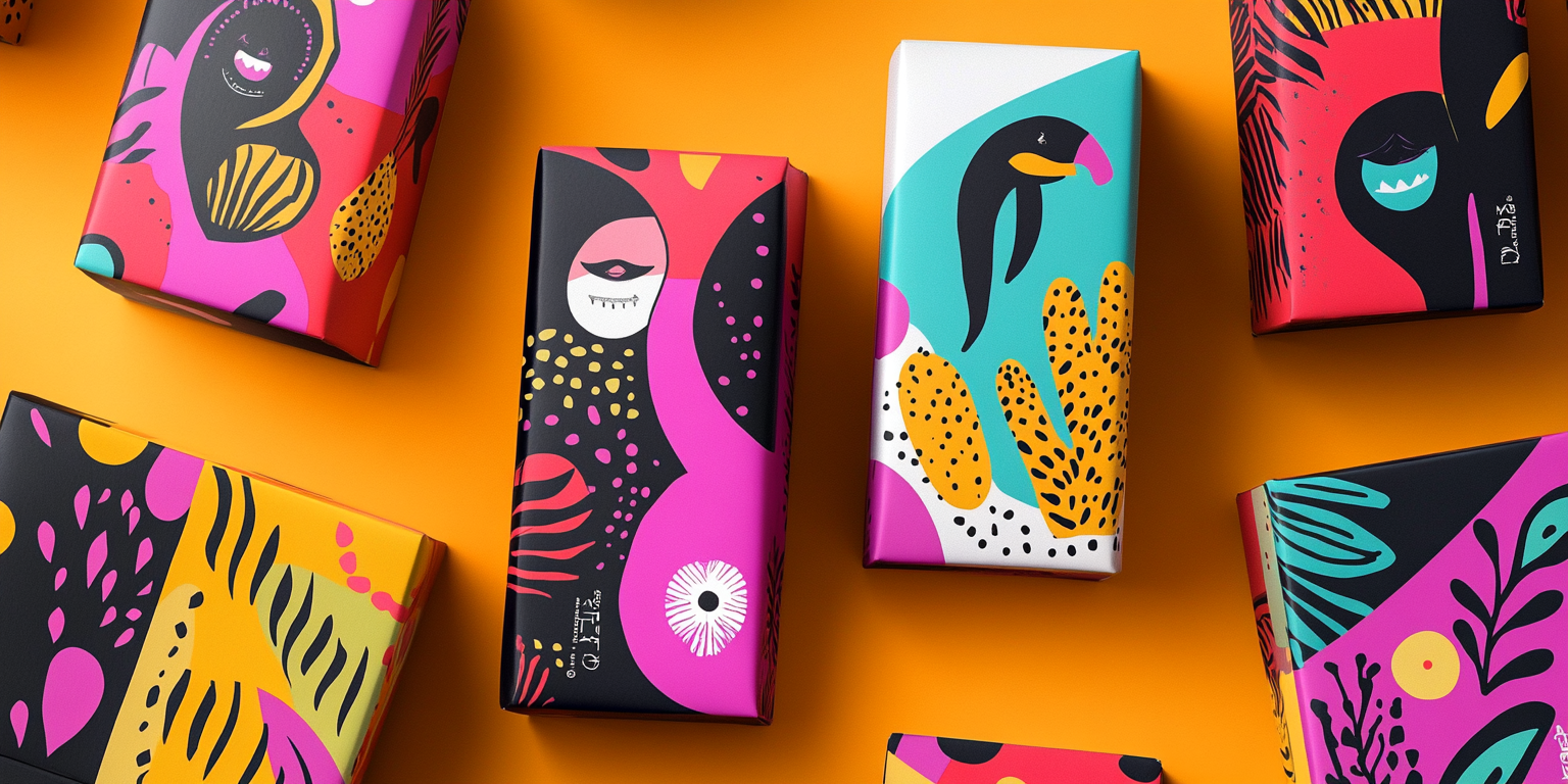
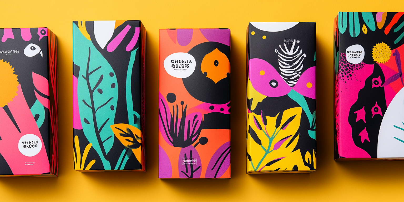
The Vibrant Abstract Packaging Collection is a bold and artistic approach to modern product packaging, designed to stand out on retail shelves. The collection embraces a playful, avant-garde aesthetic with high-contrast color schemes, organic shapes, and hand-drawn elements.
- Year of Completion: 2023
- Status: Active
Design Concept
The packaging design integrates a contemporary art-inspired approach, combining abstract compositions with striking visual contrasts. It embodies an energetic, youthful spirit while maintaining a sophisticated and premium feel.
Key Features:
- Dynamic Color Palette: A fusion of electric pinks, deep blacks, vibrant oranges, and lush greens create a visually captivating experience.
- Hand-Drawn Elements: Playful illustrations of abstract creatures, organic shapes, and expressive patterns.
- Modern Minimalism: A balance of bold graphics with clean typography for readability and aesthetic appeal.
- Premium Finishing: Matte textures with selective glossy highlights to enhance depth and contrast.
- Sustainable Approach: Eco-conscious packaging materials designed for both aesthetic and environmental impact.
Deliverables
- Full packaging suite for multiple product variants
- Custom artwork for each package
- High-resolution mockups for digital and physical presentations
- Print-ready designs with optimized color grading
Tools Used
- Adobe Illustrator & Photoshop (Graphic Design & Illustration)
- Cinema 4D & Blender (3D Mockups & Rendering)
- Pantone & CMYK Color Processing (Print Quality Assurance)
Impact & Market Appeal
- Target Audience: Trend-conscious consumers, boutique brands, and premium lifestyle product markets.
- Emotional Connection: A blend of nostalgia and modern artistry creates an engaging brand presence.
- Retail Standout: High-impact visual storytelling ensures a memorable first impression.
Challenges & Solutions
Challenges Encountered
- Maintaining harmony between multiple bold colors without overwhelming the design.
- Ensuring clarity of branding while embracing an abstract visual style.
Solutions Implemented
- Developed a structured color hierarchy to guide the viewer’s eye effectively.
- Utilized negative space strategically to balance high-intensity elements.