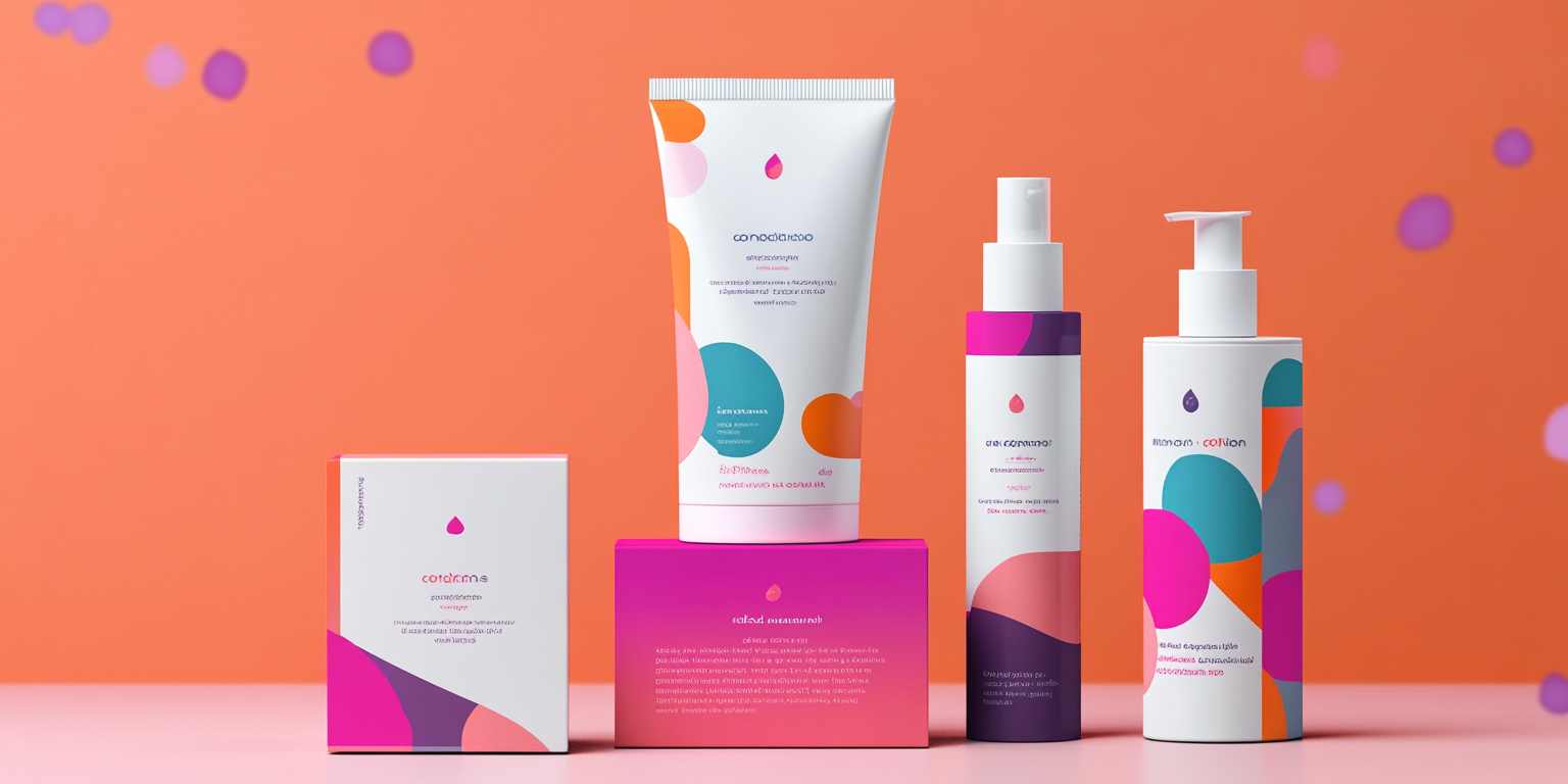
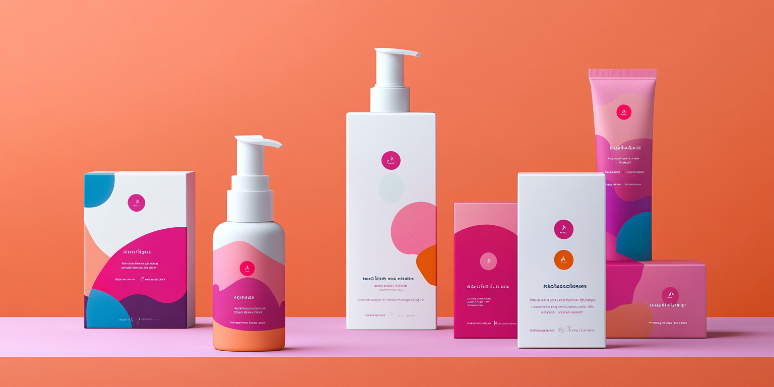
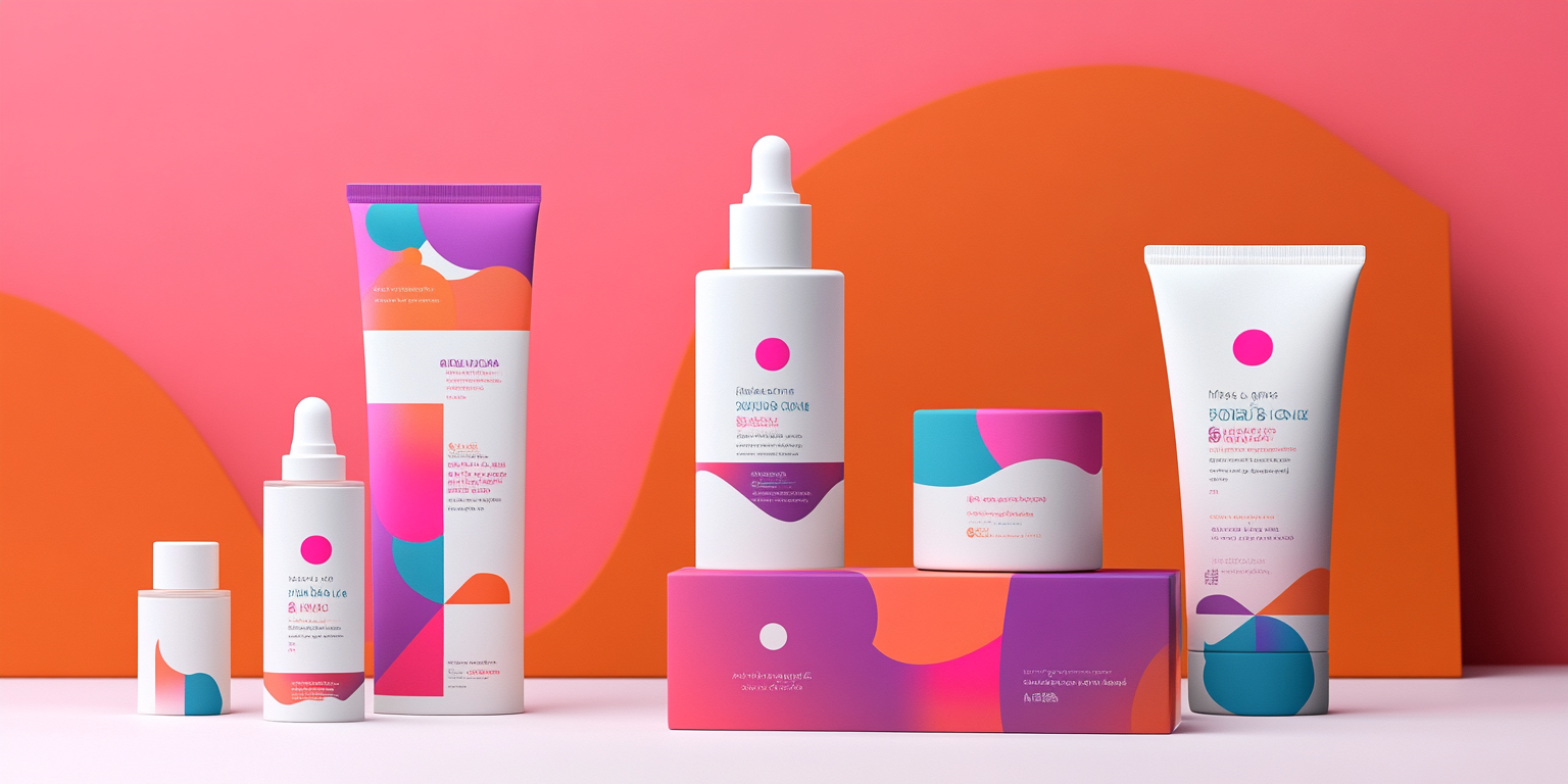
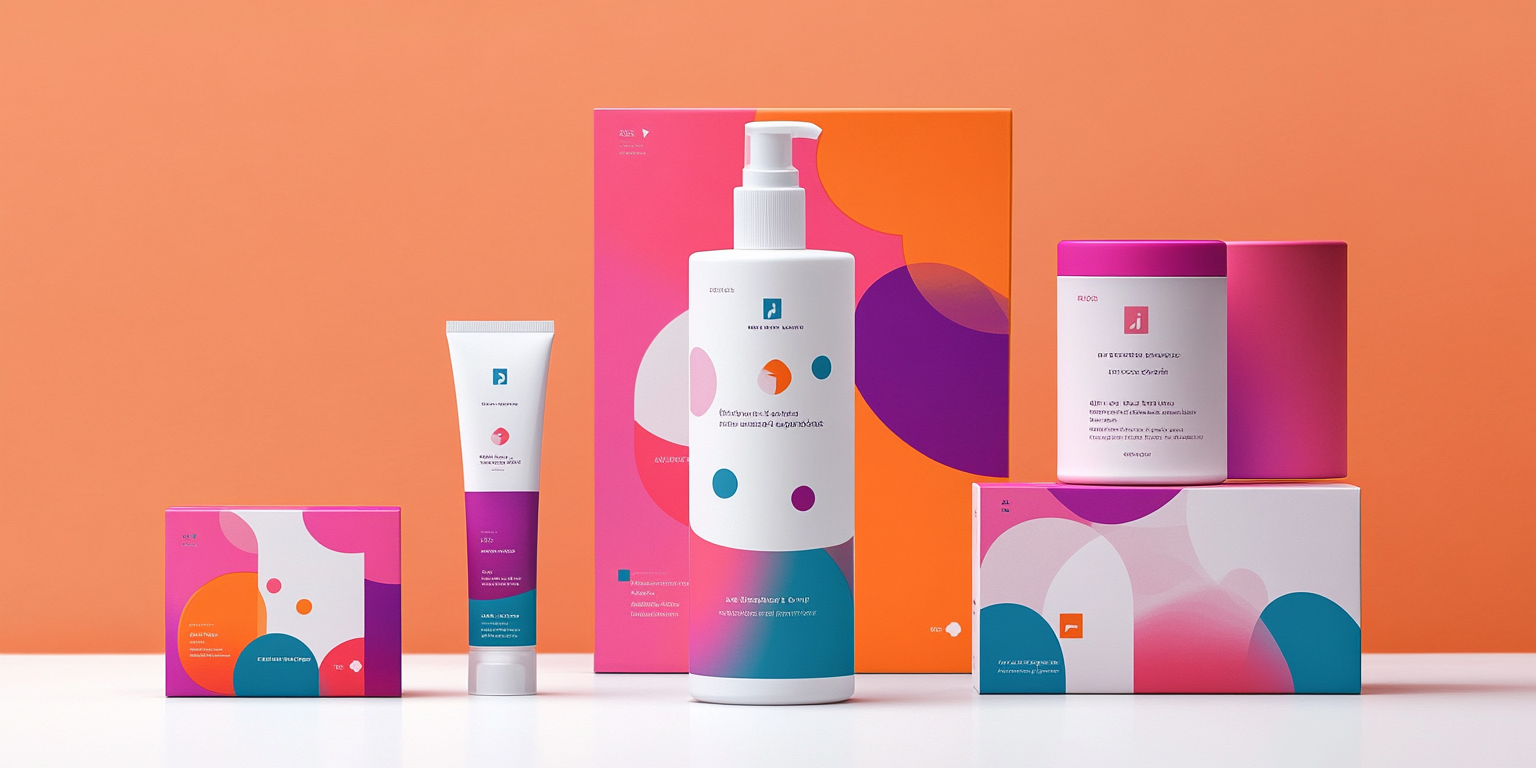
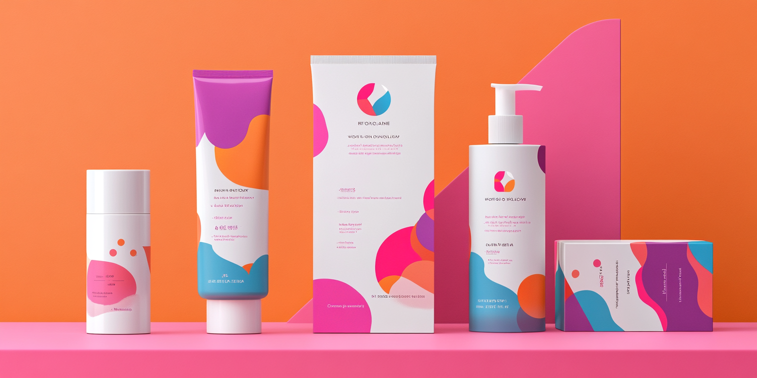
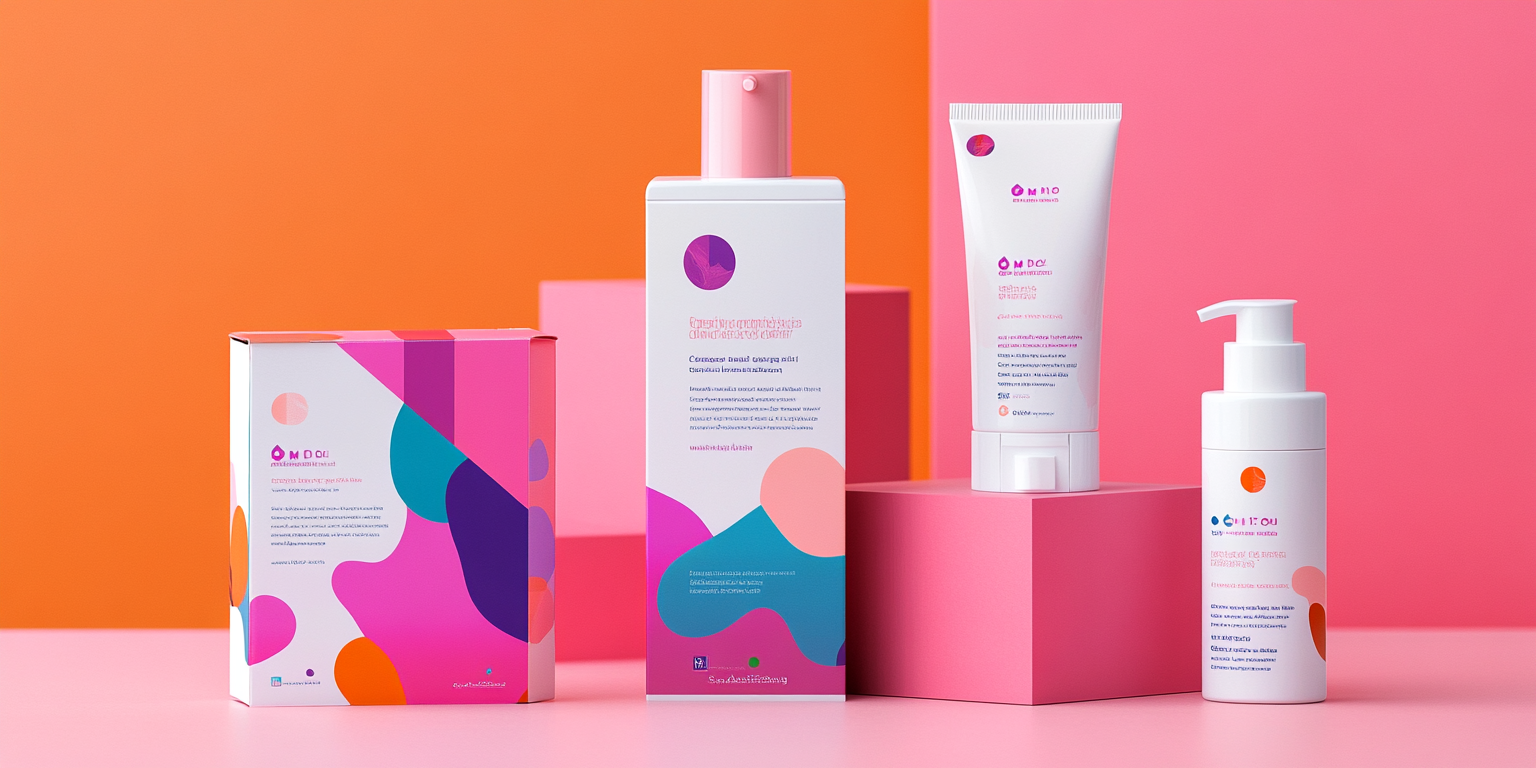
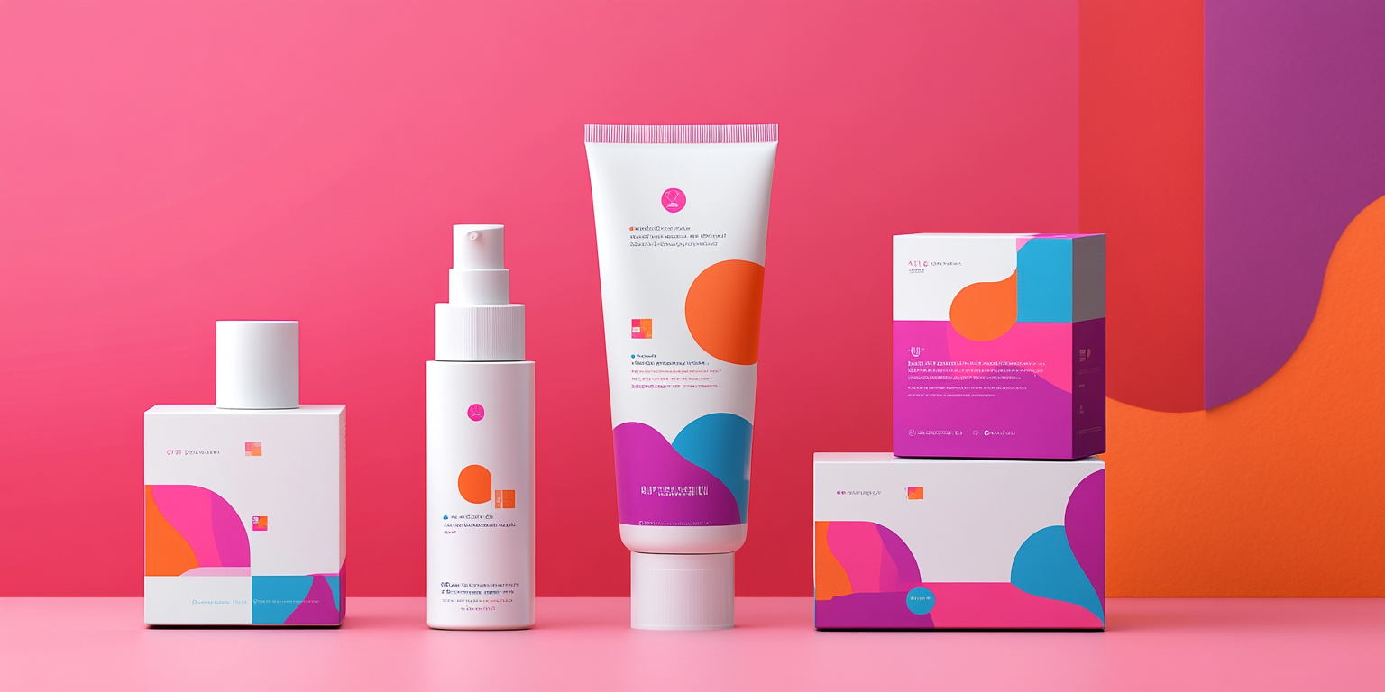
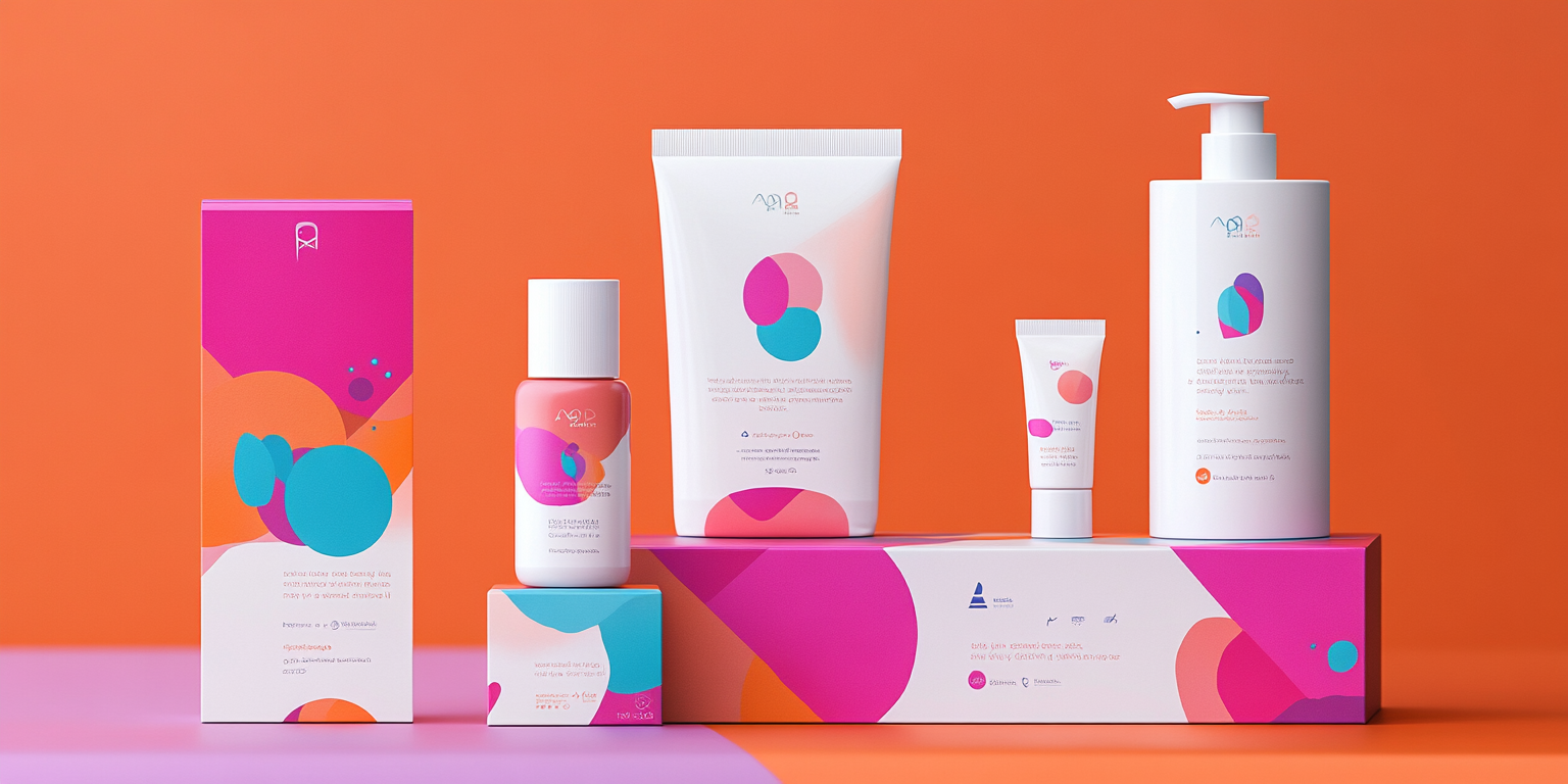
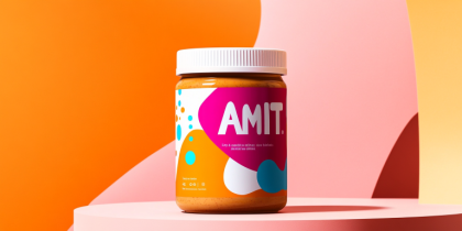
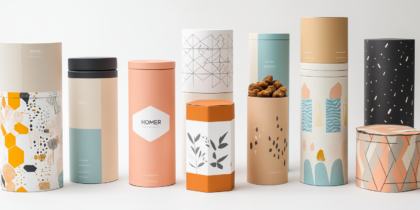
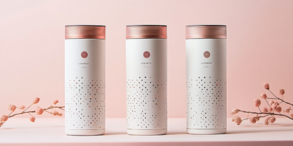
The project highlights a stunning collection of skincare packaging that marries minimalism with bold, vibrant aesthetics. Focused on clean geometric shapes and fluid, organic patterns, the designs use a striking combination of pinks, oranges, and blues to create a playful yet sophisticated visual language.
Each package exudes energy and modernity, appealing to a youthful, dynamic demographic. The carefully chosen color palette communicates freshness and vibrancy, while the clean, sans-serif typography ensures clarity and elegance. The blend of sharp contrasts and subtle gradients adds depth, making the packaging visually engaging while maintaining functionality.
Beyond aesthetics, the designs emphasize sustainability, with eco-friendly materials and mindful simplicity in their structure. The cohesive visual identity ties together all the products under a unified brand story, yet each item retains its individuality through nuanced design elements. The result is a packaging collection that feels fresh, energetic, and refined.
This project not only sets a benchmark for innovative skincare packaging but also demonstrates how thoughtful design can elevate everyday products into art. The seamless integration of bold visuals and functional branding ensures these designs leave a lasting impression, perfectly suited for contemporary beauty brands seeking to stand out in a competitive market.

