Project Overview
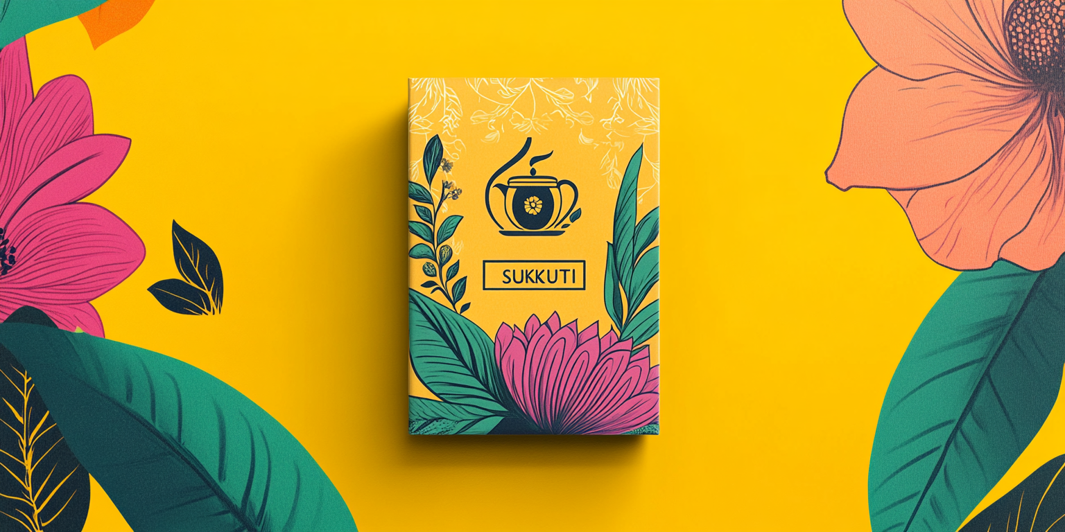
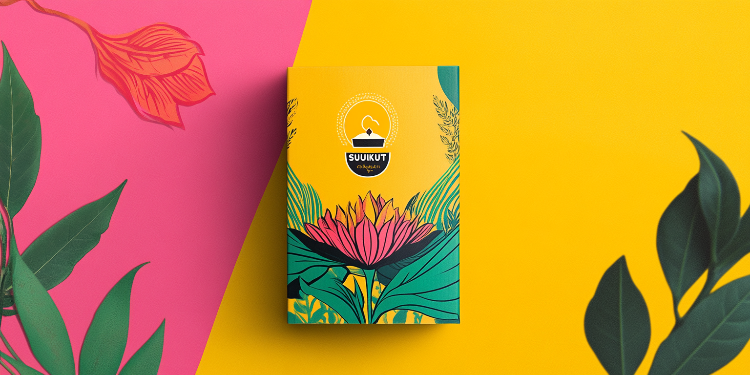
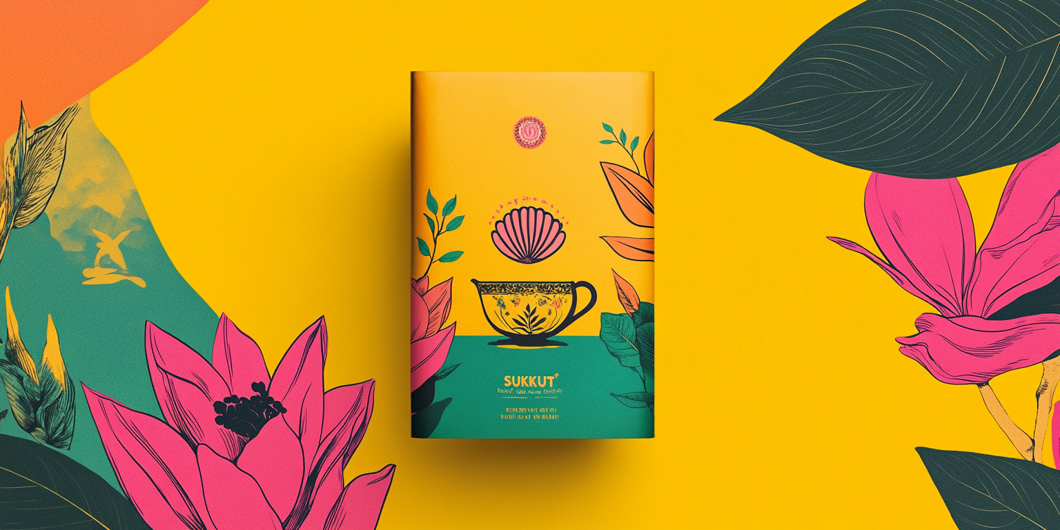
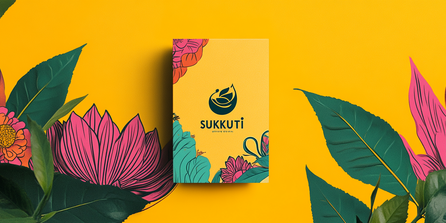
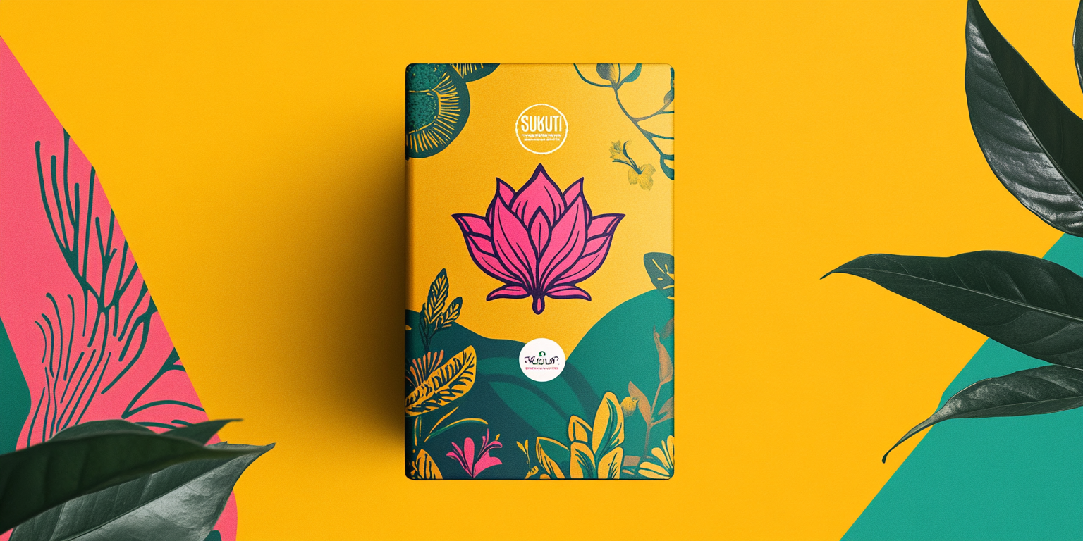
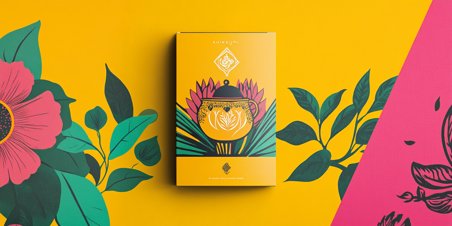
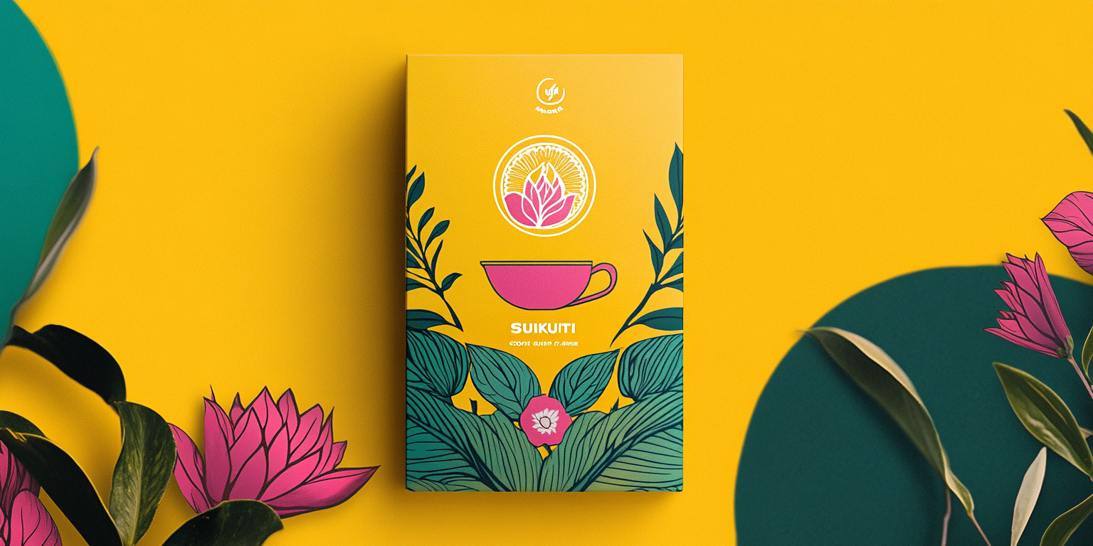
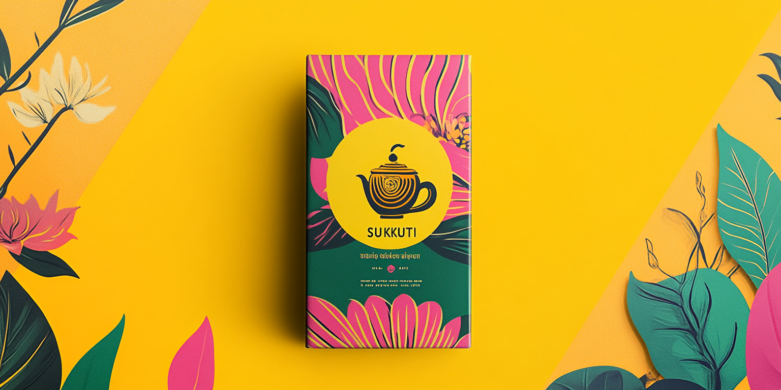
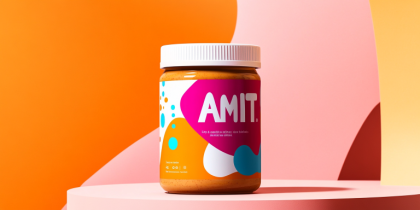
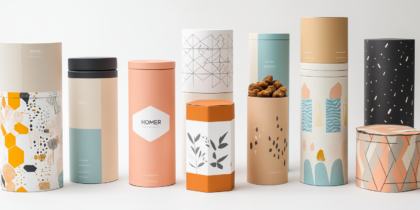
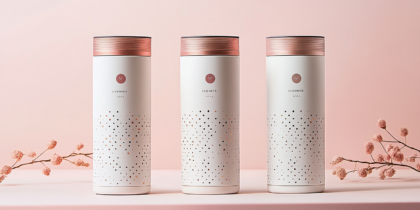
The Botanical Tea Packaging Collection is a vibrant and contemporary take on premium tea branding. Inspired by nature, this collection fuses artistic floral elements with modern typography to create an immersive packaging experience that resonates with tea enthusiasts.
- Year of Completion: 2022
- Status: Active
Design Concept
The design reflects a perfect harmony between botanical illustrations and bold color blocking, evoking a sense of warmth and freshness. Each package tells a unique story, enhancing the ritual of tea drinking through artful aesthetics.
Key Features:
- Nature-Inspired Art: Intricate floral and leaf motifs hand-drawn to represent natural ingredients.
- Elegant Contrast: A refined color palette of golden yellow, deep greens, and lively pinks with subtle gradients.
- Iconic Branding: A central emblem featuring a stylized teapot and floral insignia for an artisanal feel.
- Luxury Finishes: Matte textures with gold foil accents for a tactile and premium appearance.
- Eco-Conscious Packaging: Designed with recyclable and biodegradable materials.
Deliverables
- Complete tea packaging suite for multiple flavors
- Custom botanical illustrations and branding assets
- High-quality digital and print-ready mockups
- Conceptual storytelling for brand positioning
Tools Used
- Adobe Illustrator & Photoshop (Illustration & Packaging Design)
- Cinema 4D & Blender (3D Visualization & Rendering)
- Pantone & CMYK Color Grading (Print Optimization)
Impact & Market Appeal
- Target Audience: Tea connoisseurs, eco-conscious consumers, and specialty tea brands.
- Brand Identity: A fusion of tradition and modernity, appealing to both new and seasoned tea drinkers.
- Shelf Presence: The dynamic color contrasts and detailed botanical artwork create a striking retail display.
Challenges & Solutions
Challenges Encountered
- Creating a design that balances elegance with approachability.
- Ensuring print accuracy for intricate patterns and color vibrancy.
Solutions Implemented
- Developed a modular design system adaptable to different tea flavors.
- Utilized premium printing techniques to maintain design integrity.

