Project Overview
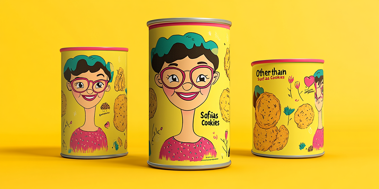
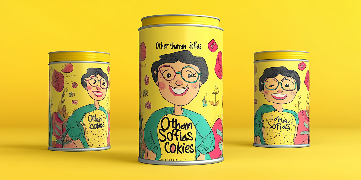
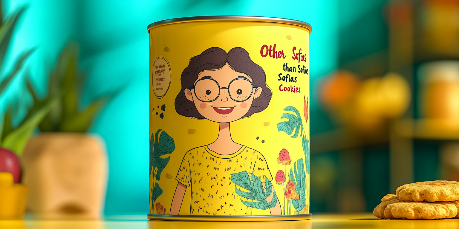
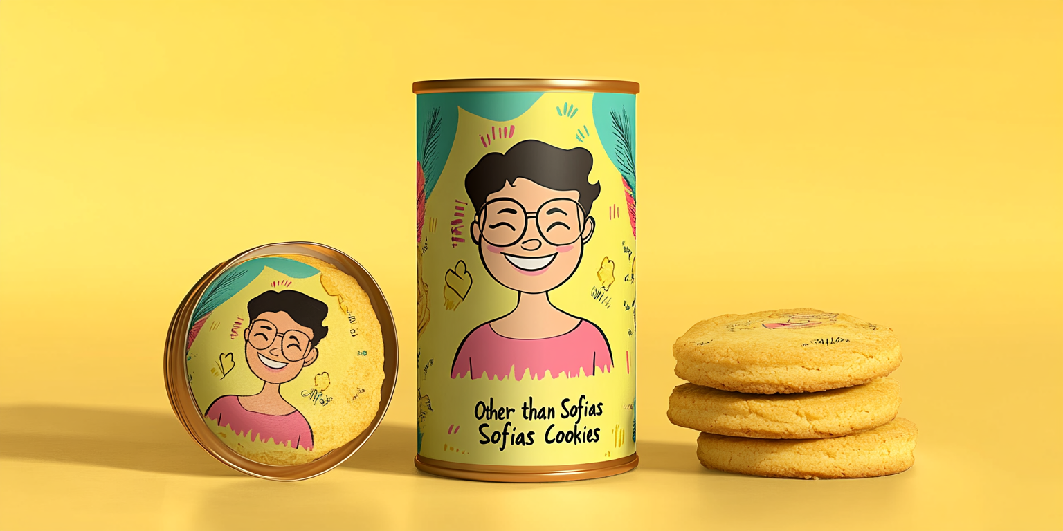
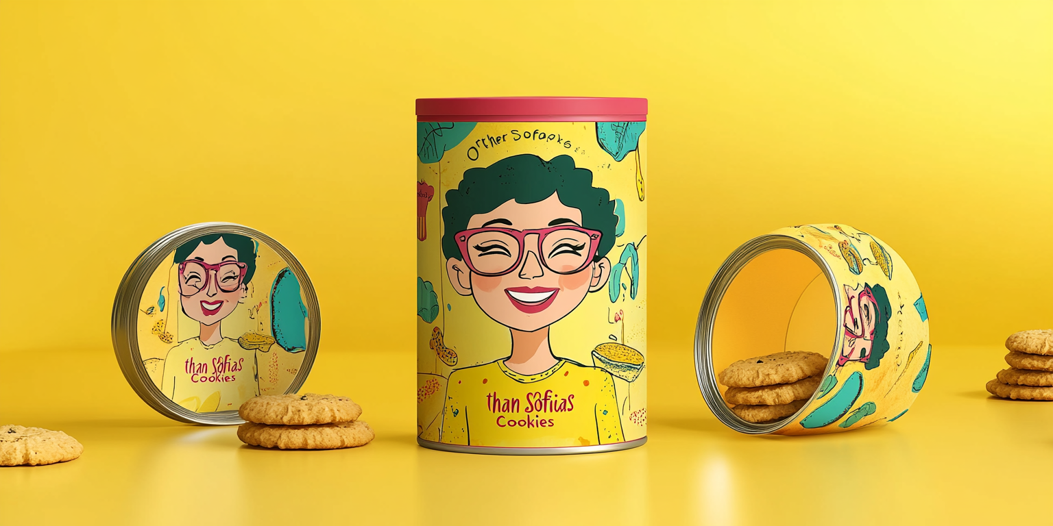
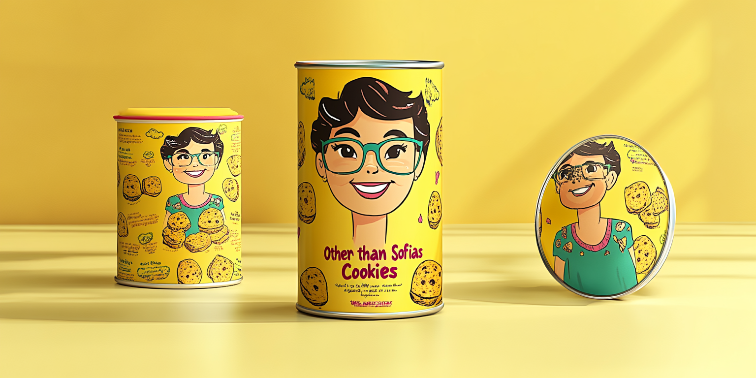
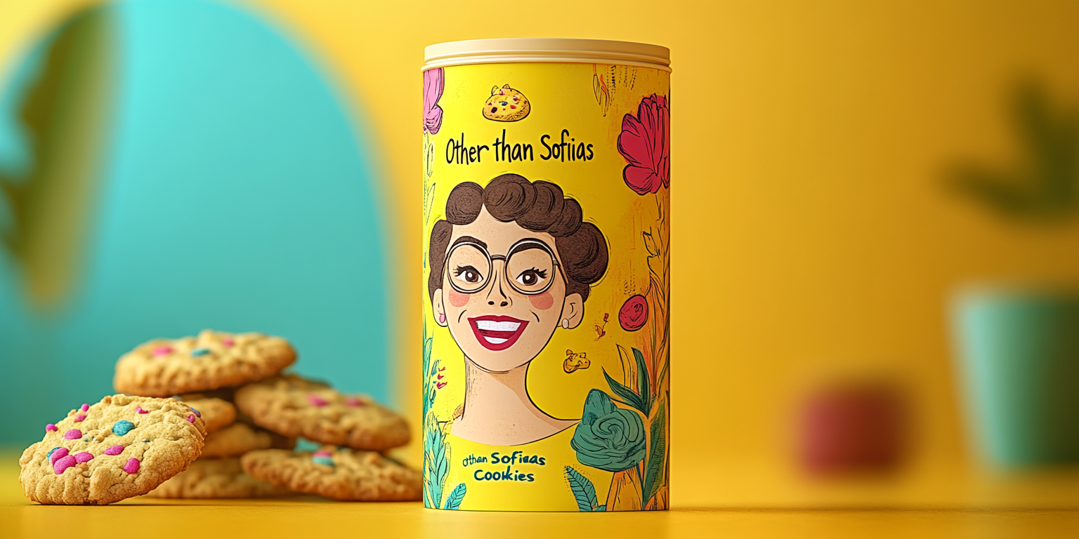
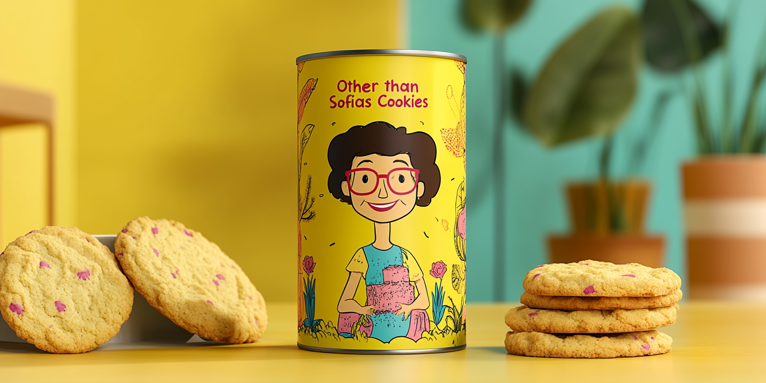
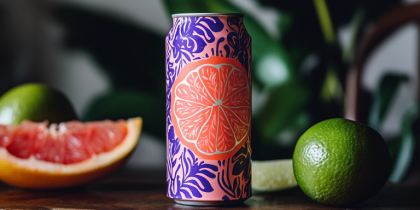
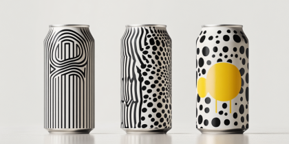
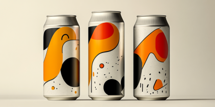
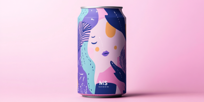
The Golden Bites Cookie Collection is a fusion of warm, inviting colors and playful illustrations, creating a packaging concept that exudes happiness and nostalgia. Designed for a premium artisanal cookie brand, this collection celebrates hand-crafted quality with a modern twist, making it a standout on shelves and in social media campaigns.
- Year of Completion: 2018
- Status: Active
Design Concept
This collection draws inspiration from home-baked goodness, childhood memories, and vibrant, illustrated storytelling. The packaging features lively, hand-drawn characters, warm yellows, and organic patterns that convey a sense of comfort and quality.
Key Features:
- Illustrative Storytelling: Hand-drawn, friendly character designs that create an emotional connection.
- Bright and Cheerful Color Palette: Dominated by warm yellows, soft pastels, and bold accent colors.
- Minimalist Typography: Playful yet modern fonts that complement the artwork without overwhelming the design.
- Premium Matte Finish with Gold Foil Accents: Elevating the luxurious appeal of the packaging.
- Sustainable Packaging: Made with recyclable and biodegradable materials to align with eco-conscious values.
Deliverables
- Full cookie packaging suite for premium artisanal cookies.
- Social media-ready marketing visuals with engaging storytelling.
- High-fidelity product mockups for e-commerce and retail display.
- Special edition tin designs for seasonal and limited-edition releases.
Tools Used
- Adobe Illustrator (Vector Illustrations & Typography)
- Adobe Photoshop (Mockups & Final Visuals)
- Procreate (Hand-Drawn Elements & Character Design)
- Cinema 4D (3D Renderings for Packaging Concepts)
Impact & Market Appeal
- Designed for All Ages: Appeals to both children and adults with its fun and inviting aesthetic.
- Memorable Brand Identity: Character-driven design ensures lasting brand recognition.
- Social Media-Worthy: Instagrammable packaging that enhances consumer engagement.
- Gift-Ready Appeal: Premium tin packaging makes it perfect for gifting occasions.
Challenges & Solutions
Challenges Encountered
- Ensuring the packaging remains playful yet sophisticated for a broad audience.
- Balancing the illustrated elements with branding and essential product details.
Solutions Implemented
- Developed a character-driven brand identity with a clean yet vibrant layout.
- Integrated strategic typography placement for maximum readability and appeal.

