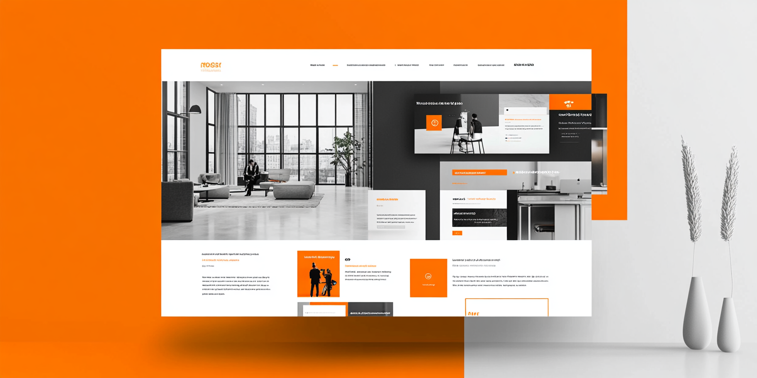
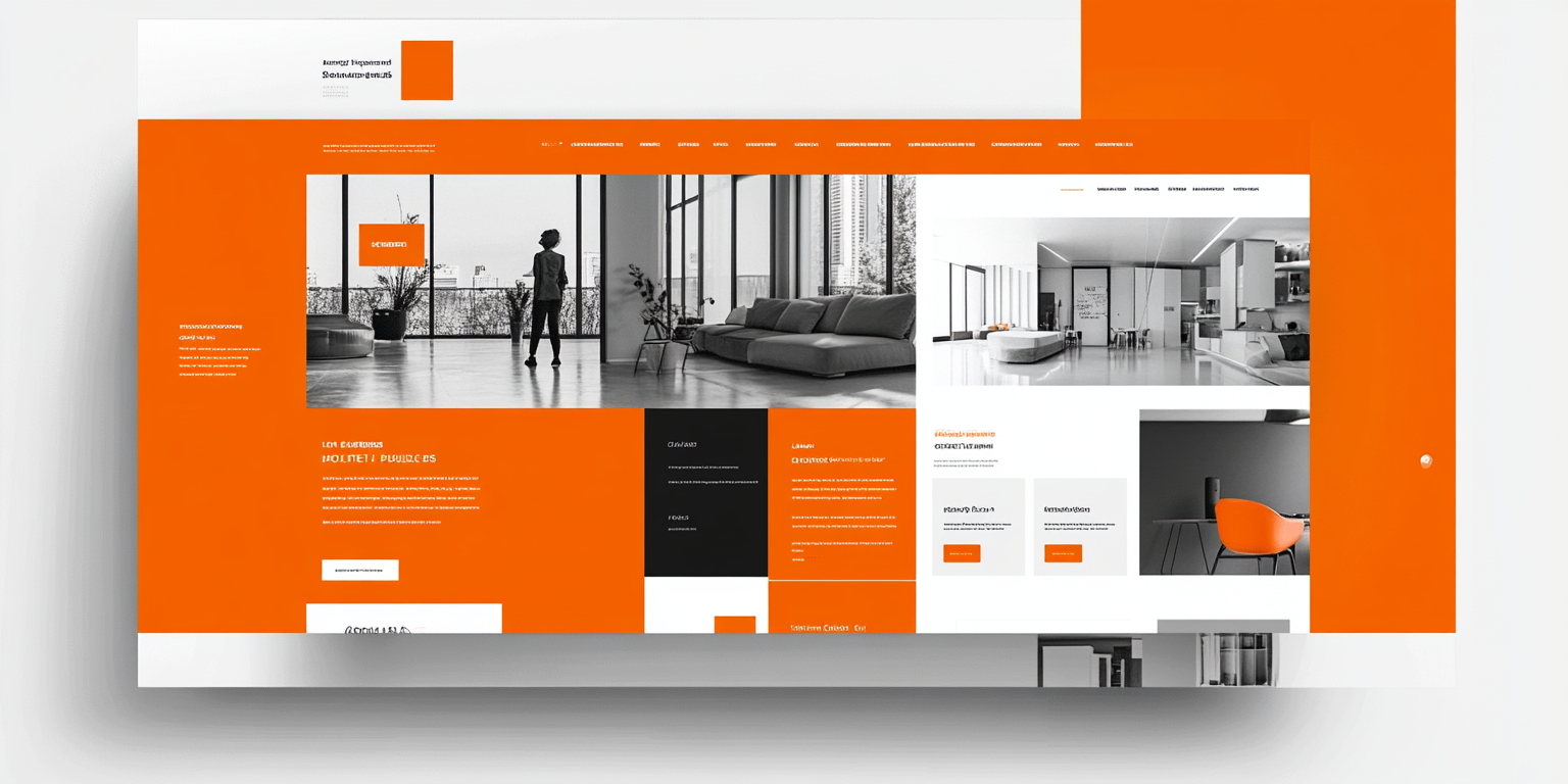
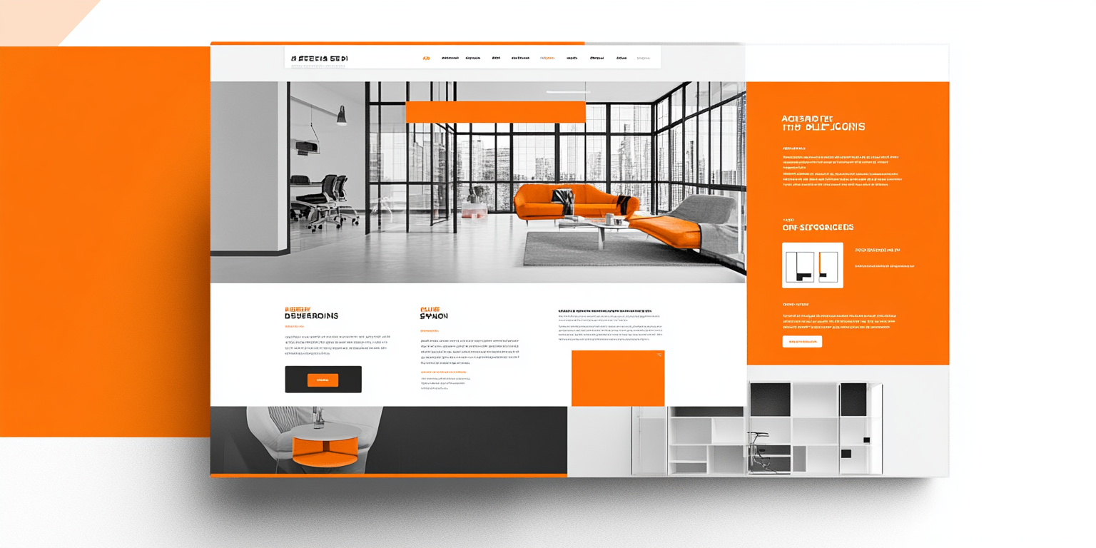
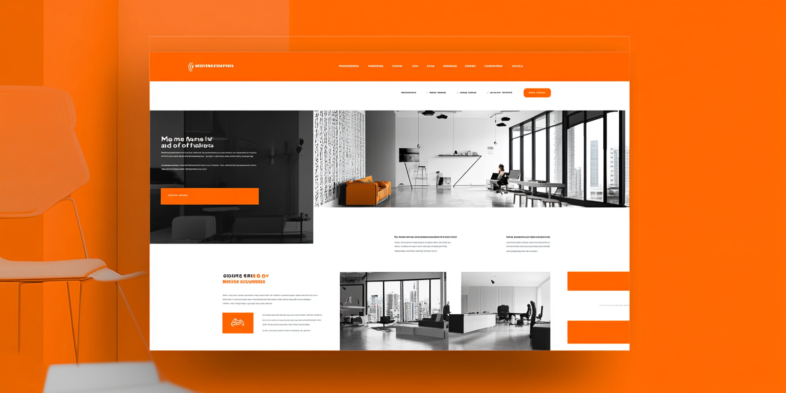
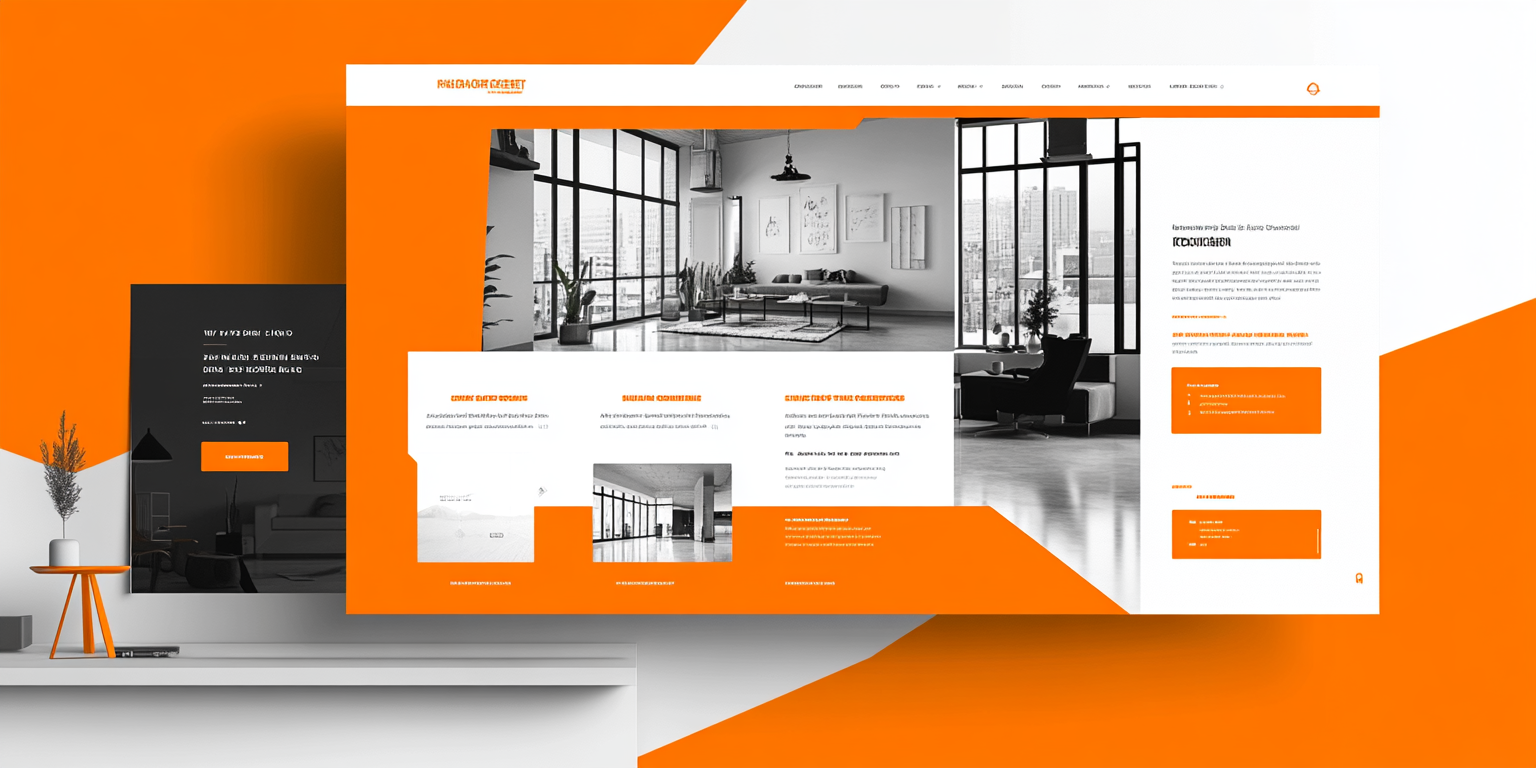
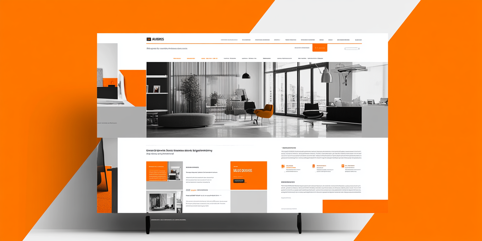
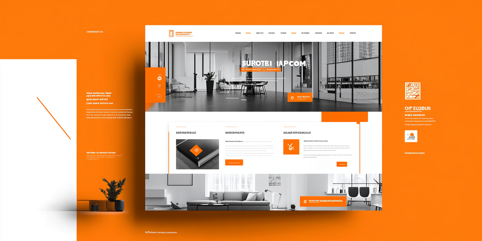
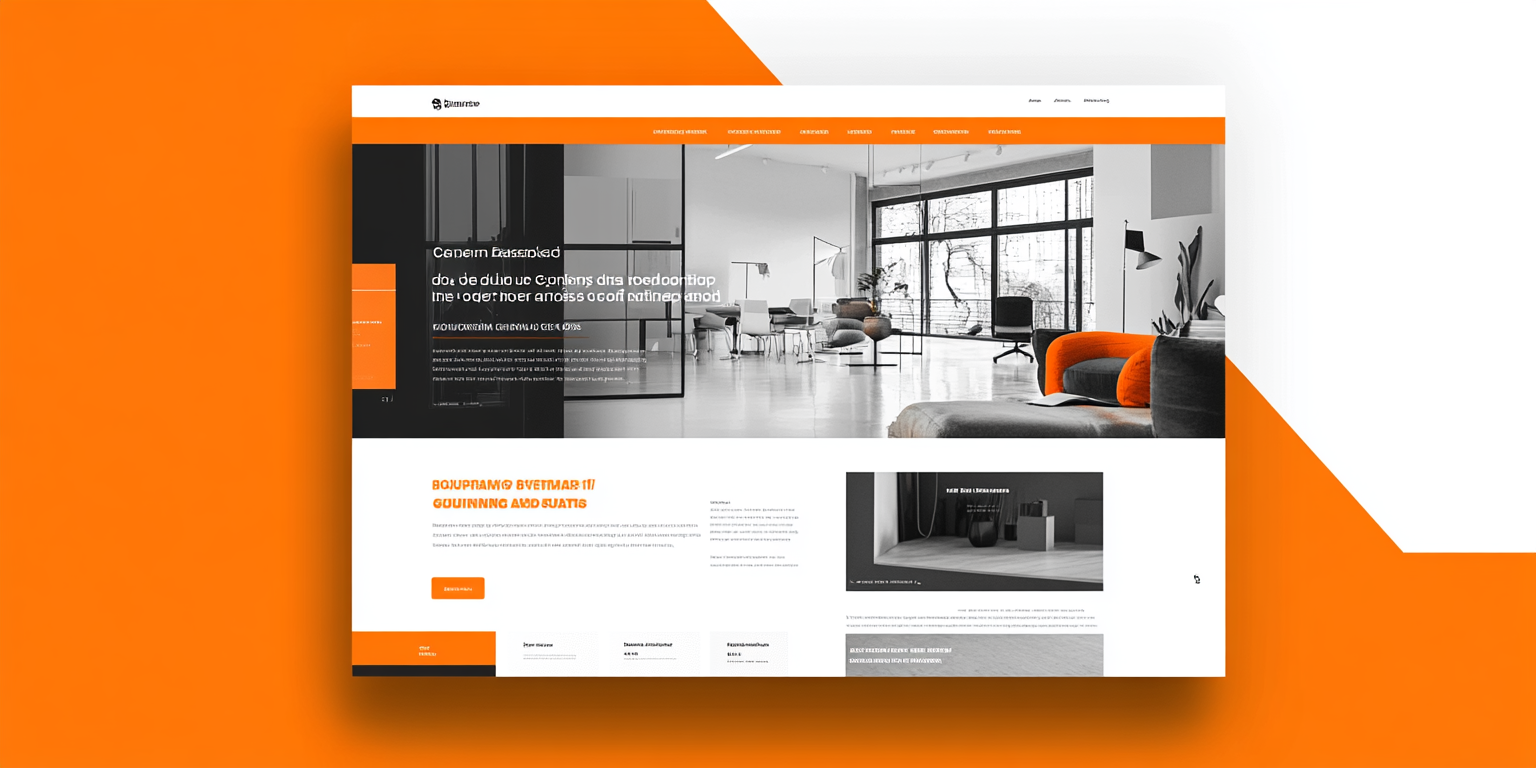
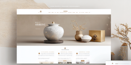
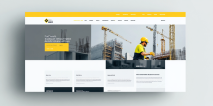
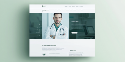
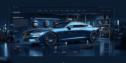
These images illustrate the essence of modern web design through sleek and structured wireframes. The consistent use of orange accents across the layouts not only brings vibrancy but also ensures that the design elements stand out without overwhelming the viewer. The strategic placement of visual elements balances aesthetics with functionality, drawing attention to call-to-action buttons and interactive sections.
The wireframes feature a minimalist design approach, showcasing expansive white spaces that promote readability and user focus. By integrating large imagery with grayscale elements, the layout achieves a harmonious blend of professionalism and creativity, ideal for businesses aiming to make a bold, modern statement.
Typography plays a critical role in these designs, with bold headings complemented by concise subtexts. The structured sections allow for an easy flow of information, ensuring users can navigate through the content intuitively. The emphasis on modular layouts makes the designs adaptable for various industries, including interior design, technology, and corporate portfolios.

