Project Overview
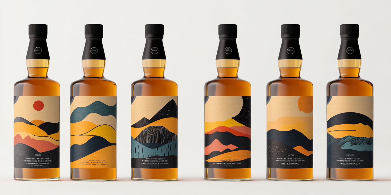
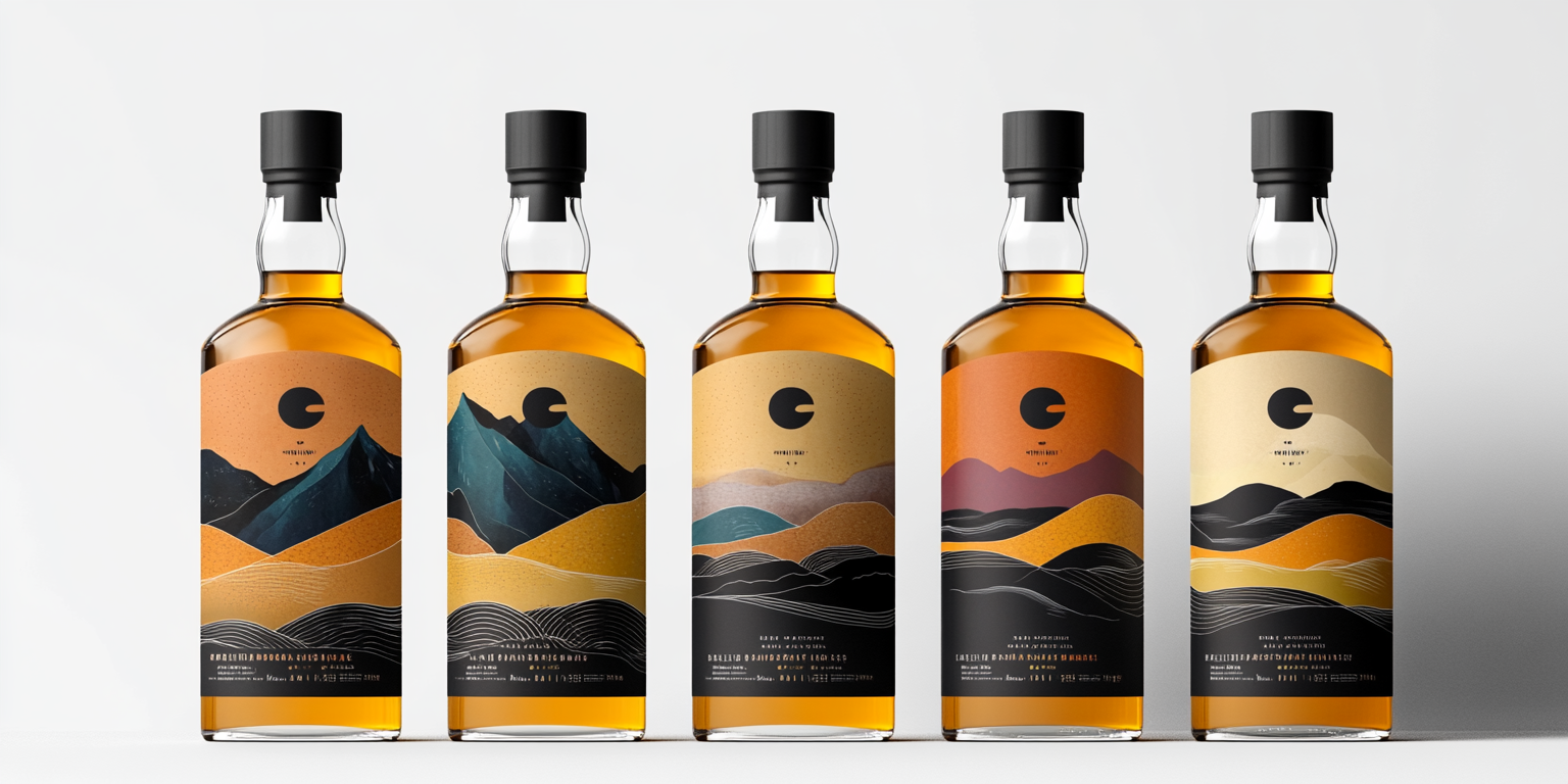
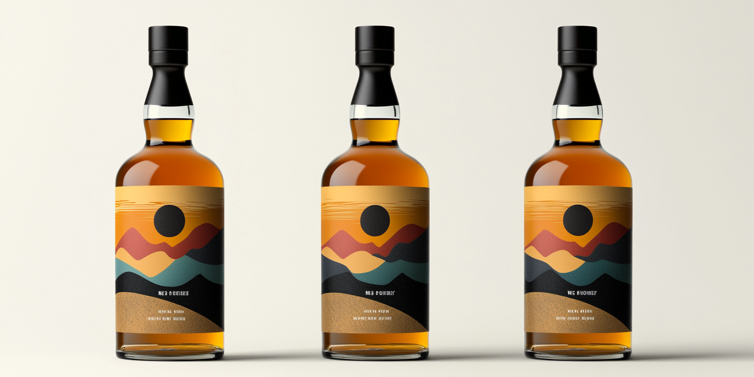
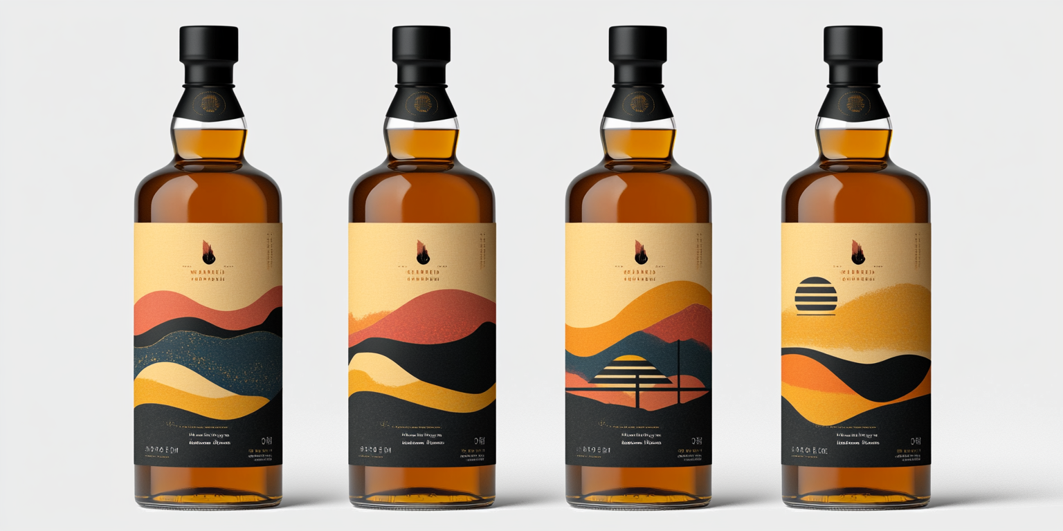
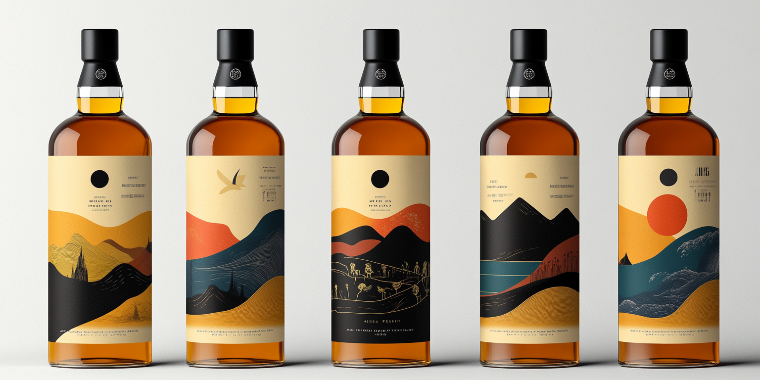
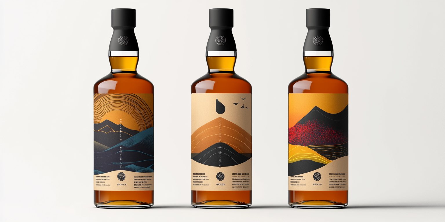
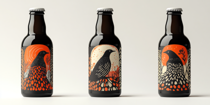
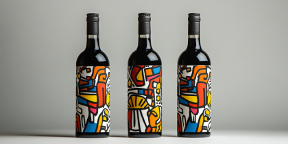
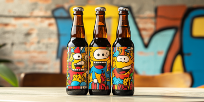
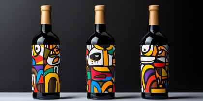
This premium whiskey bottle label collection is designed to merge artistic elegance with a modern, minimalist approach. Inspired by nature, landscapes, and abstract aesthetics, each design enhances the whiskey’s visual appeal, elevating its presence on store shelves and collector displays.
- Year of Completion: 2021
- Status: Active
Design Concept
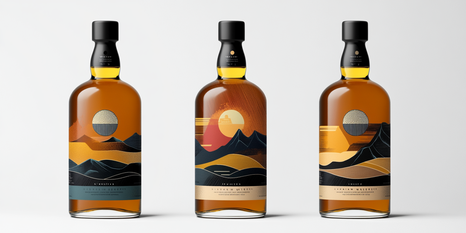
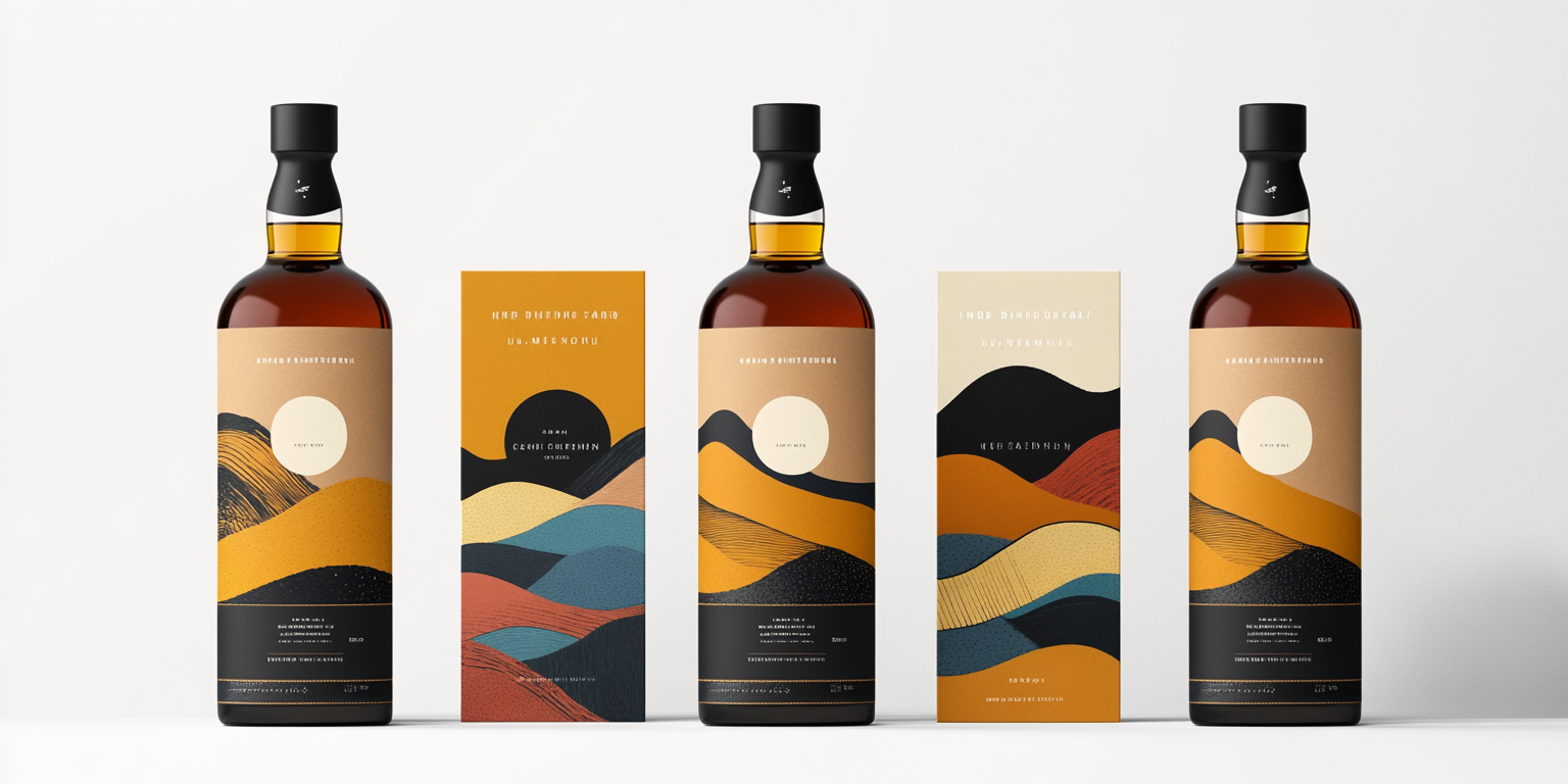
The labels feature a fusion of warm tones, flowing shapes, and abstract landscapes, echoing the complexity and depth of the whiskey inside. The use of textured backgrounds, soft gradients, and earthy color palettes creates a sophisticated and contemporary feel.
Key Features:
- Minimalist Aesthetic: Clean and elegant layout with a focus on abstract art.
- Warm Color Palette: Earthy hues of gold, amber, burnt orange, and deep blue to complement the whiskey’s natural tones.
- Textured Details: Subtle embossed patterns for a tactile experience.
- Modern Typography: Simple, refined typeface for a timeless appeal.
- Premium Printing Techniques: Foil stamping and matte finishes enhance visual depth.
Deliverables
- Four unique whiskey label designs
- High-resolution print-ready files
- Branding and promotional assets
- Digital mockups for marketing campaigns
Tools Used
- Adobe Illustrator (Vector Label Design)
- Adobe Photoshop (Mockups & Branding)
- Cinema 4D (3D Bottle Visualization)
Impact & Market Reach
- Luxury Branding Appeal: Designed for premium whiskey brands targeting a high-end audience.
- Increased Shelf Visibility: Distinctive artistic design ensures standout presence.
- Collector’s Edition Potential: Appeals to connoisseurs and collectors looking for unique packaging.
Challenges & Solutions
Challenges Faced
- Balancing artistic expression with brand clarity.
- Ensuring colors and textures translate effectively in print.
Solutions Implemented
- Conducted print material tests for color accuracy and texture enhancement.
- Used high-contrast elements to ensure legibility and striking shelf impact.

