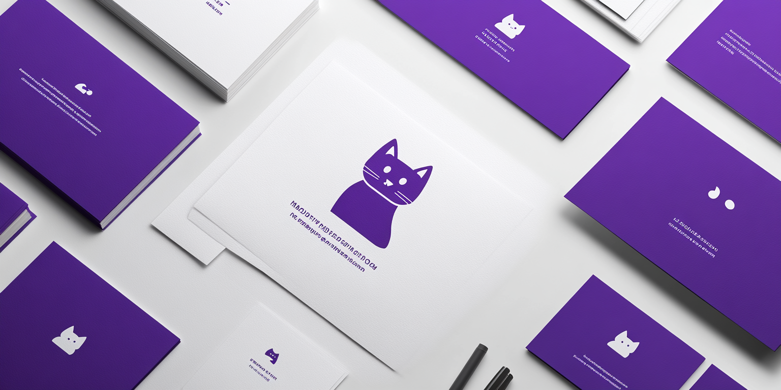
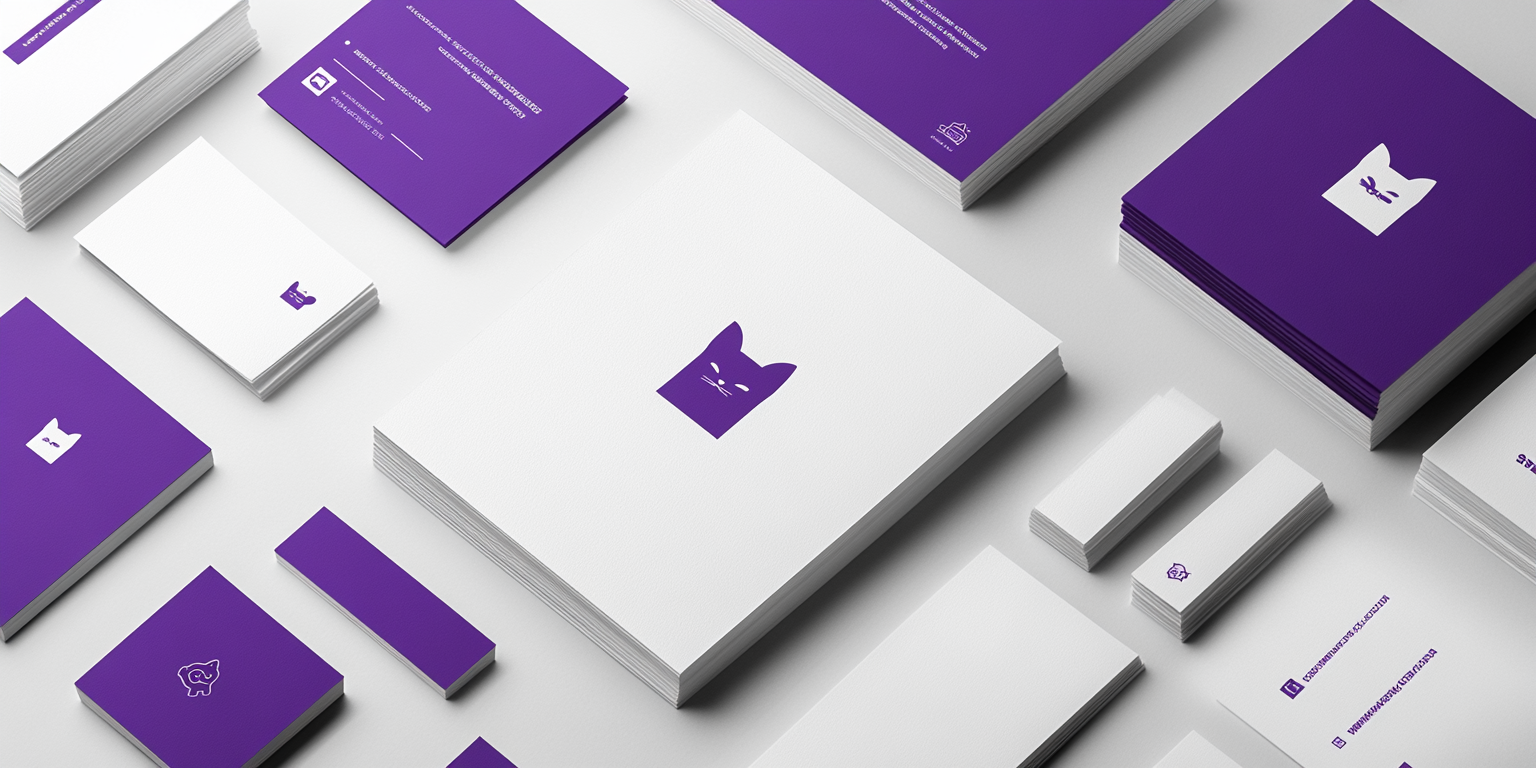
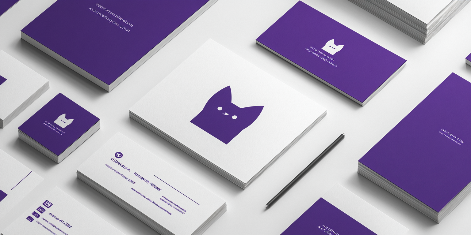
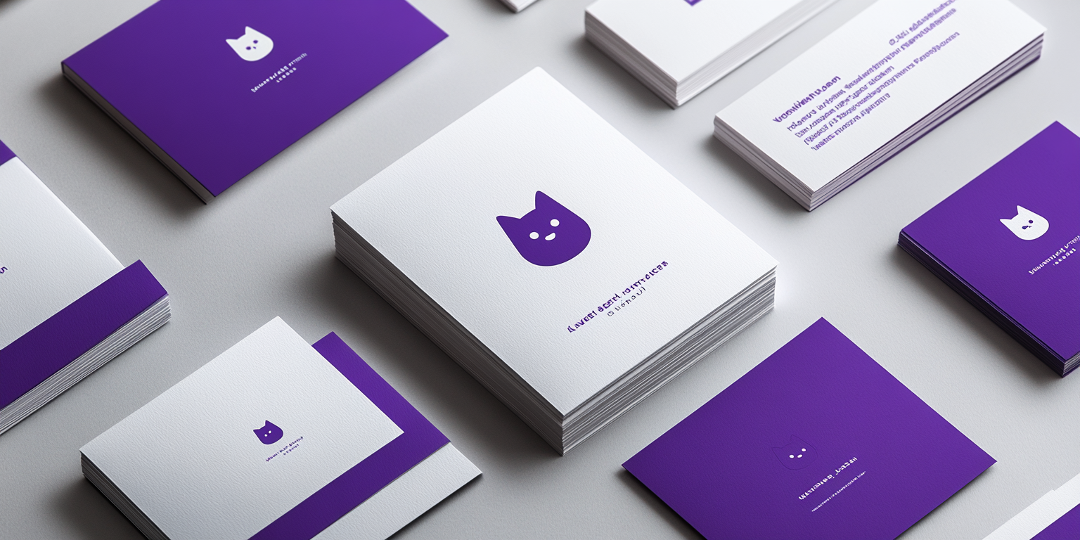
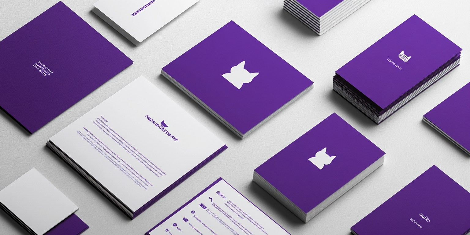
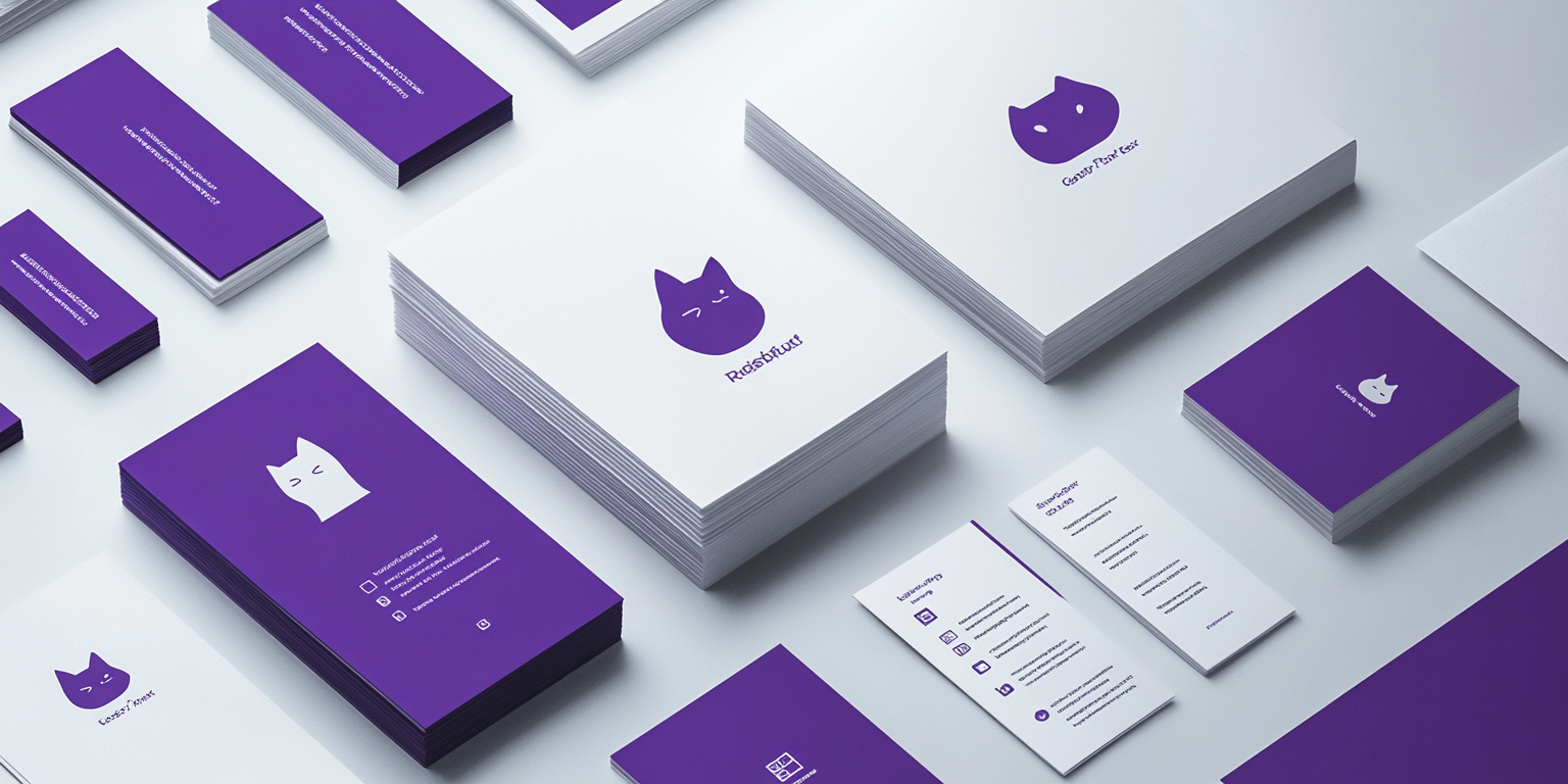
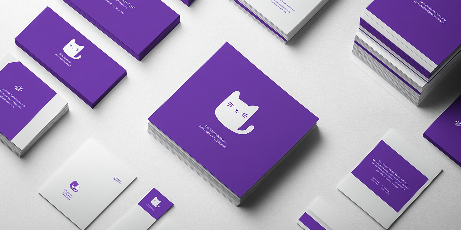
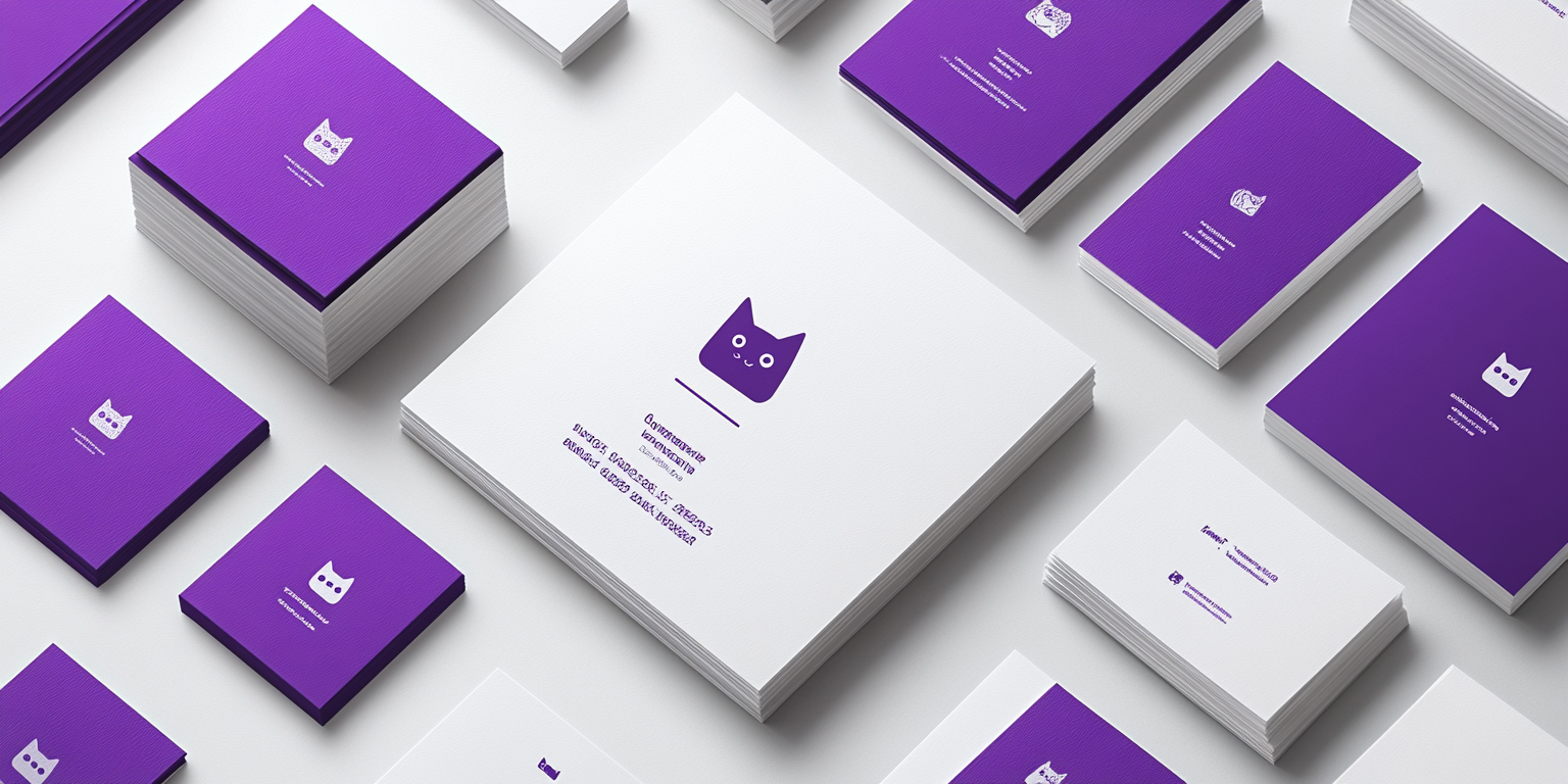
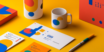
The images showcase a distinctive brand identity using purple and white tones, centered around a simple, recognizable cat icon. This branding approach emphasizes elegance, minimalism, and clarity, demonstrating the power of cohesive design. The use of white space and monochromatic elements enhances readability, ensuring that the visual message is direct and uncluttered. The consistent application across various materials—business cards, notebooks, brochures, and letterheads—reinforces the brand’s identity. The purple hue symbolizes creativity and ambition, making it ideal for businesses seeking to leave a lasting impression. The cat logo, playful yet refined, adds a personable touch, hinting at the brand’s approachable nature. This design reflects the importance of uniformity in branding. By maintaining visual harmony across all touchpoints, the brand ensures memorability and fosters trust. The cat icon serves as a focal point, making it instantly recognizable across platforms, whether on print media or digital spaces. In today’s competitive market, such a consistent and clean brand identity can set a business apart. It communicates professionalism with a hint of playfulness, appealing to audiences seeking both style and substance.
Portfolio

