Project Overview
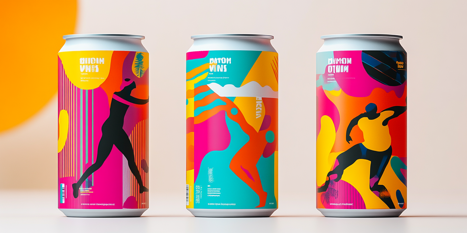
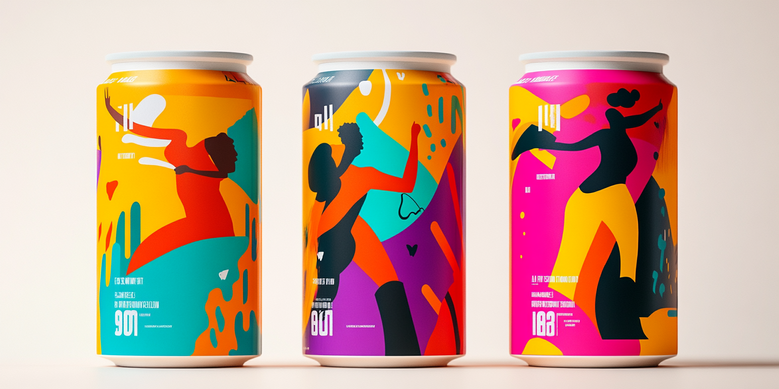
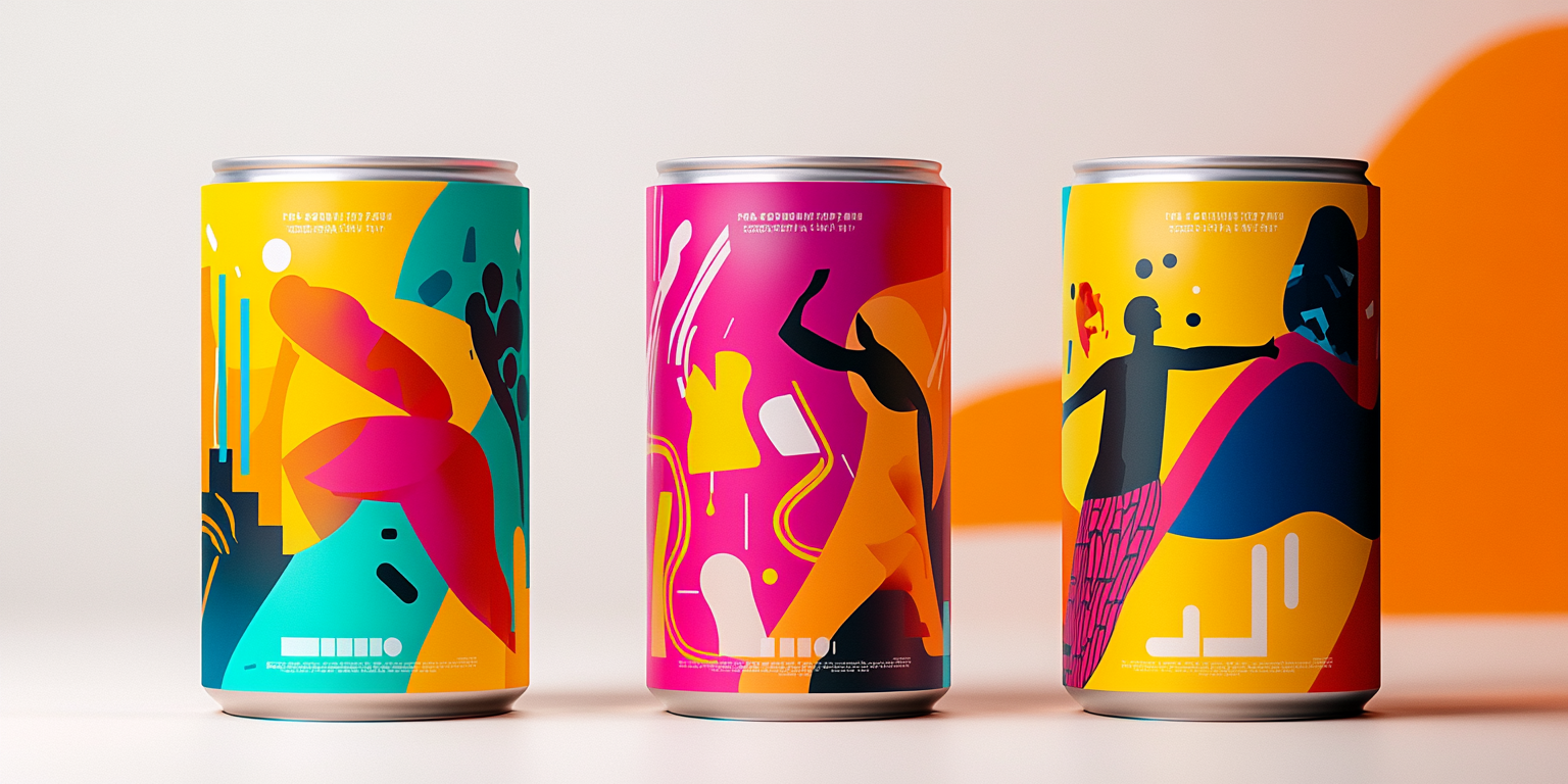
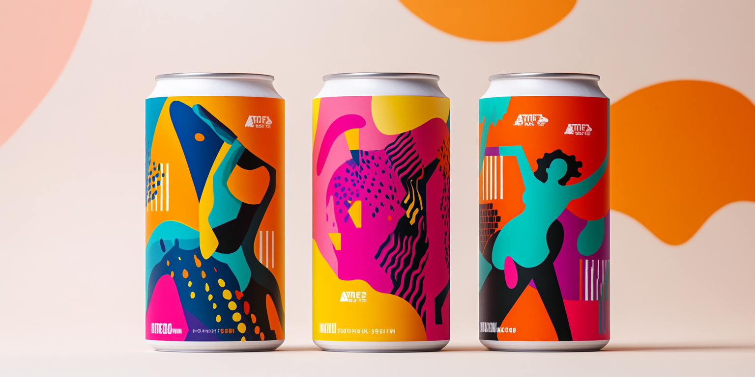
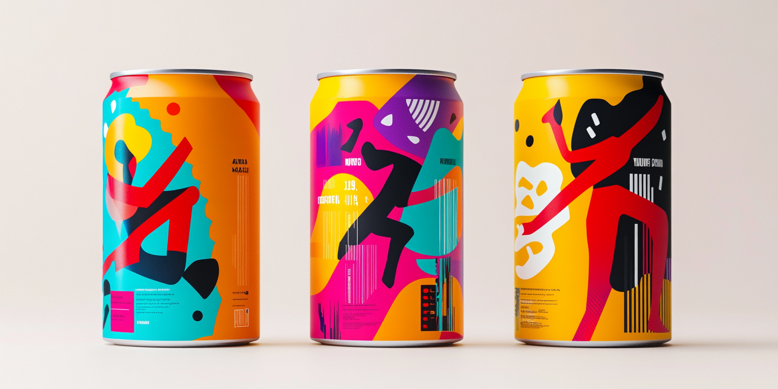
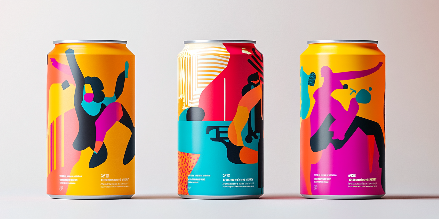
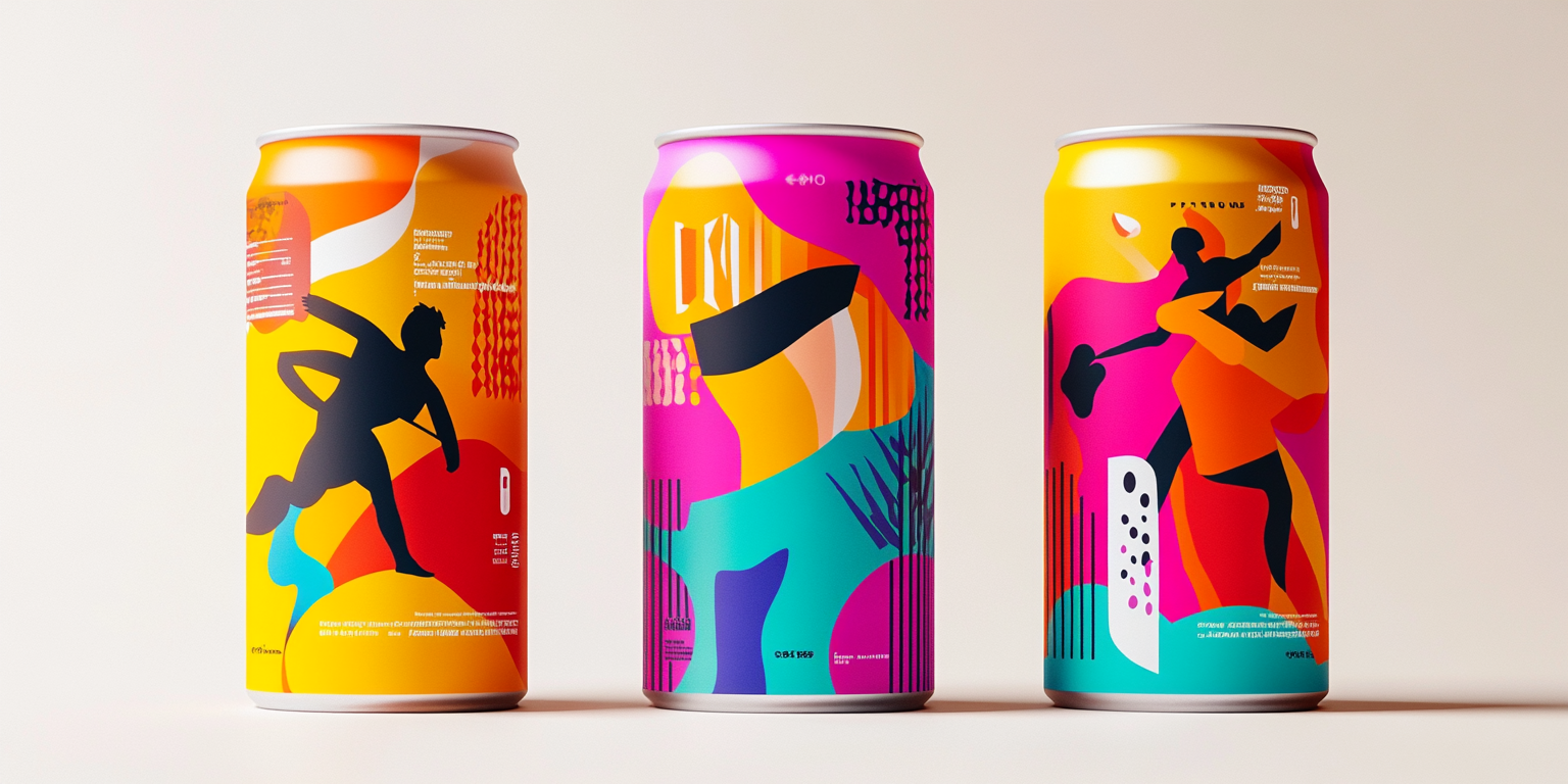
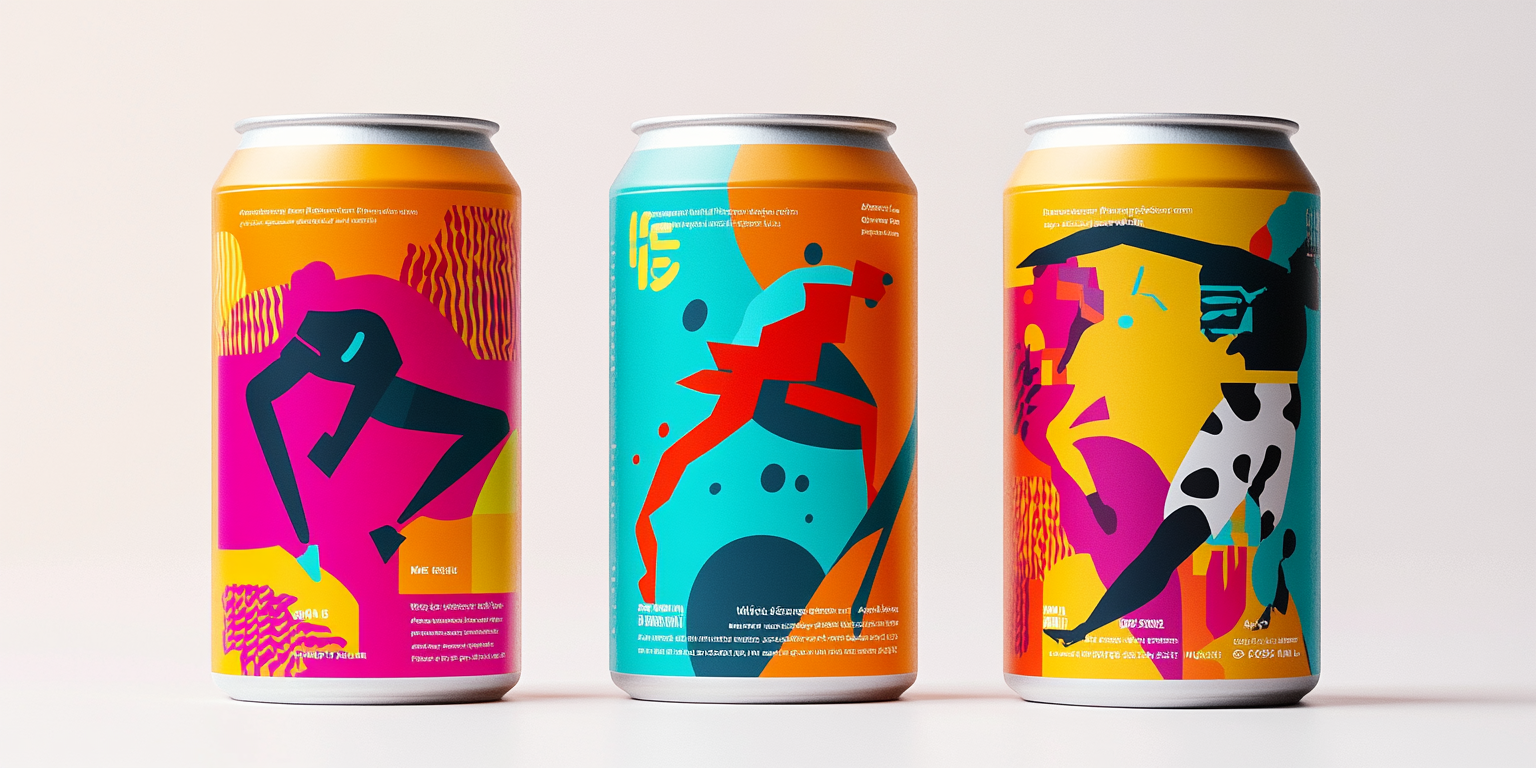
The Bold Energy Beverage Collection is a high-impact, visually striking line designed for a brand that embraces intensity and attitude. With aggressive, graffiti-inspired artwork and an electrifying color scheme, this collection breaks conventional design norms to create a rebellious and energetic brand identity.
- Year of Completion: 2019
- Status: Active
Design Concept
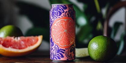
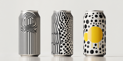
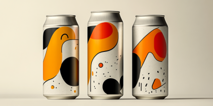
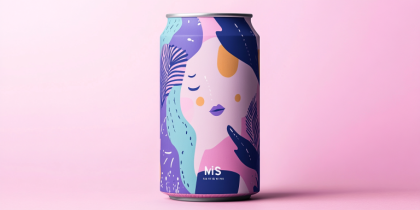
The collection takes inspiration from underground street art and punk aesthetics, blending raw, expressive elements with bold typography and graphic illustration. The explosive visuals and color palette command attention, making this packaging stand out on any shelf.
Key Features:
- Graffiti-Inspired Artwork: Sharp, aggressive lines and spray-paint textures.
- Striking Color Contrasts: Neon pinks, electric yellows, and bold blacks create an energetic impact.
- Distressed & Dripping Effects: A rough, unfinished look that captures the rebellious spirit of the brand.
- Minimalist Typography: Clean yet bold logo placement that complements the chaotic artwork.
- Gloss & Matte Print Combination: Enhancing visual texture and bringing the designs to life.
Deliverables
- Complete beverage packaging suite designed to embody the brand’s high-energy aesthetic.
- Digital and print marketing assets featuring interactive, street-style branding.
- Photo-realistic mockups for promotional materials and online campaigns.
- Limited-edition releases with collectible packaging for brand exclusivity.
Tools Used
- Adobe Illustrator (Vector Art & Custom Illustrations)
- Adobe Photoshop (Mockups & Image Enhancements)
- Procreate (Hand-Drawn Elements & Digital Sketching)
- Blender (3D Rendering for Hyper-Realistic Presentation)
Impact & Market Appeal
- Designed for a Fearless & Energetic Audience: Perfect for energy drinks, sports beverages, and edgy soda brands.
- Highly Shareable & Collectible: Packaging that resonates with a bold, modern consumer base and stands out in a competitive space.
- Shelf Dominance & Instant Recognition: Eye-catching designs that demand attention and create strong brand recall.
Challenges & Solutions
Challenges Encountered
- Achieving a fine balance between an intense, raw look and a professional, polished finish.
- Ensuring brand identity remains consistent despite high-impact, varied designs.
Solutions Implemented
- Developed a core set of design principles, including a unified color palette and recognizable graphic elements.
- Created structured visual hierarchies to maintain legibility while embracing artistic chaos.