Project Overview
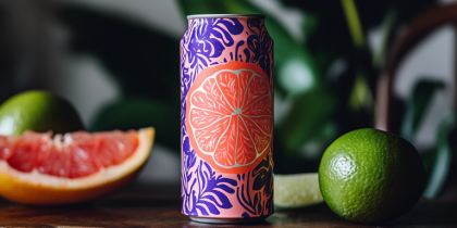
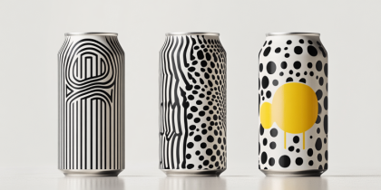
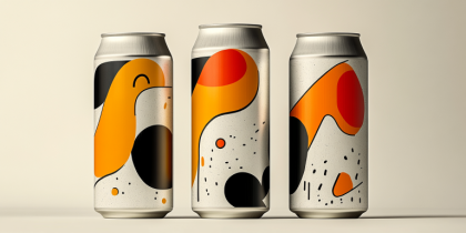
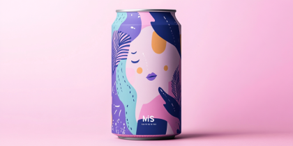
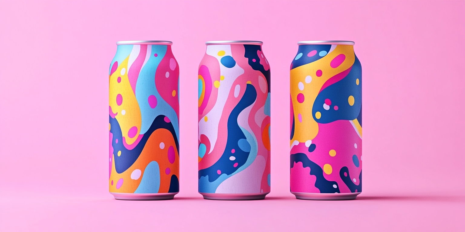
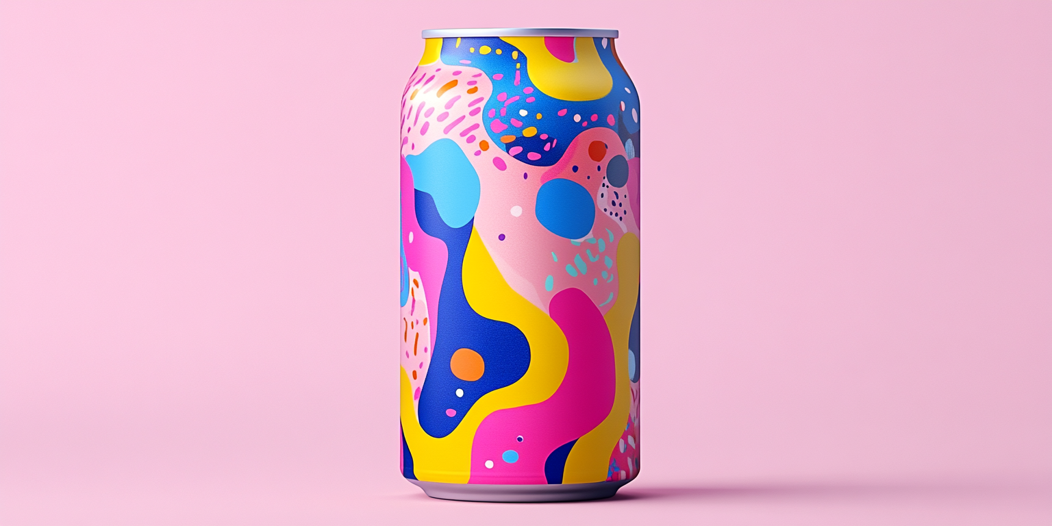
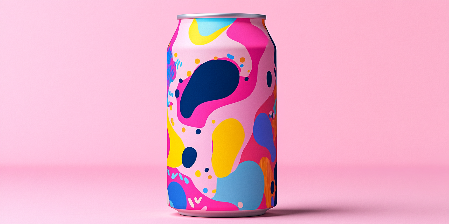
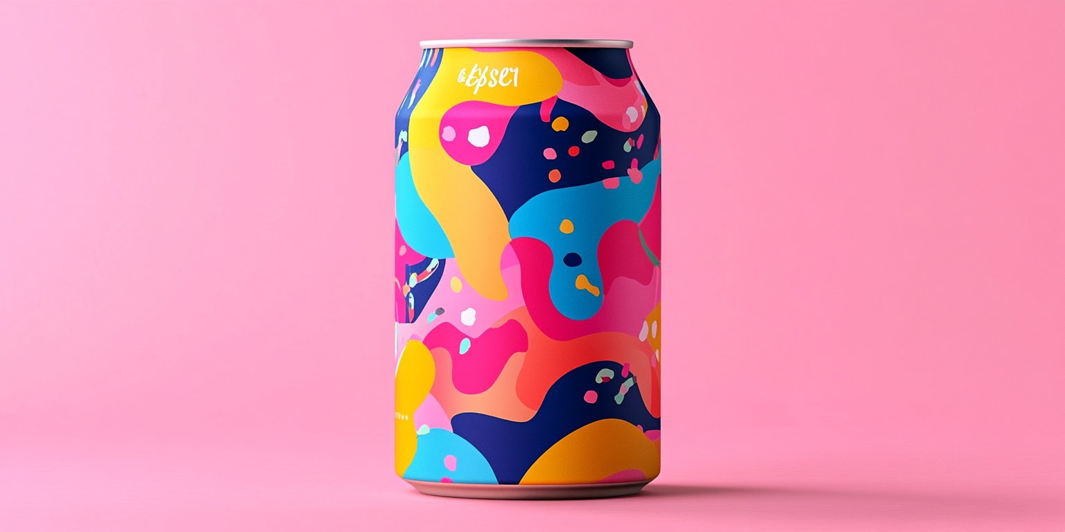
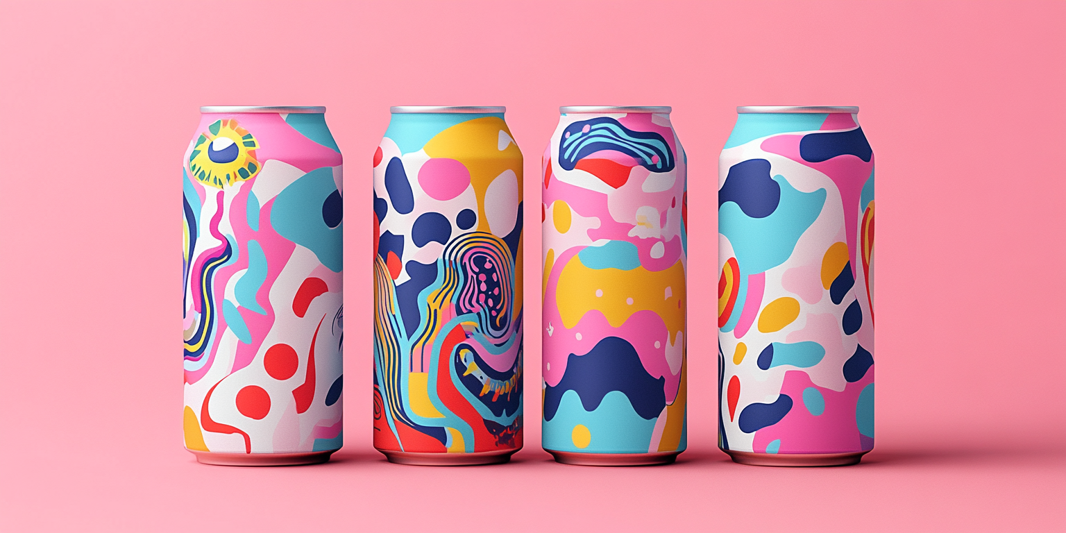
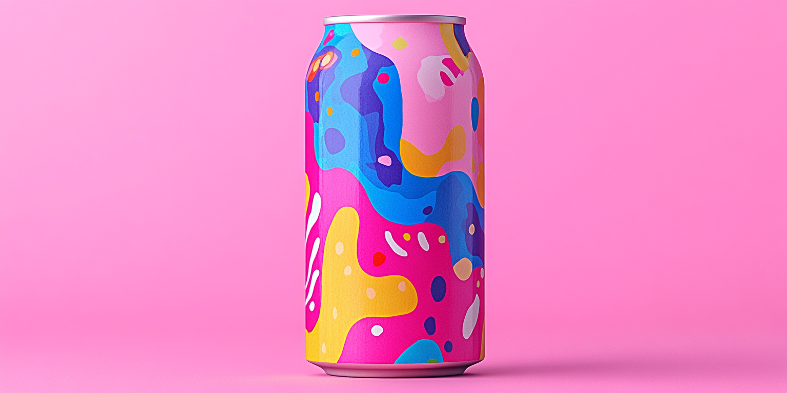
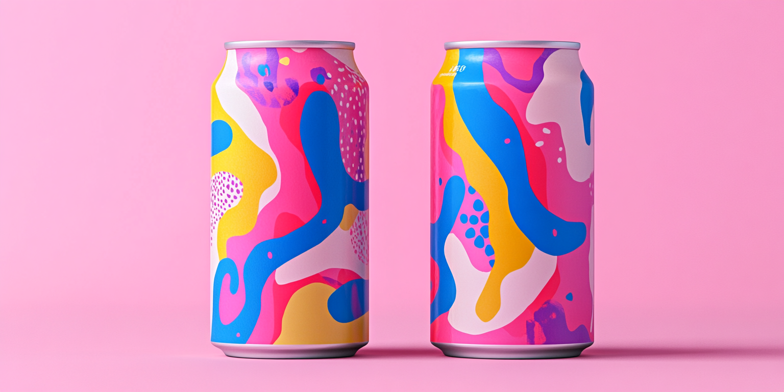
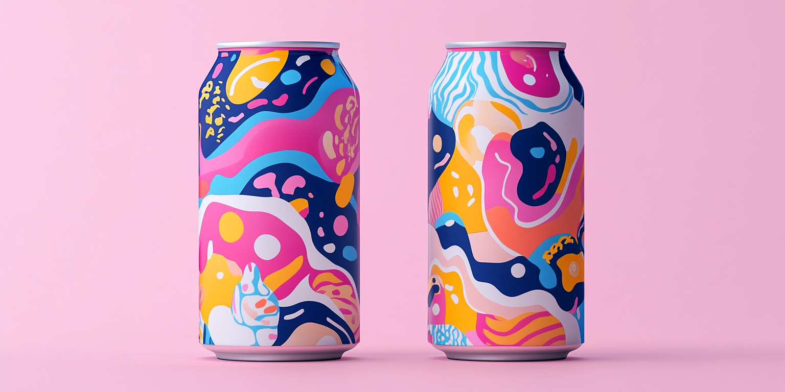
The Neon Pop Beverage Collection is an explosion of bold colors, abstract shapes, and an electrifying aesthetic designed for a high-energy drink brand. This collection embraces an ultra-modern approach to packaging, fusing dynamic neon hues with fluid, organic patterns to create a visually striking and engaging product.
- Year of Completion: 2018
- Status: Active
Design Concept
This collection is inspired by the vibrant energy of pop culture, nightlife, and futuristic design elements. The cans feature fluid, abstract forms that evoke movement and excitement, paired with an intense neon color palette that demands attention.
Key Features:
- Bold and Fluid Abstract Patterns: Dynamic, energetic compositions with a neon-inspired twist.
- High-Contrast Neon Colors: A striking mix of electric pinks, blues, yellows, and purples for maximum visibility.
- Minimalist Branding: A clean logo approach that allows the artwork to take center stage.
- Matte and Glossy Print Combinations: Enhancing texture and depth for a premium tactile experience.
- Gradient and Iridescent Effects: Designed to capture light and create a captivating shimmer.
Deliverables
- Full beverage packaging suite for a futuristic and high-energy drink line
- Digital and print marketing assets designed for vibrant social media appeal
- High-fidelity product mockups for promotional campaigns
- Limited edition can designs for exclusive releases
Tools Used
- Adobe Illustrator (Vector Graphics & Abstract Artwork)
- Adobe Photoshop (Mockups & Color Enhancements)
- Procreate (Hand-Drawn Digital Illustrations)
- Blender (3D Renderings for Hyper-Realistic Visuals)
Impact & Market Appeal
- Targeted Toward a Young, Bold Audience: Perfect for energy drinks, performance beverages, and futuristic lifestyle brands.
- Collectible and Highly Shareable: Unique packaging that doubles as an art piece, driving consumer engagement.
- Standout Shelf Presence: Designed to disrupt traditional beverage aisles with an innovative and unconventional aesthetic.
Challenges & Solutions
Challenges Encountered
- Balancing the complexity of abstract forms while ensuring brand recognition.
- Creating a visually immersive design that remains legible and functional.
Solutions Implemented
- Developed a structured yet fluid layout that maintains brand clarity.
- Incorporated strategic typography placement to ensure readability without overpowering the design.