Project Overview
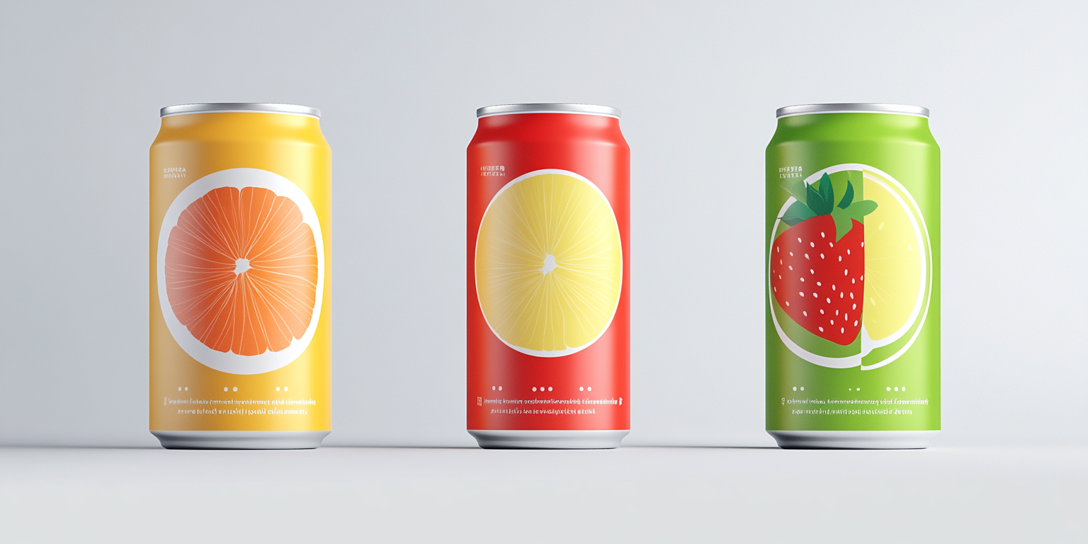
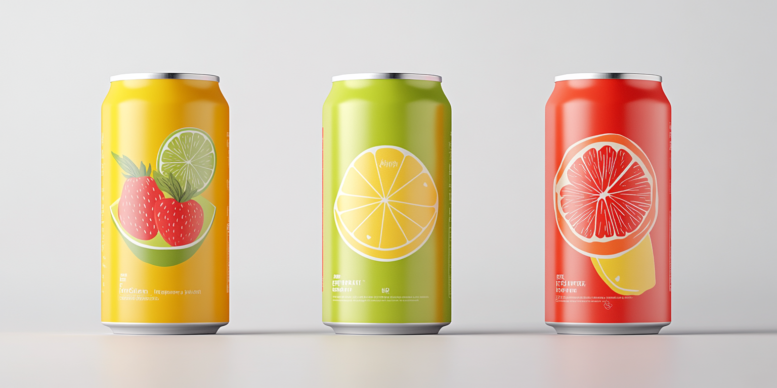
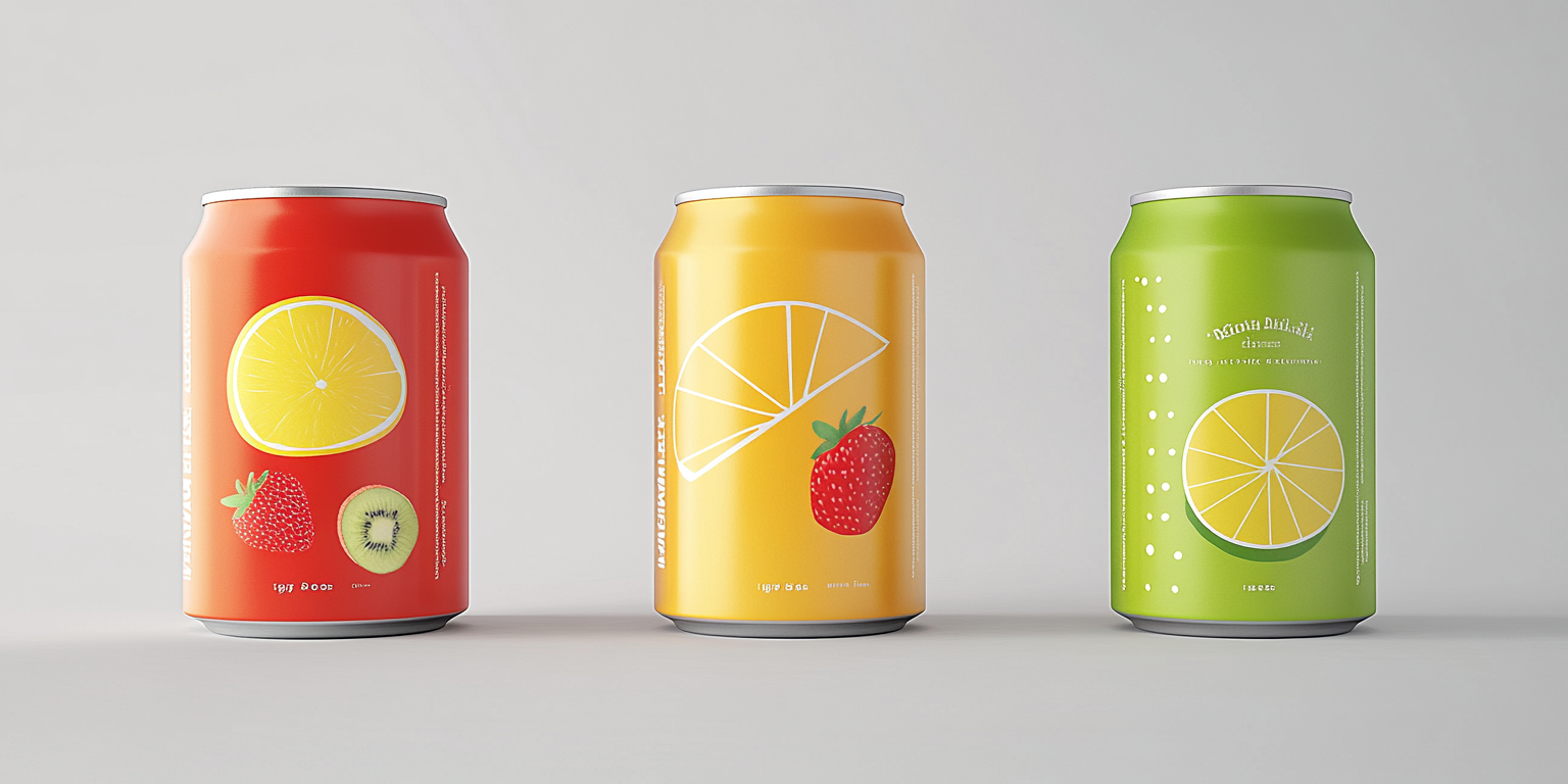
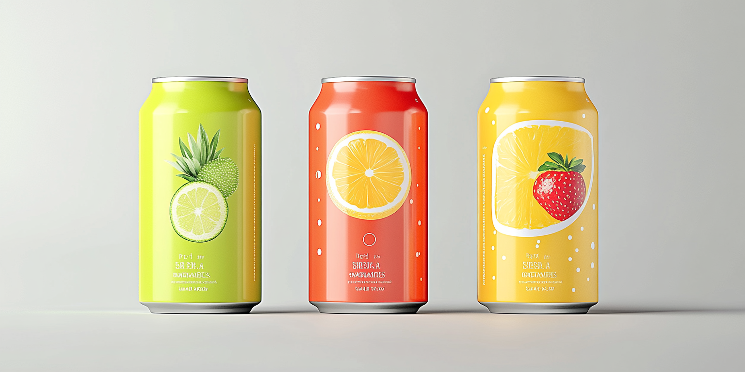
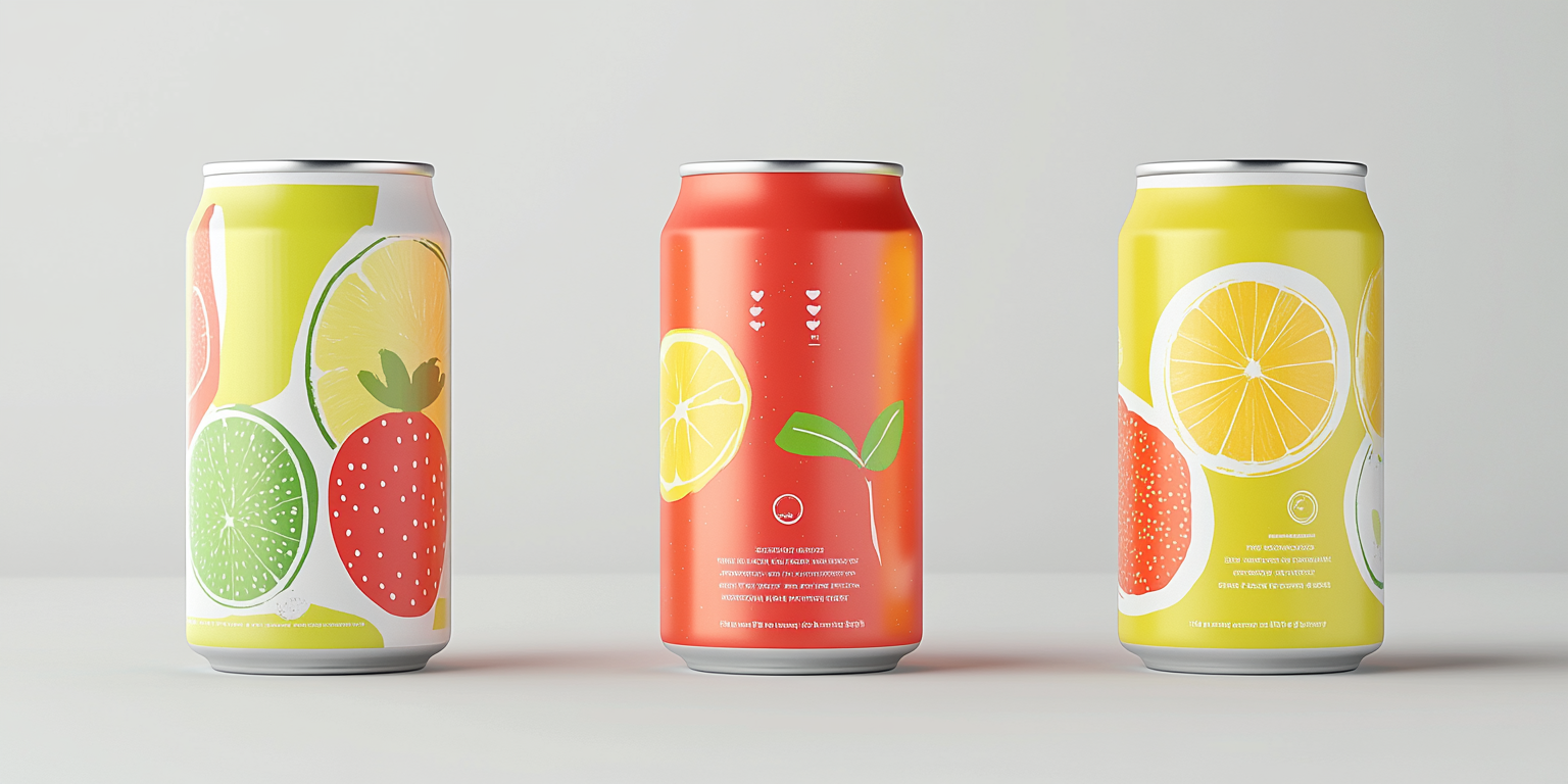
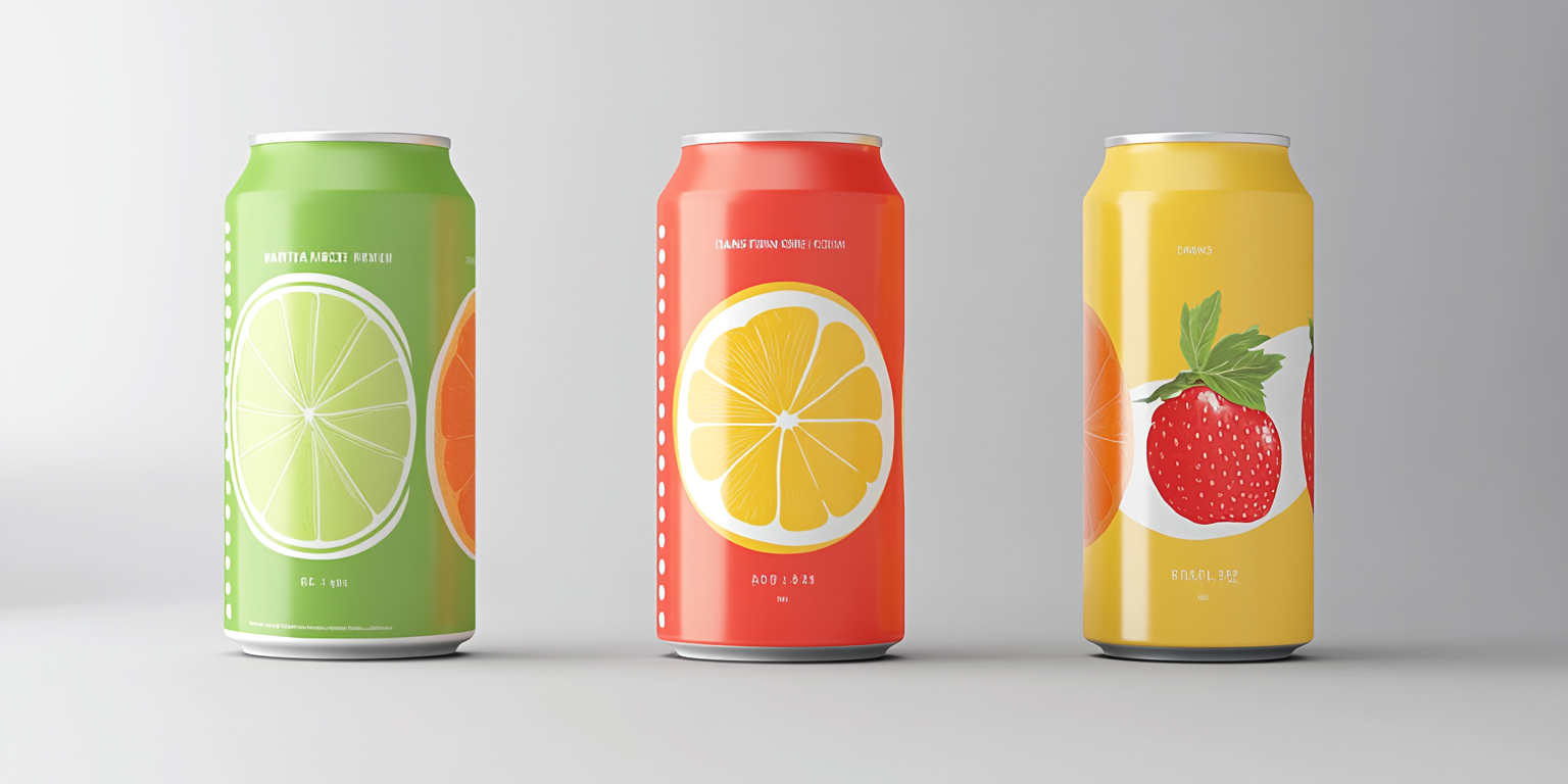
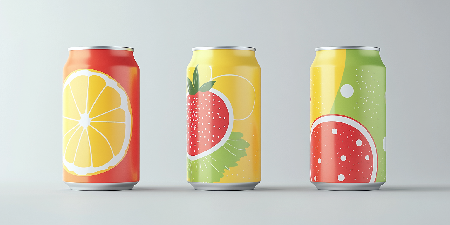
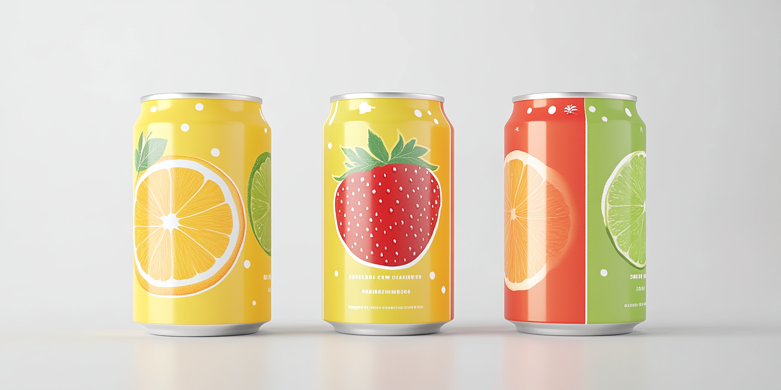
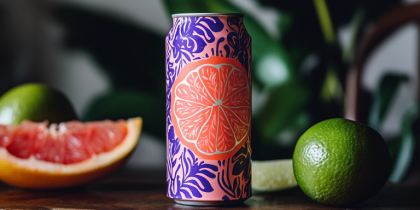
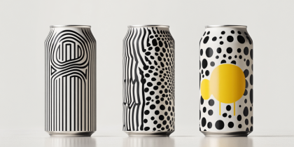
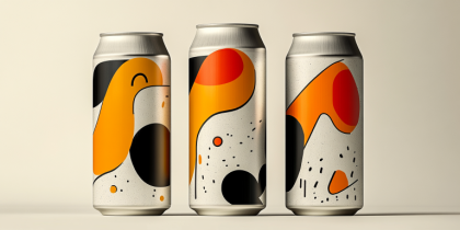
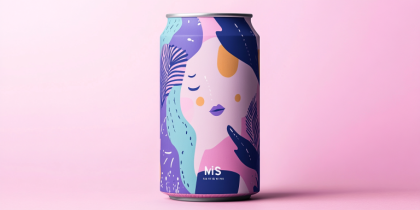
The Vibrant Essence Beverage Branding Collection is a bold and refreshing take on modern beverage packaging. Designed to highlight the natural and fruity essence of each flavor, this identity system features dynamic color palettes, minimalistic yet striking illustrations, and a clean, contemporary layout.
- Year of Completion: 2022
- Status: Active
Design Concept
This branding approach emphasizes fresh, natural ingredients through vivid colors and sleek, modern typography. The aesthetic balances minimalism with eye-catching visual cues, ensuring instant recognition in retail spaces.
Key Features:
- Bold & Playful Aesthetic: Bright hues corresponding to fruit flavors, creating a visually appealing lineup.
- Minimalist Yet Expressive: Clean can designs with crisp illustrations of fruits, keeping the focus on natural flavors.
- Versatile Branding Elements: Effective across packaging, marketing materials, and digital promotions.
- Typography & Color Palette: A blend of bold, modern typography with energetic, high-contrast colors for maximum impact.
- Premium Print Quality: High-resolution fruit graphics and matte aluminum finishes for a sleek, sophisticated look.
Deliverables
- Full beverage packaging design suite
- Marketing and advertising collateral
- Digital branding for e-commerce and social media
- Merchandise concepts for brand extensions
Tools Used
- Adobe Illustrator (Vector Graphics & Label Design)
- Adobe Photoshop (Mockups & Visual Identity Development)
- Blender (3D Renderings for Product Showcases)
Impact & Market Appeal
- Instant Shelf Recognition: Bold colors and striking fruit imagery stand out in competitive beverage markets.
- Health & Lifestyle Focused: Appeals to health-conscious consumers looking for natural and refreshing drinks.
- Memorable & Distinct Identity: Balances minimalism with vibrant energy, making each product pop.
Challenges & Solutions
Challenges Encountered
- Differentiating each flavor while maintaining a cohesive brand identity.
- Ensuring high visibility and readability of packaging elements.
Solutions Implemented
- Created a unified design language using a consistent layout but distinct color schemes per flavor.
- Utilized high-contrast typography and strategic placement to enhance clarity and brand recall.

