
Project Overview
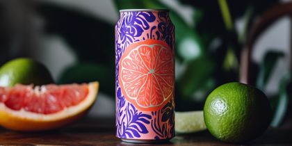
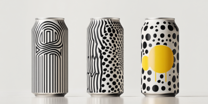
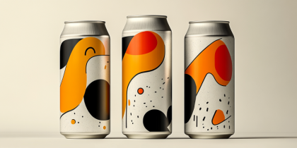
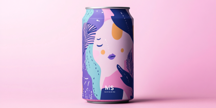
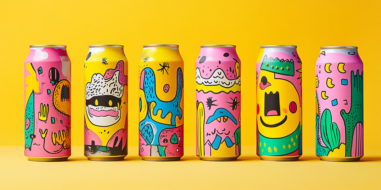
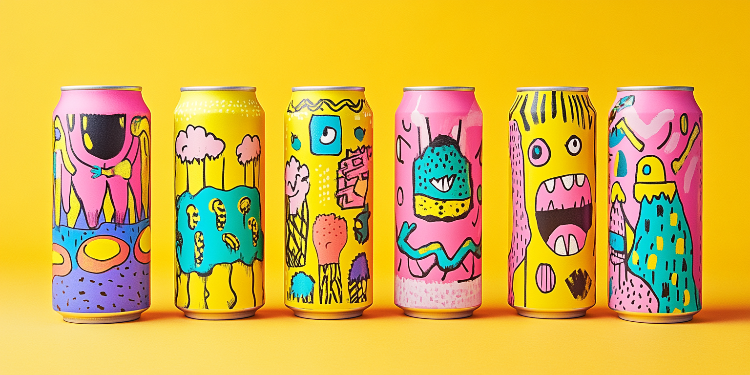
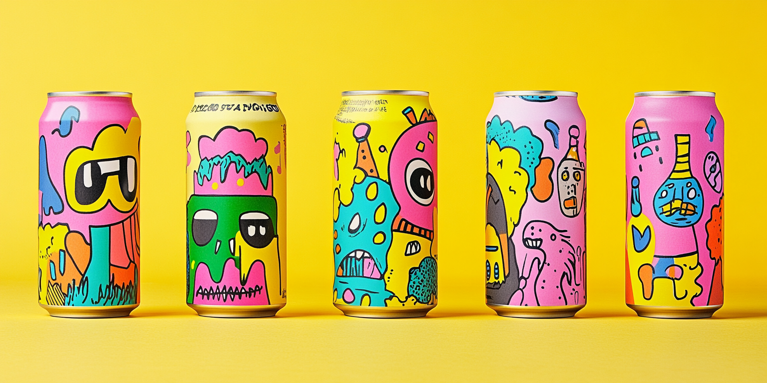
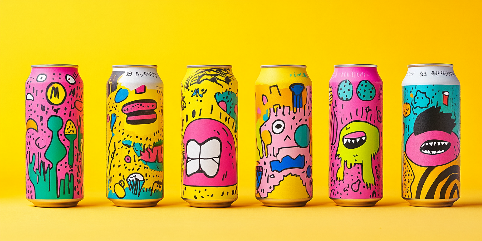
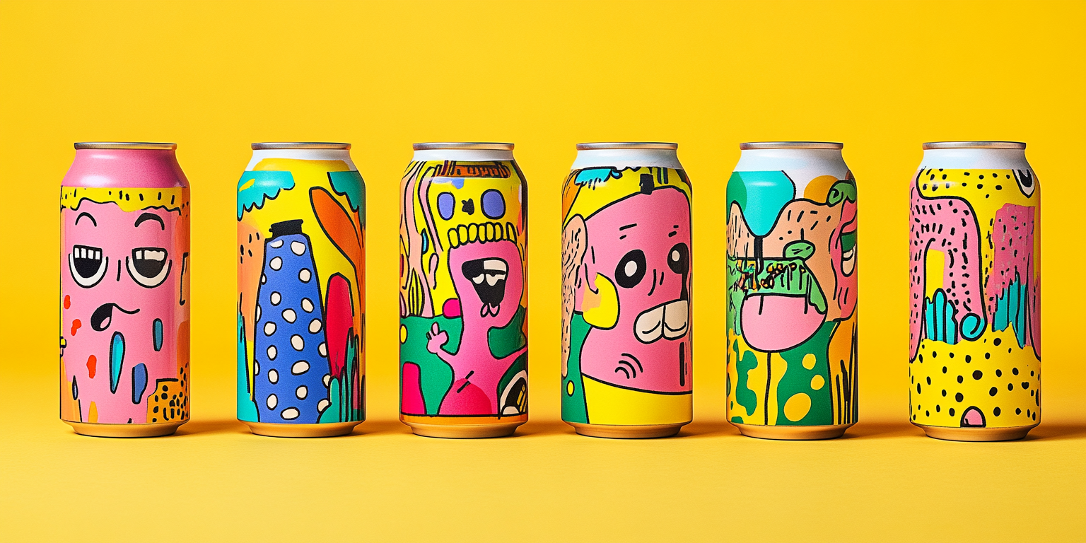
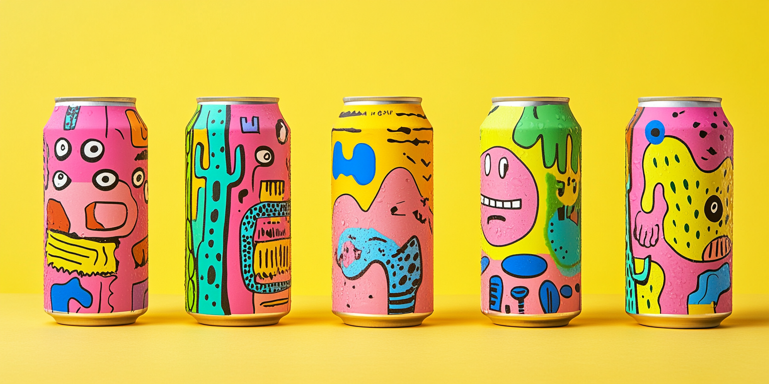
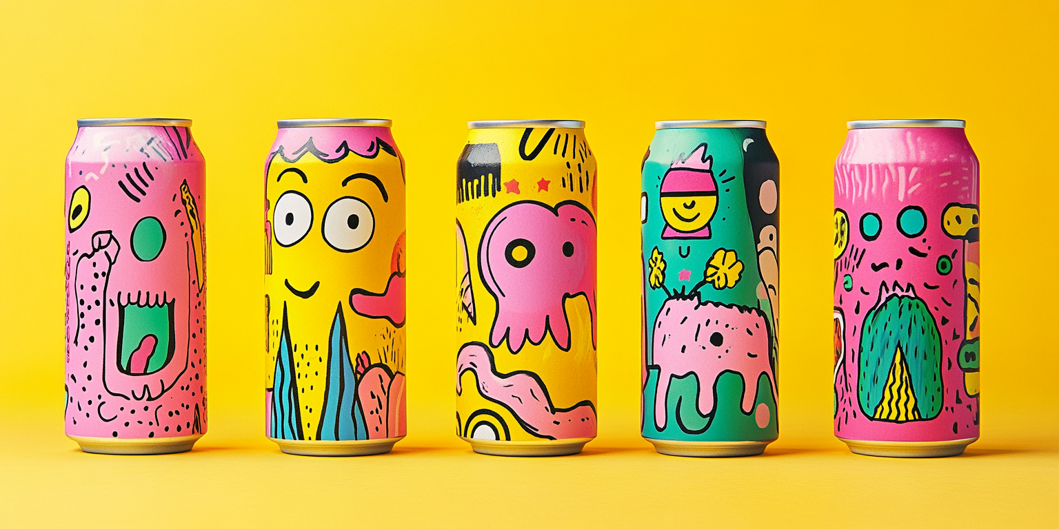
The Electric Funk Beverage Collection is a high-energy blend of urban street art and playful, hand-drawn illustrations. Designed for a bold and rebellious beverage brand, this collection bursts with eccentricity, vibrant colors, and expressive character designs that redefine creative packaging.
- Year of Completion: 2020
- Status: Active
Design Concept
This collection captures the raw, spontaneous nature of pop art with surreal characters, graffiti-inspired textures, and a bold mix of neon hues. Each can tells its own unique story, turning an everyday beverage into a collectible art piece.
Key Features:
- Hand-Drawn, Freeform Illustrations – A mix of abstract characters, funky shapes, and urban doodles.
- Energetic and Chaotic Color Palette – Neon pinks, electric blues, bold yellows, and vibrant greens.
- Graffiti and Street Art Influences – Rough sketch lines and bold splashes of color.
- Minimalist Logo Placement – Letting the artwork take center stage.
- Gloss and Matte Finish Combinations – Enhancing texture and creating a layered visual appeal.
Deliverables
- Full packaging design suite with a bold, electric-inspired brand identity.
- Social media marketing assets featuring animated and interactive branding.
- Three-dimensional hyper-realistic mockups for digital and print campaigns.
- Special edition can designs for collaborations and seasonal drops.
Tools Used
- Adobe Illustrator (Vector Art and Hand-Drawn Elements)
- Procreate (Digital Illustrations and Sketching)
- Adobe Photoshop (Mockups and Final Color Refinement)
- Blender (Three-Dimensional Renders for Ultra-Realistic Visualization)
Impact and Market Appeal
- Designed for the Unconventional – Perfect for energy drinks, craft sodas, and experimental beverage brands.
- Collectible and Highly Shareable – A packaging experience that consumers will want to showcase.
- Unmatched Shelf Appeal – A disruptive, artistic presence that grabs attention in any store.
Challenges and Solutions
Challenges Encountered
- Ensuring the playful chaos still felt like a cohesive brand.
- Balancing extreme vibrancy with premium design aesthetics.
Solutions Implemented
- Created a unified visual structure while giving each can a distinct personality.
- Used high-contrast elements to enhance depth and clarity while maintaining bold color impact.