Project Overview
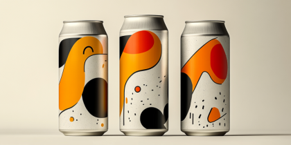
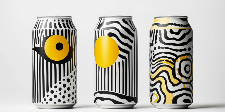
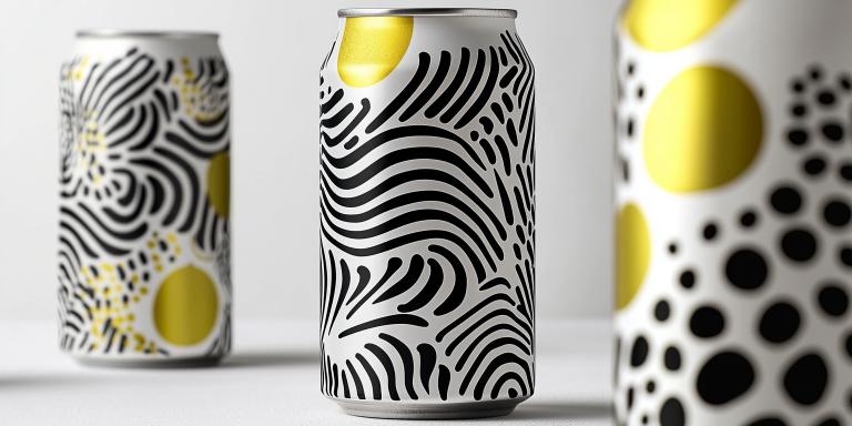
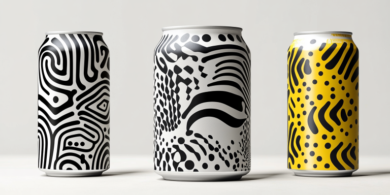
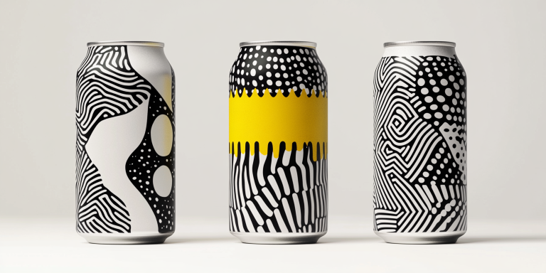
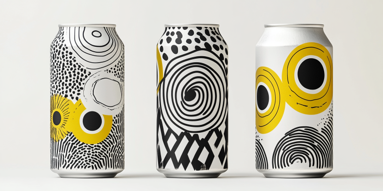
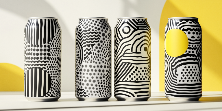
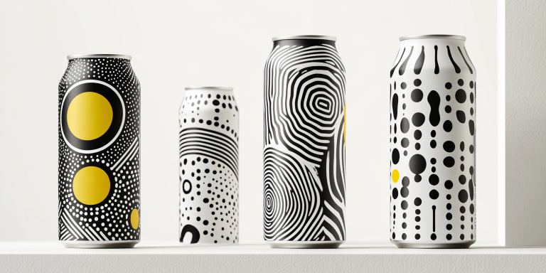
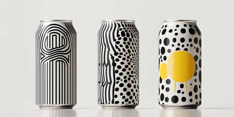
The Monochrome Flow Can Collection is a striking exploration of contrast, movement, and visual storytelling. Designed for an avant-garde beverage brand, this collection embraces bold black-and-white patterns, infused with pops of energetic yellow to create an unforgettable visual identity.
- Year of Completion: 2025
- Status: Active
Design Concept
Inspired by the interplay of organic textures and abstract forms, this collection merges fluid motion with structured design. The stark black-and-white aesthetic, enhanced by vibrant yellow highlights, ensures a modern and sophisticated look that stands out on store shelves.
Key Features:
- High-Contrast Aesthetic: A bold fusion of black-and-white patterns for a striking visual effect.
- Dynamic Linework & Organic Forms: Abstract waves, dots, and strokes create a sense of movement and depth.
- Limited Color Palette: Monochrome base with vibrant yellow accents to enhance visual impact.
- Versatile Branding Elements: Designed for craft beverages, sparkling drinks, and premium energy products.
- Tactile Packaging Experience: Matte finishes and raised textures amplify the sensory appeal.
Deliverables
- Complete can packaging design series
- Custom typography and logo placement
- Digital and print-ready assets for marketing and promotions
- Store display mockups and advertising visuals
Tools Used
- Adobe Illustrator (Vector Graphics & Branding Elements)
- Adobe Photoshop (Mockups & Visual Enhancements)
- Cinema 4D (3D Rendering & Visualization)
Impact & Market Appeal
- High Shelf Presence: The unique contrast-based aesthetic ensures strong visibility in retail settings.
- Minimalist Yet Expressive: A timeless design that appeals to modern consumers and design-conscious brands.
- Cultural & Artistic Influence: Inspired by modernist art movements and optical illusions, perfect for contemporary markets.
Challenges & Solutions
Challenges Encountered
- Creating a high-contrast design that remains visually appealing without overwhelming the viewer.
- Maintaining brand cohesion across multiple product variations while keeping each design unique.
Solutions Implemented
- Developed a strategic balance between organic and geometric elements.
- Introduced selective yellow highlights to maintain engagement and differentiation.