Project Overview
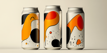
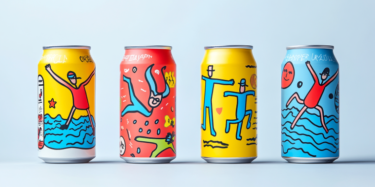
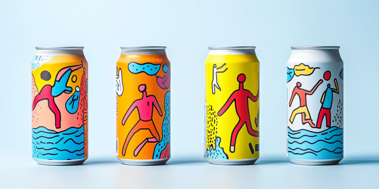
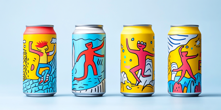
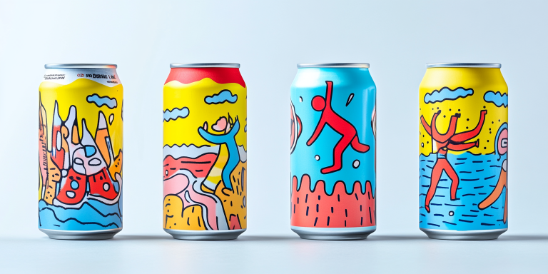
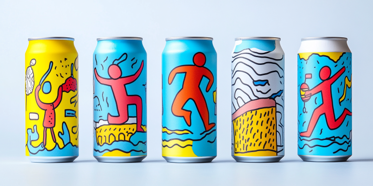
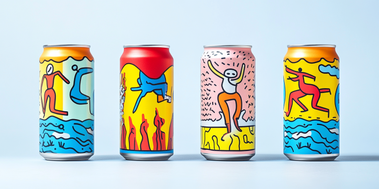
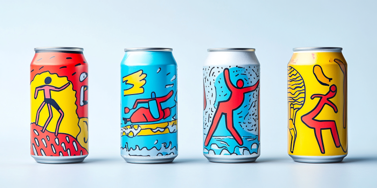
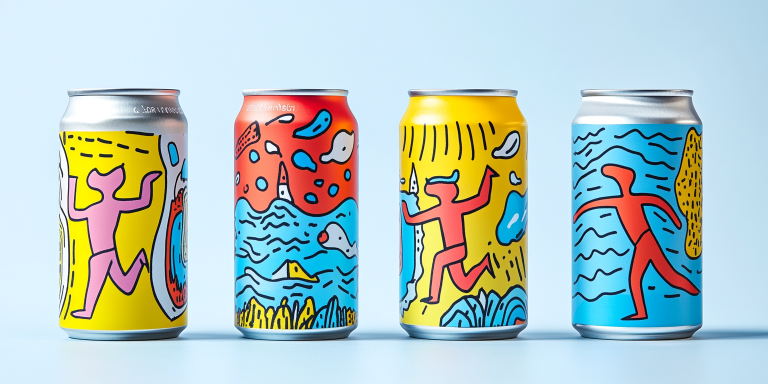
The Vibrant Motion Collection is a dynamic brand identity that captures the energy and spontaneity of movement. Inspired by the joy of expression, this bold and colorful packaging design features hand-drawn figures in motion, playful compositions, and a fresh, modern aesthetic that speaks to creative spirits and active lifestyles.
- Year of Completion: 2024
- Status: Active
Design Concept
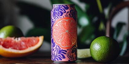
This collection embraces a lively and artistic approach, integrating hand-sketched figures with fluid, energetic strokes. The combination of primary colors—yellow, red, and blue—creates a visual language of fun, freedom, and limitless motion. The illustrations reflect the dynamism of an urban, active lifestyle, perfect for contemporary beverage and lifestyle brands.
Key Features:
- Expressive & Playful Illustrations: Bold, hand-drawn characters in action.
- Vibrant Color Palette: A striking mix of yellow, blue, red, and white.
- Artistic & Freeform Approach: Abstract movement-inspired compositions.
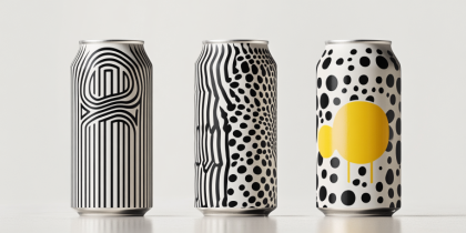
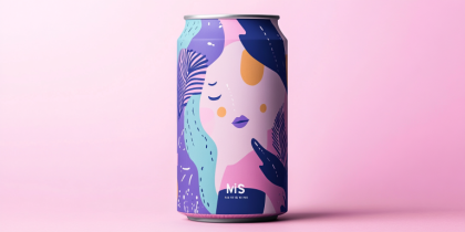
- Versatile Branding Application: Adaptable for beverage cans, apparel, merchandise, and posters.
- Energetic & Youthful Appeal: Aimed at creative individuals, active audiences, and lifestyle brands.
Deliverables
- Packaging design for limited-edition beverage cans.
- Visual identity system for branding and marketing.
- Merchandise concepts, including apparel and posters.
- Digital assets and promotional materials.
Tools Used
- Adobe Illustrator (Vector Graphics & Illustrations)
- Adobe Photoshop (Mockups & Branding Applications)
- Procreate (Hand-Drawn Sketches & Digital Art)
Impact & Market Appeal
- Culturally Relevant & Trendy: Appeals to young, creative, and adventurous audiences.
- Bold & Eye-Catching: Stands out in retail spaces and digital marketing.
- Timeless & Artistic Identity: Blending modern pop art with contemporary branding.
Challenges & Solutions
Challenges Encountered
- Maintaining a balance between freeform artistic expression and structured branding.
- Creating designs that feel both spontaneous and cohesive across product lines.
Solutions Implemented
- Developed a structured grid for layout while preserving artistic movement.
- Used a strategic color palette to unify the diverse design elements.