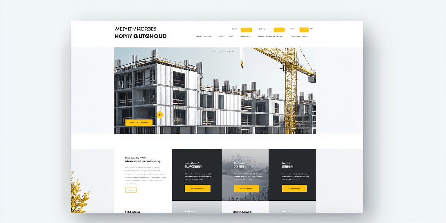
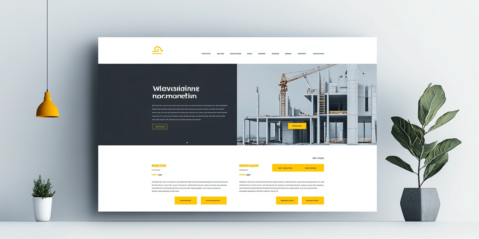
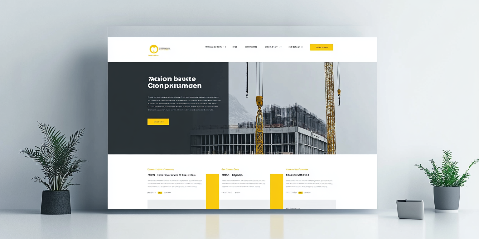
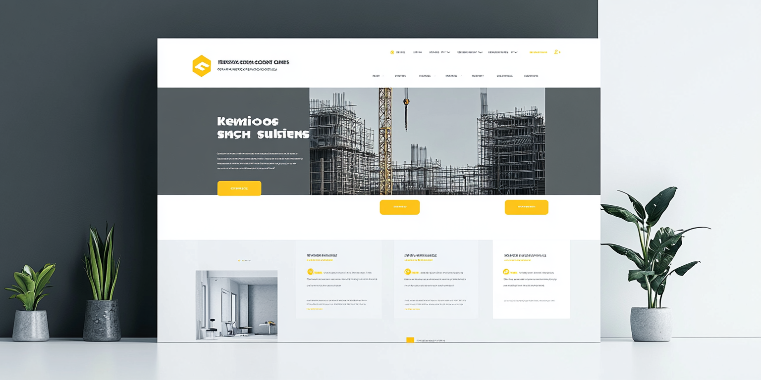
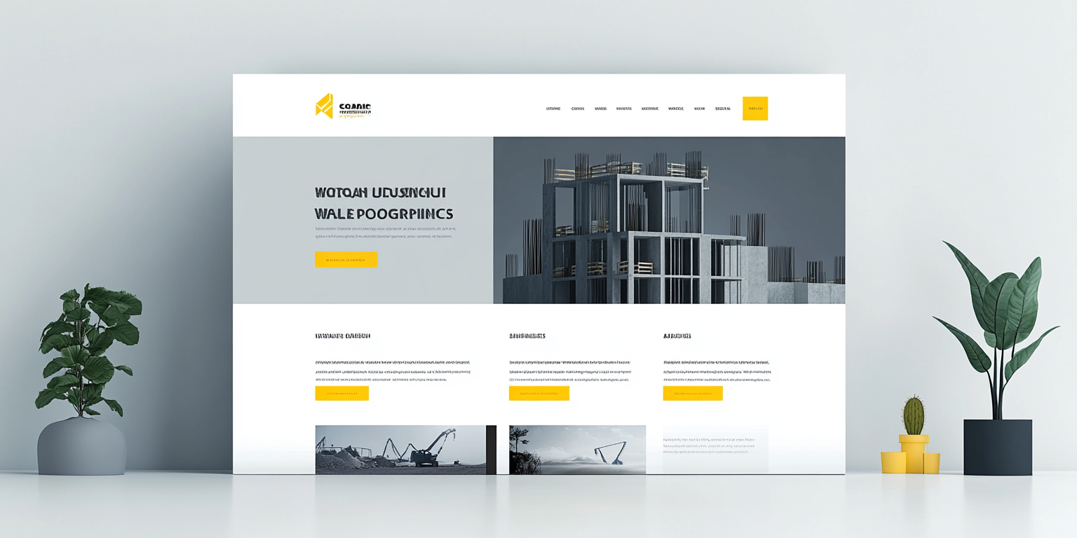
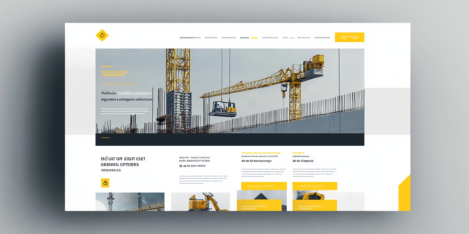
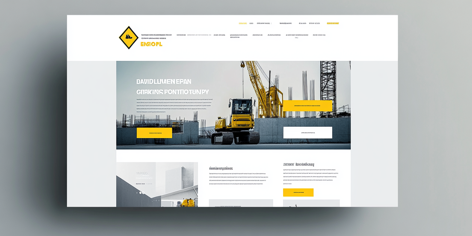
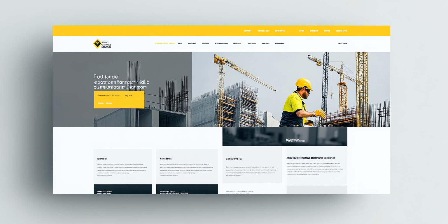
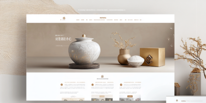
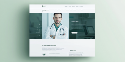
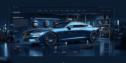
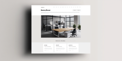
The images showcase sleek and innovative web design layouts for a construction-related business. These designs emphasize modernity and professionalism through a balanced use of colors, with prominent shades of yellow and gray. The yellow elements highlight important calls to action, while the gray background provides a neutral tone that conveys reliability and stability, qualities essential in the construction industry.
Each design layout is well-structured, with clear navigation bars and intuitive sections that enhance user experience. Large images of construction sites and machinery dominate the design, reinforcing the business’s expertise and industry presence. Additionally, strategically placed icons and quick links provide users with easy access to essential information such as services, projects, and contact details.
The designs also suggest responsiveness, ensuring accessibility on various devices, which is crucial in today’s fast-paced, digital environment. These concepts reflect a seamless blend of aesthetics and functionality, making them ideal for construction companies aiming to create a lasting impression online. The overall layouts not only attract attention but also build trust by visually communicating professionalism and dedication to quality.

