Project Overview
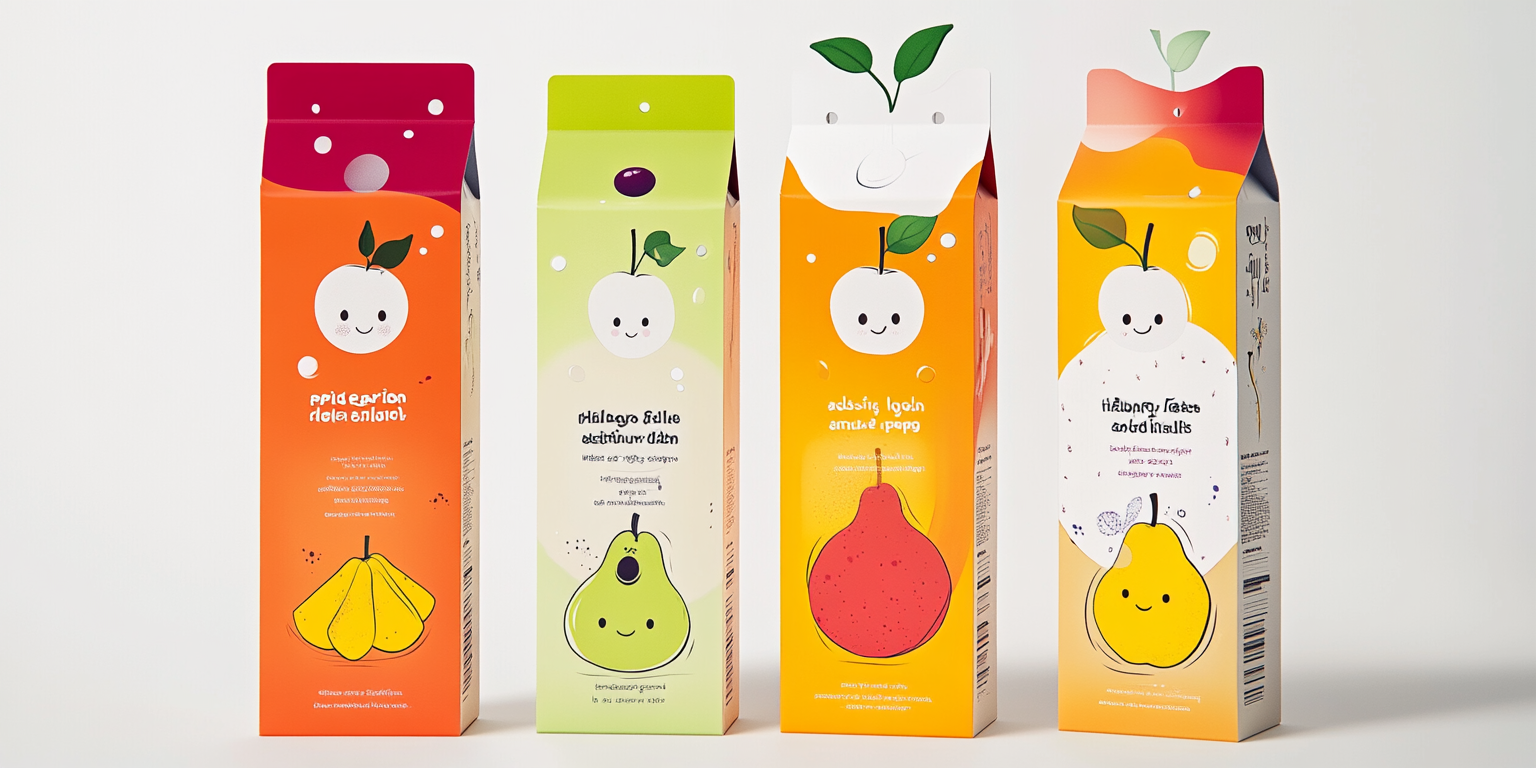
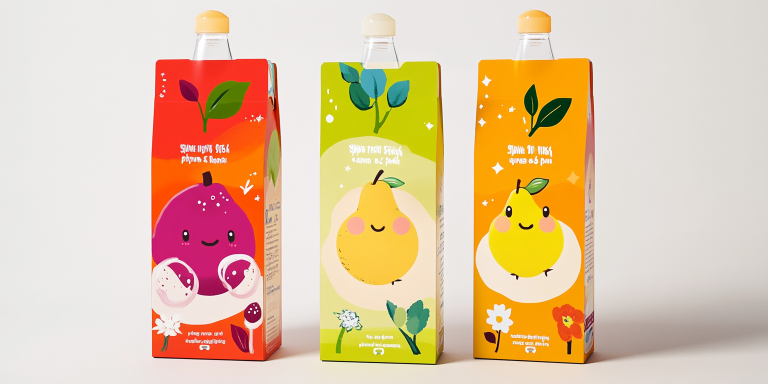
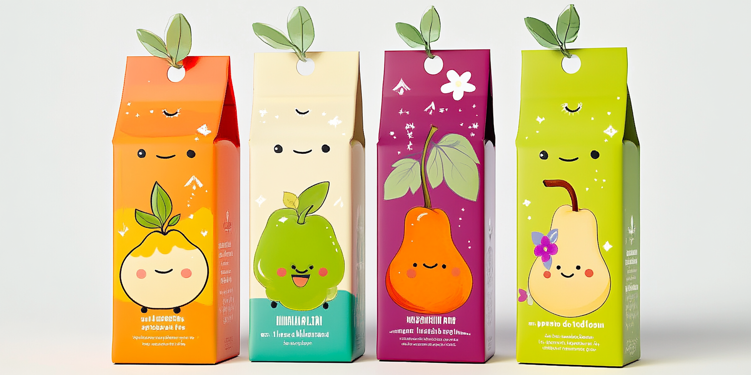
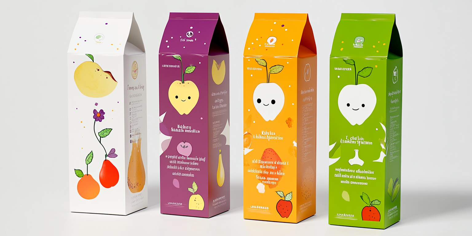
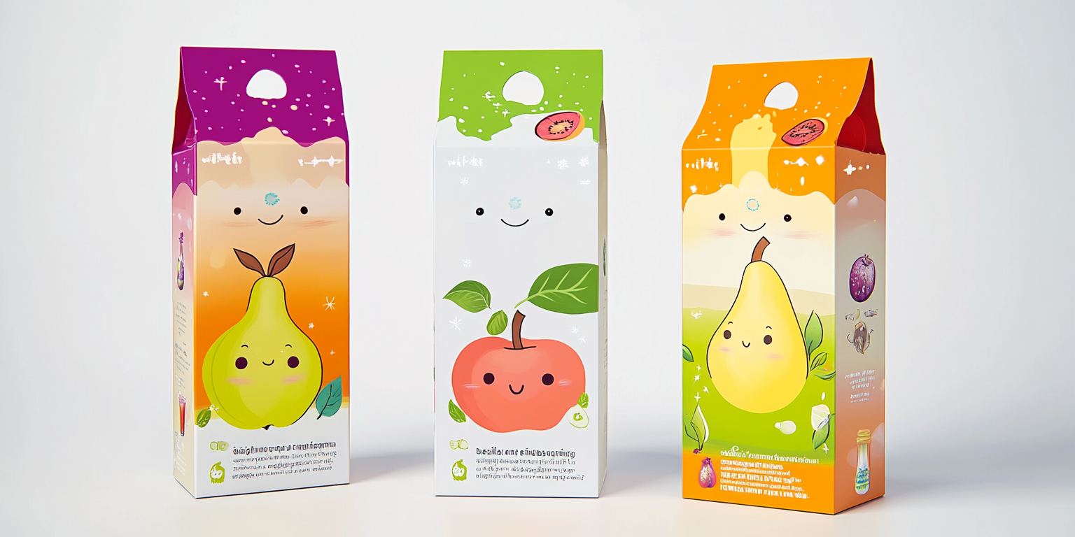
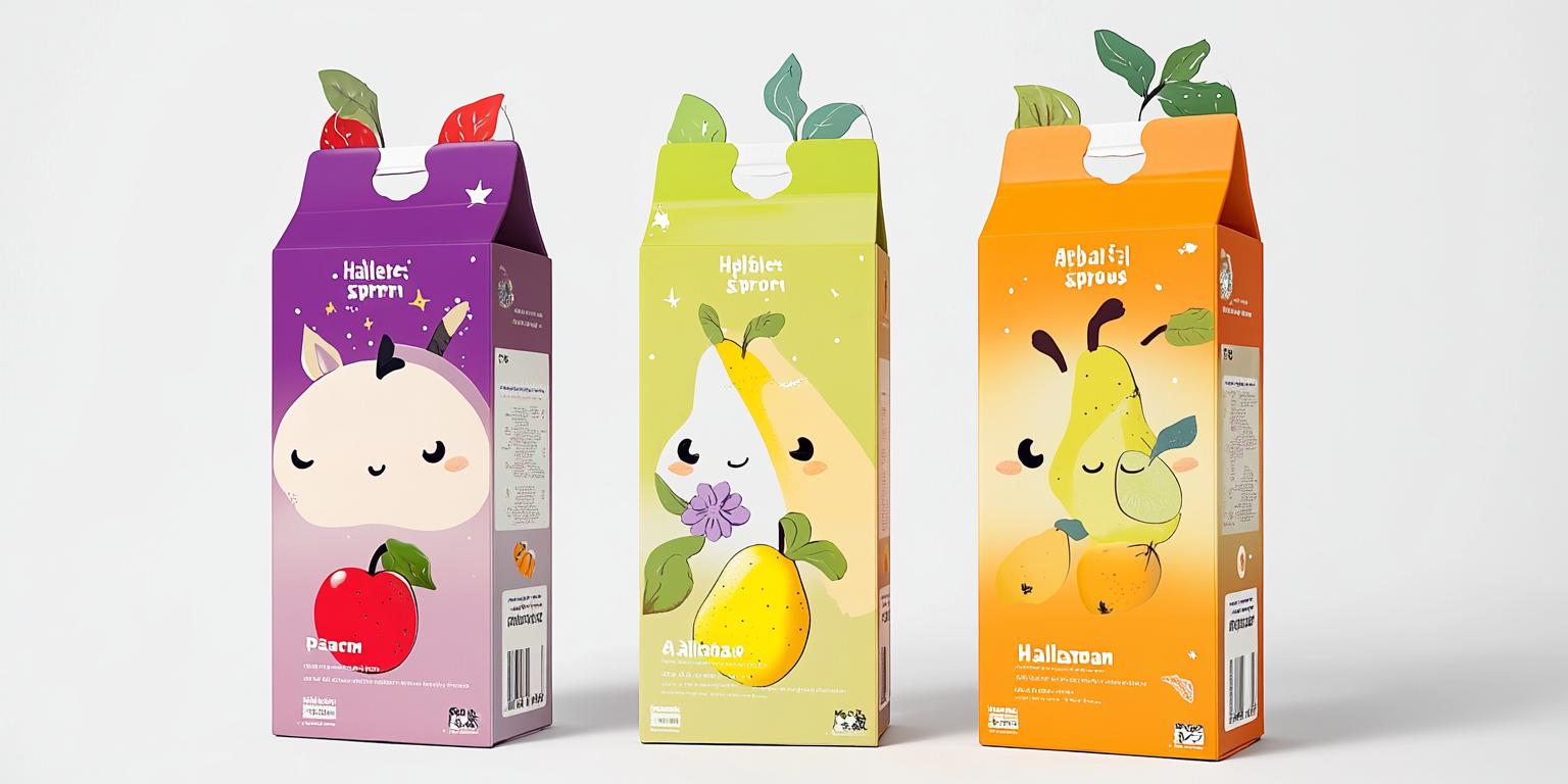
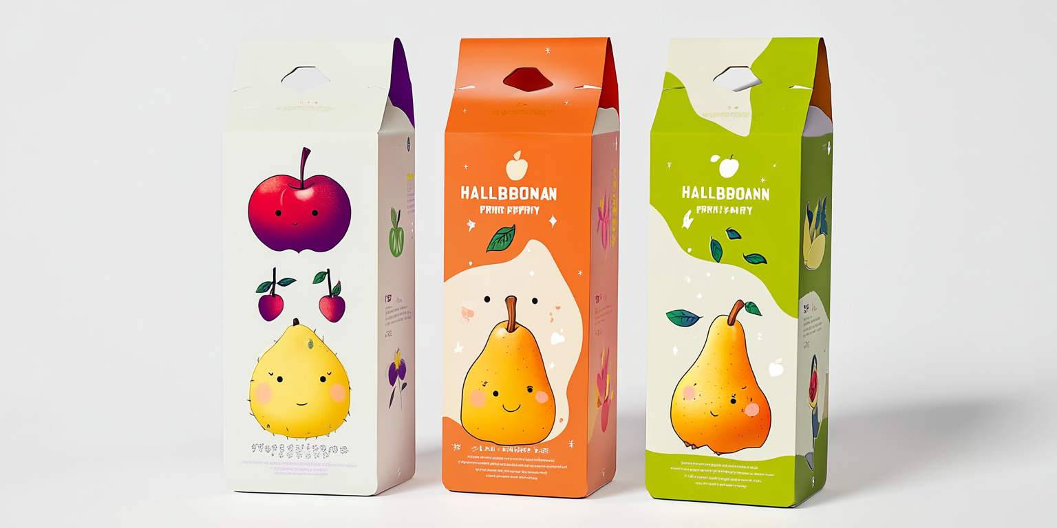
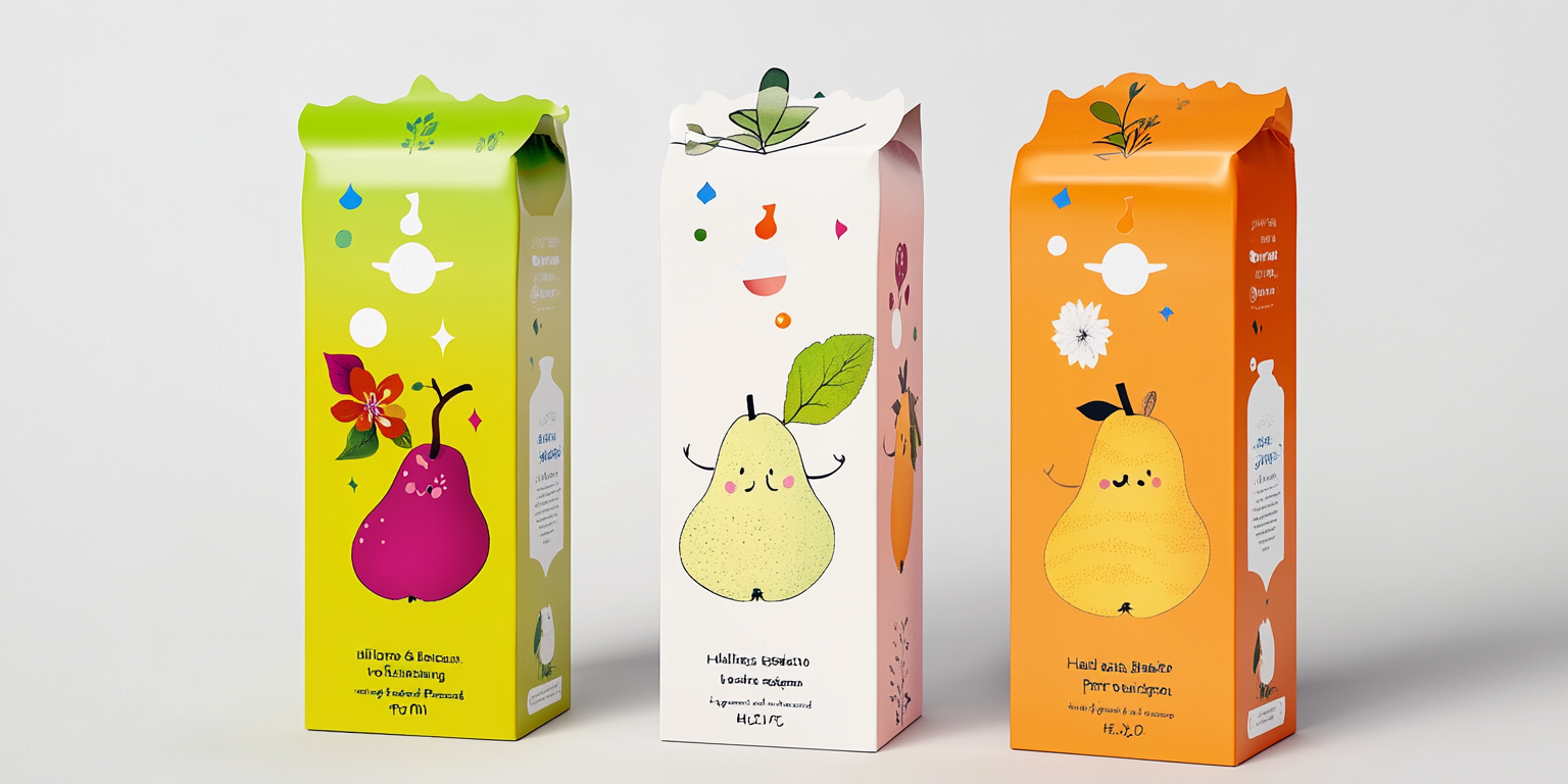
The Playful Fruit Juice Packaging Collection is a vibrant and cheerful design concept crafted for a premium juice brand targeting health-conscious consumers and families. The collection embraces a lively, character-driven visual identity that merges fun with freshness.
- Year of Completion: 2024
- Status: Active
Design Concept
The packaging design integrates playful, hand-drawn fruit characters with a minimalist yet bold aesthetic. The goal is to create an engaging and memorable brand experience that reflects natural ingredients and premium quality.
Key Features:
- Whimsical Fruit Illustrations: Each packaging features a unique hand-drawn fruit mascot with expressive faces and personality.
- Bright & Fresh Color Palette: A combination of citrus tones, soft pastels, and energetic hues to evoke freshness and vitality.
- Interactive Design Elements: Die-cut leaves and playful typography enhance the tactile and visual appeal.
- Sustainable Materials: Eco-friendly carton packaging with minimal plastic usage.
- Storytelling Approach: Each fruit character represents a different flavor, bringing a unique brand narrative to life.
Deliverables
- Complete packaging suite for various juice flavors
- Custom fruit character illustrations and branding assets
- High-resolution digital and print-ready mockups
- Product concept alignment with target audience
Tools Used
- Adobe Illustrator & Photoshop (Illustration & Packaging Design)
- Procreate & Wacom Tablets (Character Development)
- Cinema 4D & Blender (3D Rendering & Prototyping)
- Pantone & CMYK Color Matching (Print Production Optimization)
Impact & Market Appeal
- Target Audience: Young families, health-conscious individuals, and premium juice consumers.
- Emotional Connection: Fun, relatable fruit mascots create an engaging brand identity.
- Retail Visibility: The bright and unique packaging ensures shelf standout in competitive beverage markets.
Challenges & Solutions
Challenges Encountered
- Balancing playful branding with a premium aesthetic.
- Maintaining color consistency across print and digital mediums.
Solutions Implemented
- Used refined typography and clean layouts to enhance brand sophistication.
- Conducted multiple print tests to achieve optimal vibrancy and material compatibility.