Project Overview
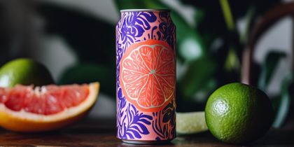
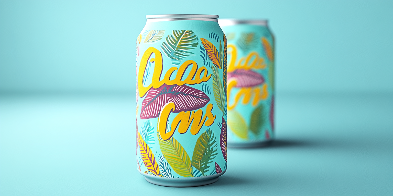
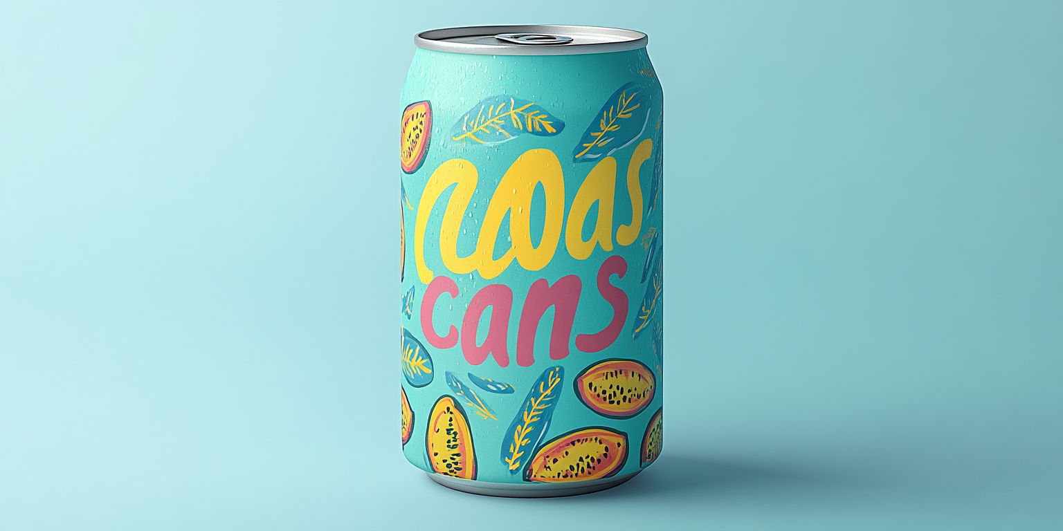
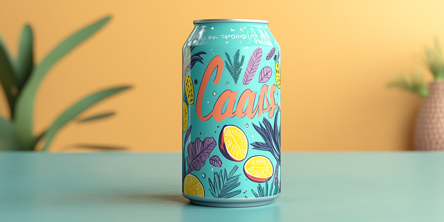
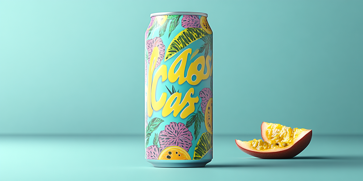
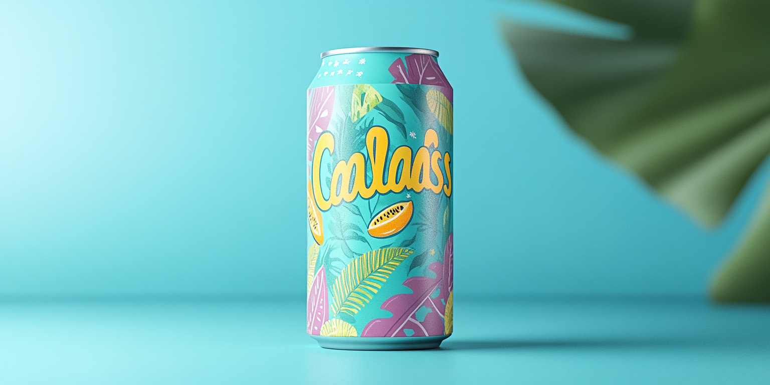
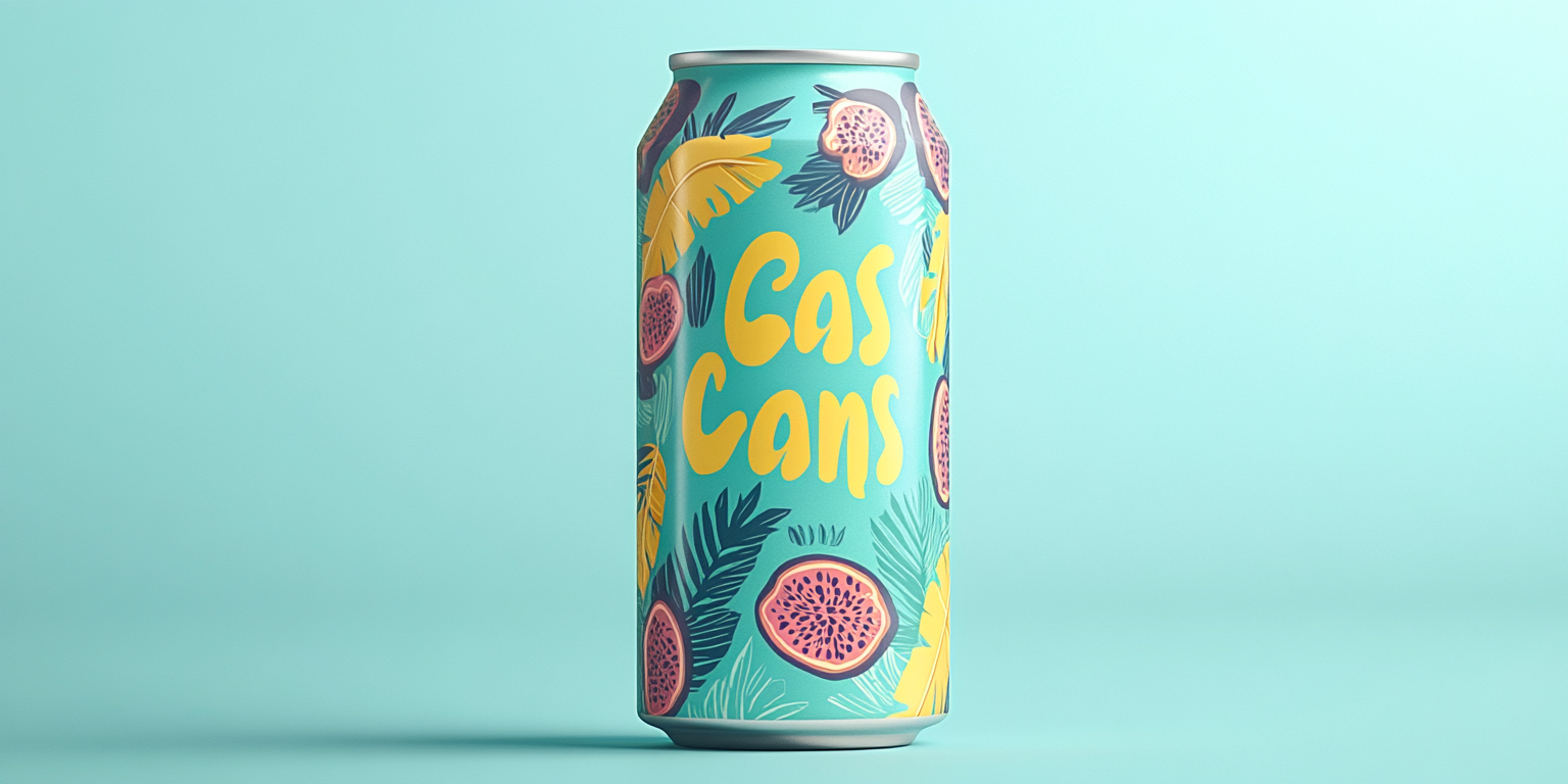
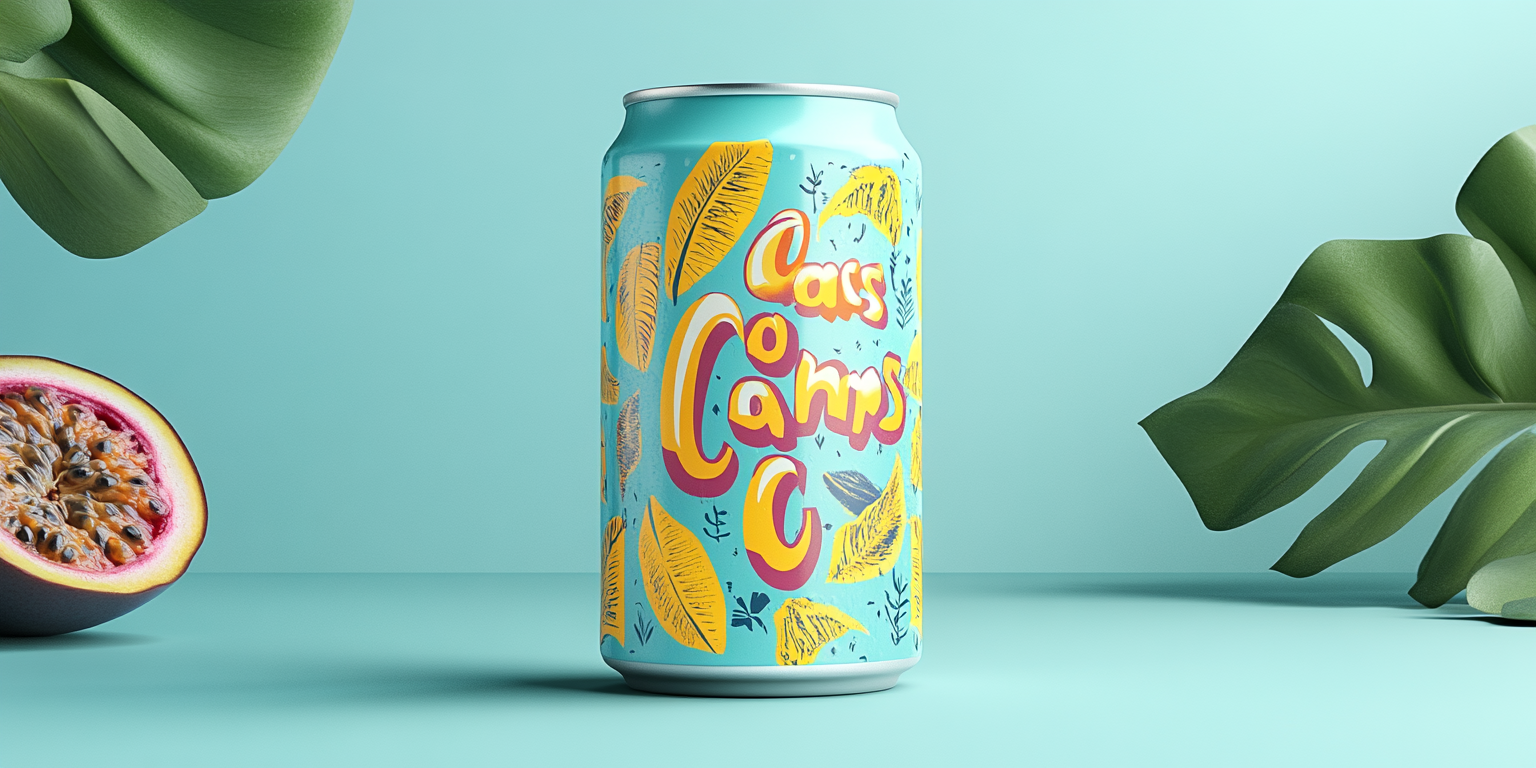
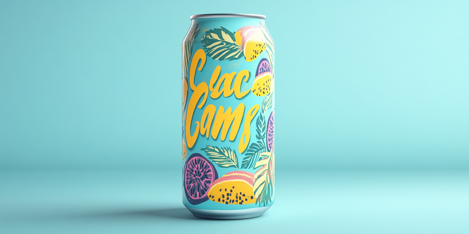
The Tropical Vibes Beverage Collection is a fusion of fresh botanical elements, bright pastel tones, and an inviting island aesthetic designed to capture the essence of a refreshing tropical drink. This collection brings together lush greenery, exotic fruits, and fluid lettering, making it an eye-catching and vibrant packaging concept.
- Year of Completion: 2017
- Status: Active
Design Concept
Inspired by the energy of summer, the warmth of island life, and the vibrancy of tropical fruits, this collection blends organic patterns with playful typography to create an immersive, feel-good beverage experience.
Key Features:
- Lush Botanical Illustrations: Hand-drawn tropical leaves and florals add a natural, organic touch.
- Soft Pastel & Vibrant Colors: A balance of soothing aquas, bright yellows, and tropical pinks for a modern yet lively feel.
- Playful, Handwritten Typography: Adds a personalized, welcoming element to the design.
- Glossy and Matte Print Combination: Enhancing the textures and creating an upscale, luxurious feel.
- Seamless Wraparound Artwork: Ensuring a visually complete and engaging experience from every angle.
Deliverables
- Full beverage packaging suite for a fruit-based drink line
- Digital and print marketing assets optimized for social media appeal
- High-resolution product mockups for branding presentations
- Special edition designs featuring unique fruit blends
Tools Used
- Adobe Illustrator (Illustrations & Vector Artwork)
- Adobe Photoshop (Color Enhancements & Mockups)
- Procreate (Hand-Drawn Digital Art)
- Blender (3D Renderings for Hyper-Realistic Visuals)
Impact & Market Appeal
- Appeals to the Health & Wellness Market: Designed for natural fruit-based beverages, infused waters, and sustainable drink brands.
- Social Media-Ready: Playful, shareable packaging that engages audiences with a bright, fun aesthetic.
- Strong Shelf Presence: Bold, warm tones and dynamic layouts help the packaging stand out in competitive beverage aisles.
Challenges & Solutions
Challenges Encountered
- Ensuring the vibrancy of pastel colors remains visually engaging and not washed out.
- Balancing intricate tropical elements without overcrowding the design.
Solutions Implemented
- Adjusted contrast and layering techniques to enhance color depth and maintain vibrancy.
- Introduced structured negative space to ensure clarity and readability in branding elements.