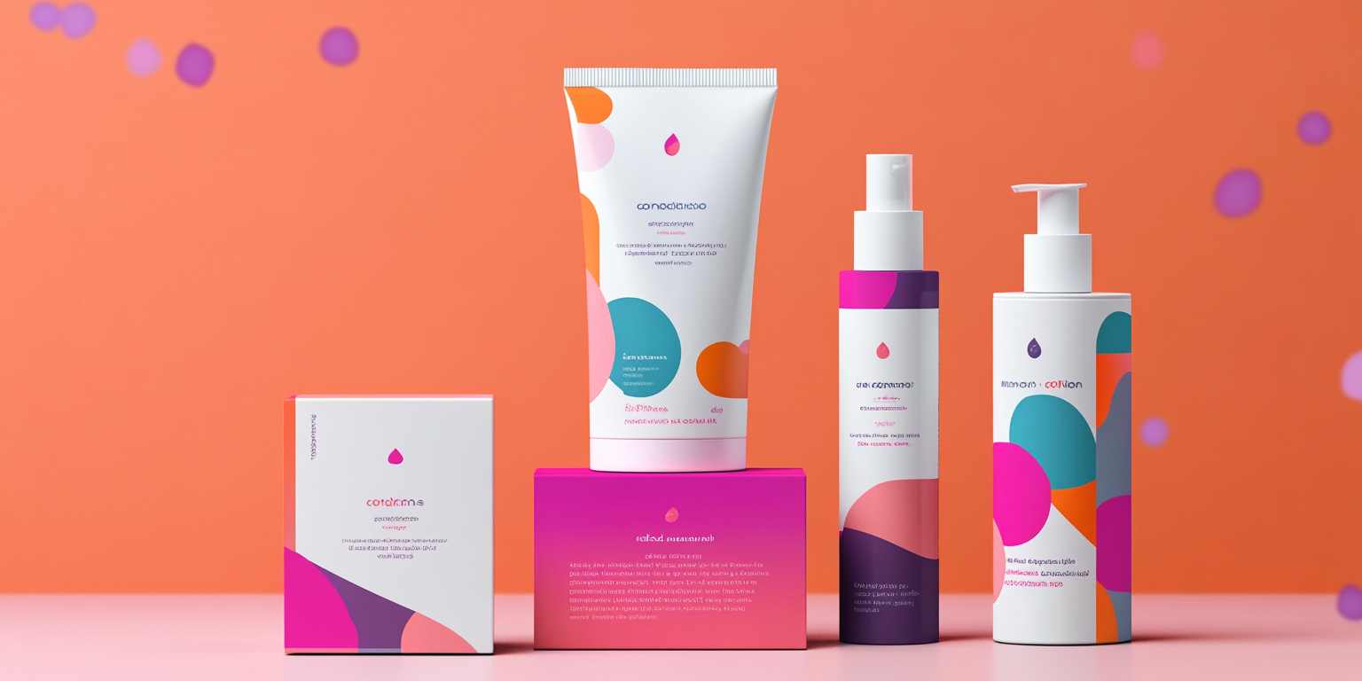
Project Overview
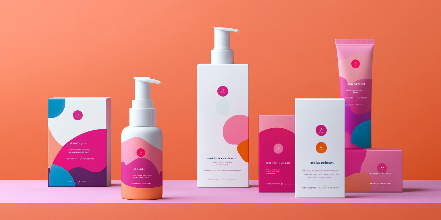
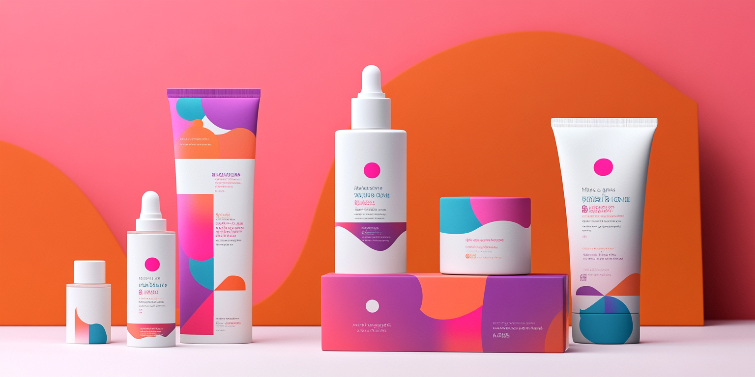
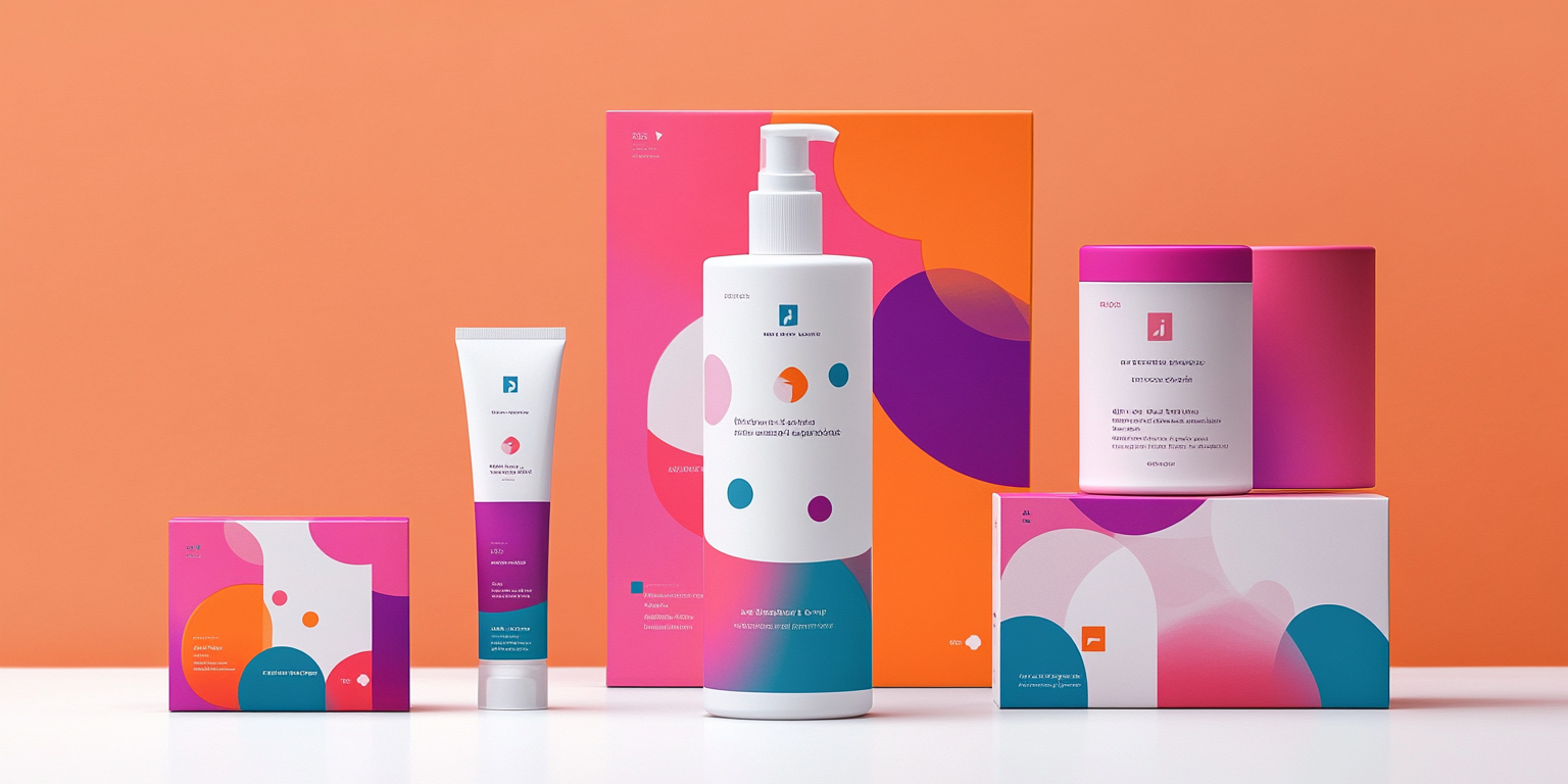
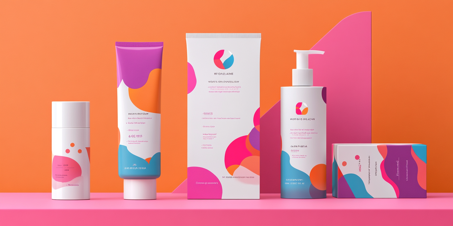
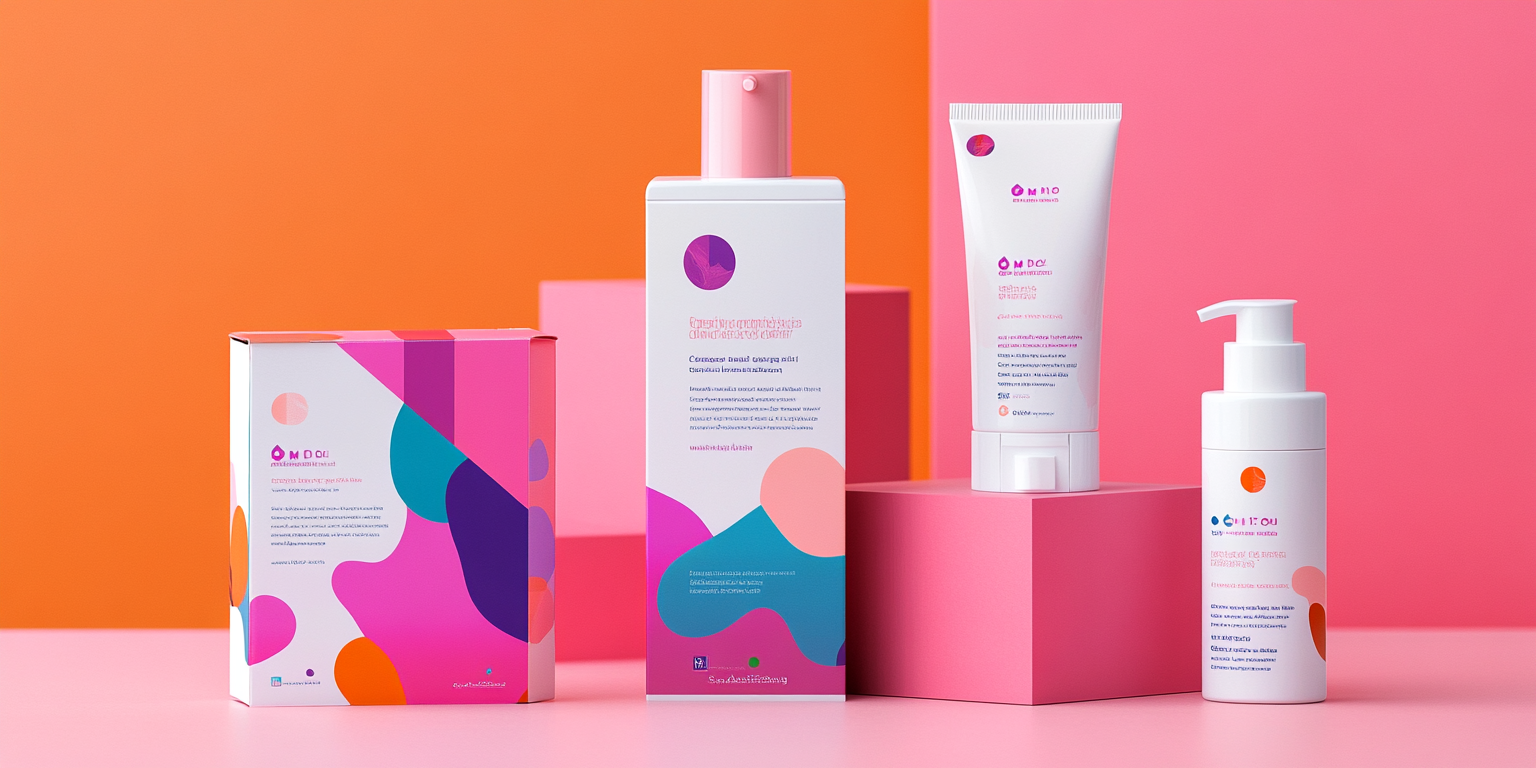
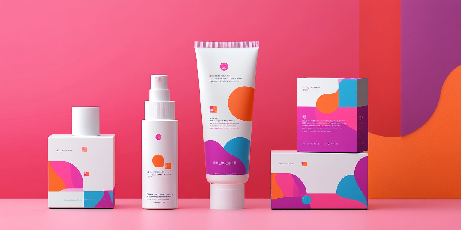
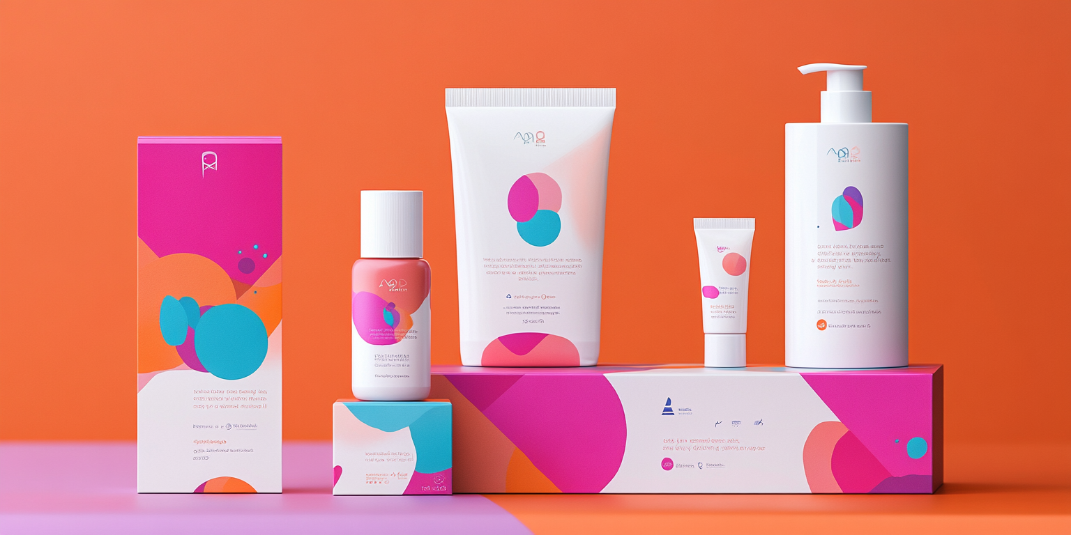
The Vivid Glow Skincare Collection is a bold and vibrant identity designed for a modern, energetic beauty brand. Featuring striking colors, abstract organic shapes, and sleek typography, this collection reflects confidence, self-care, and innovation in skincare.
- Year of Completion: 2019
- Status: Active
Design Concept
This branding system embraces the power of vivid hues and dynamic compositions, creating a sense of movement and fluidity. Inspired by youthful energy and self-expression, it’s perfect for brands that cater to skincare enthusiasts who seek both effectiveness and aesthetic appeal.
Key Features:
- Playful, Abstract Aesthetic: Bold fuchsia, energetic orange, and deep teal create a visually dynamic look.
- Diverse Product Range: Packaging applied across bottles, tubes, boxes, and jars for a unified brand identity.
- Minimalist Yet Expressive: Clean layouts balanced with artistic, fluid shapes.
- Typography & Color Palette: A blend of soft, modern fonts paired with bright, energetic colors.
- Premium Skincare Appeal: A high-end yet youthful vibe that attracts trend-conscious consumers.
Deliverables
- Complete skincare packaging identity
- Custom packaging design for serums, creams, cleansers, and moisturizers
- Digital & print-ready brand assets
- Social media branding & product marketing visuals
Tools Used
- Adobe Illustrator (Packaging & Branding Elements)
- Adobe Photoshop (Mockups & Visual Styling)
- Procreate (Hand-Drawn Abstract Graphics)
Impact & Market Appeal
- Modern & Trend-Driven: Ideal for contemporary beauty brands with a bold identity.
- Social Media-Ready Packaging: Designed to stand out in the beauty influencer space.
- Versatile & Scalable: Adaptable for different product lines, from skincare to cosmetics.
Challenges & Solutions
Challenges Encountered
- Balancing vibrant, bold colors with a sophisticated skincare aesthetic.
- Ensuring high-end appeal while keeping the design fun and expressive.
Solutions Implemented
- Used soft gradients and abstract elements to create depth and visual interest.
- Kept typography minimal and clean to contrast the bold color palette.