Project Overview
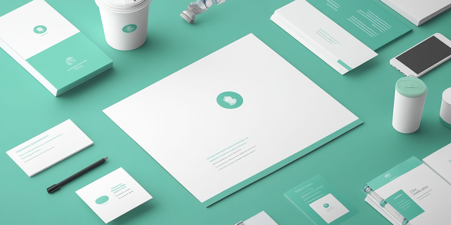
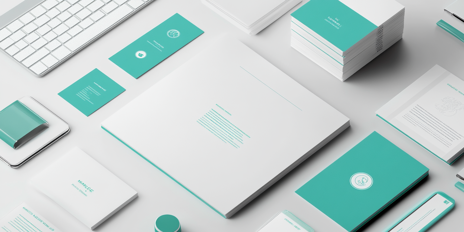
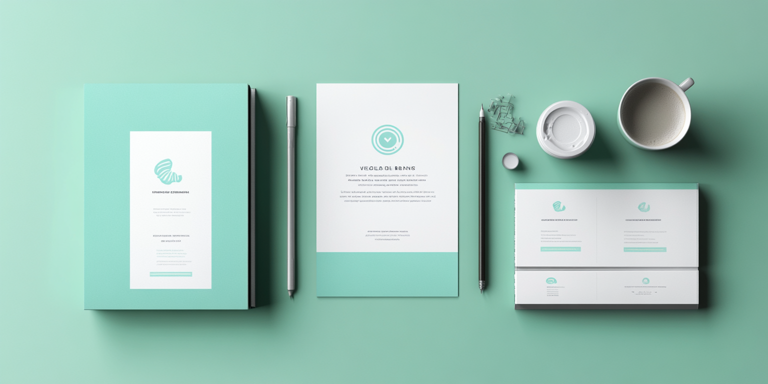
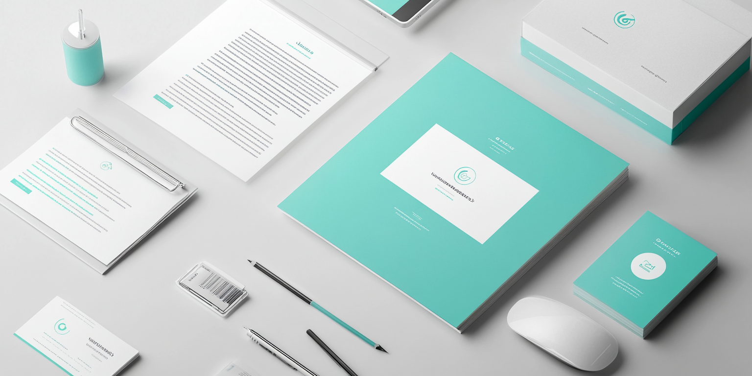
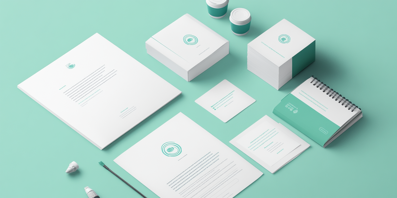
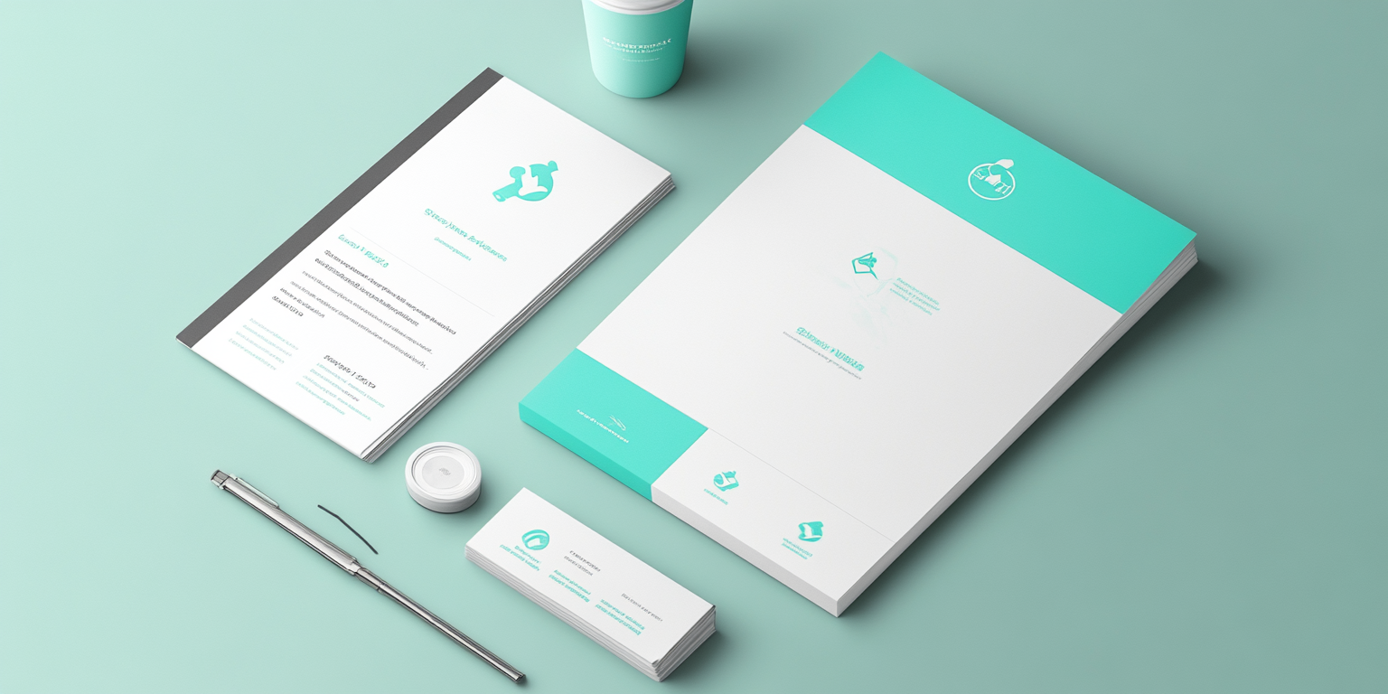
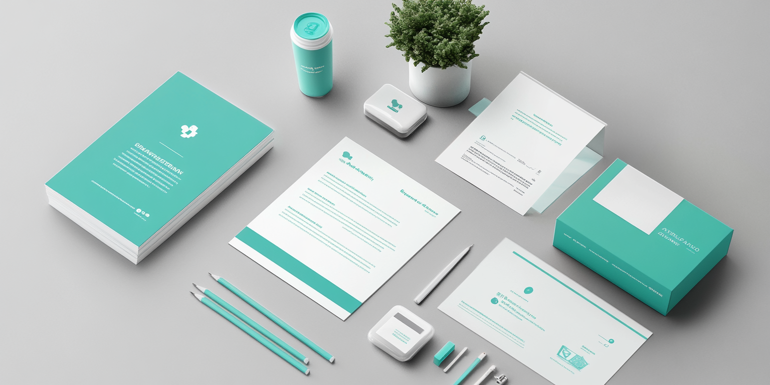
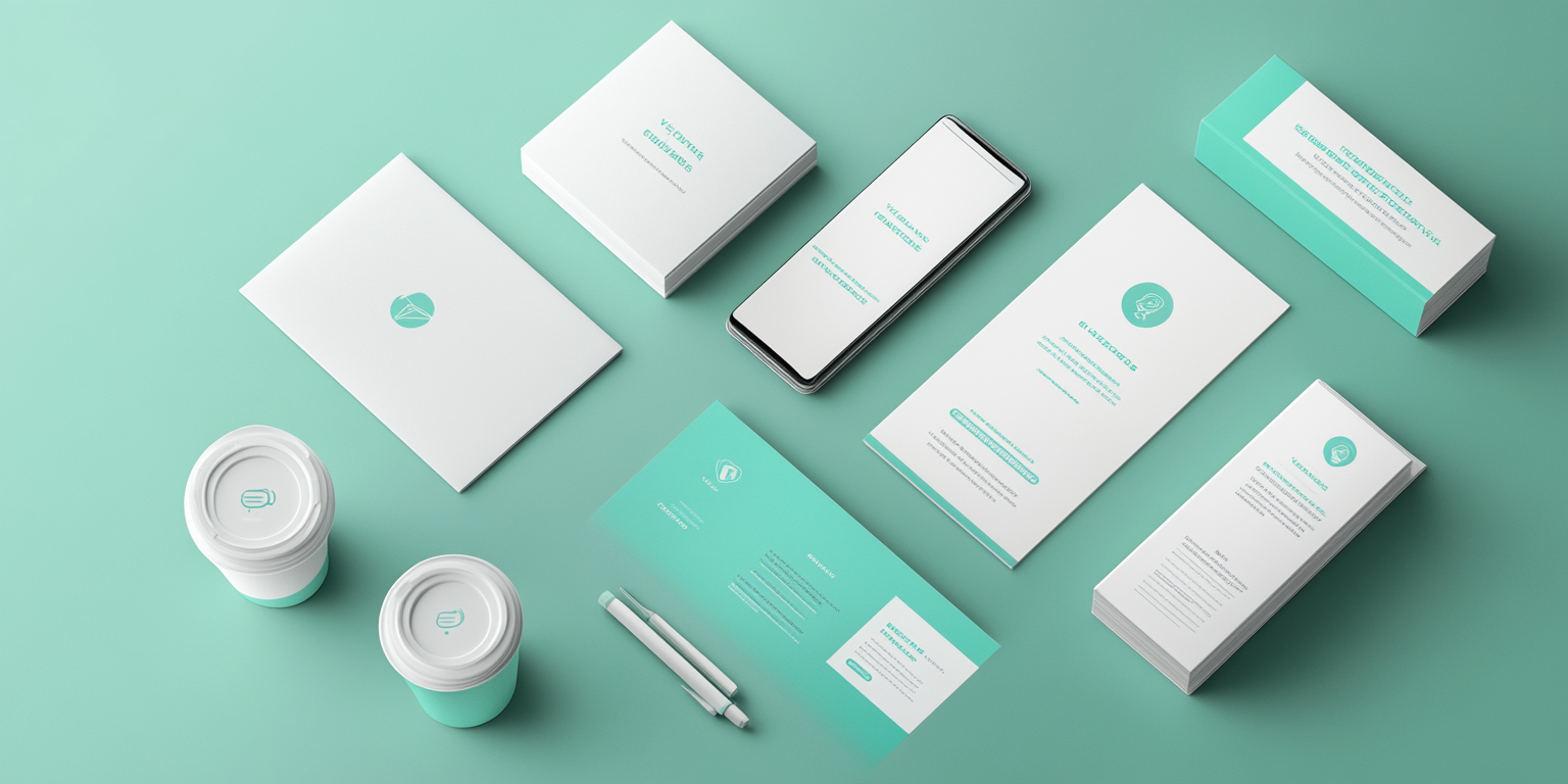
The AquaMed Collection is a professional and modern branding system crafted for healthcare, wellness, and medical organizations. Featuring a clean, minimalist aesthetic with a calming aqua blue and white color palette, this collection embodies trust, clarity, and innovation. Designed for hospitals, clinics, medical startups, and health-focused enterprises, AquaMed ensures a polished and credible corporate identity.
- Year of Completion: 2022
- Status: Active
Design Concept
AquaMed integrates modern medical branding with a fresh and serene visual identity. The design highlights clarity, transparency, and professionalism, ensuring an approachable and reliable presence for healthcare businesses.
Key Features:
- Medical & Wellness Branding: Designed for clinics, hospitals, and healthcare startups.
- Minimalist Color Palette: Soothing aqua blue tones combined with crisp white for a clean, sterile feel.
- Professional Layouts: Structured design ensuring high readability and clarity in documentation.
- Healthcare-Centric Icons & Symbols: Subtle, well-designed medical symbols incorporated into branding.
- Premium Print Finishes: High-quality matte finishes, embossing, and smooth paper textures for a polished look.
Deliverables
- Corporate Branding Package: Logo, typography, and brand color guidelines.
- Medical Stationery Kit: Prescription pads, business cards, letterheads, and notepads.
- Patient Communication Materials: Brochures, appointment cards, and health service flyers.
- Digital & Social Media Assets: Optimized templates for healthcare branding across online platforms.
Tools Used
- Adobe Illustrator & Photoshop (for branding and layout design).
- Medical Iconography Design Software (for custom healthcare symbols and infographics).
- Premium Print Production (matte finishes, smooth-touch textures, and high-end ink printing).
Impact & Market Appeal
- Healthcare Trust & Credibility: Ensures a strong and professional visual identity in the medical industry.
- Clean & Modern Design: Appeals to clinics, hospitals, and medical technology startups.
- Approachable & Professional: A balance between medical precision and patient-friendly branding.
Challenges & Solutions
Challenges Encountered
- Maintaining a balance between clinical professionalism and patient-friendly aesthetics.
- Ensuring a clean and sterile design while keeping it visually engaging.
Solutions Implemented
- Used a soft aqua color palette to create a calming and reassuring feel.
- Integrated modern typography and clean layouts to enhance readability and trust.