Project Overview
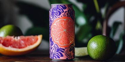
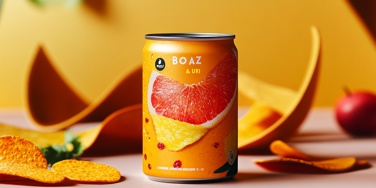
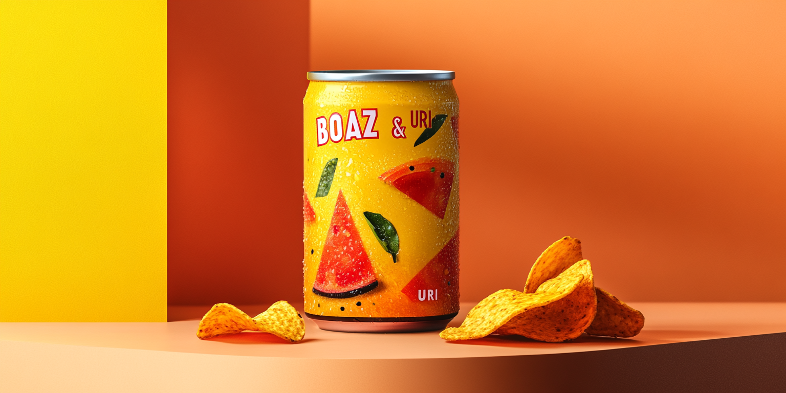
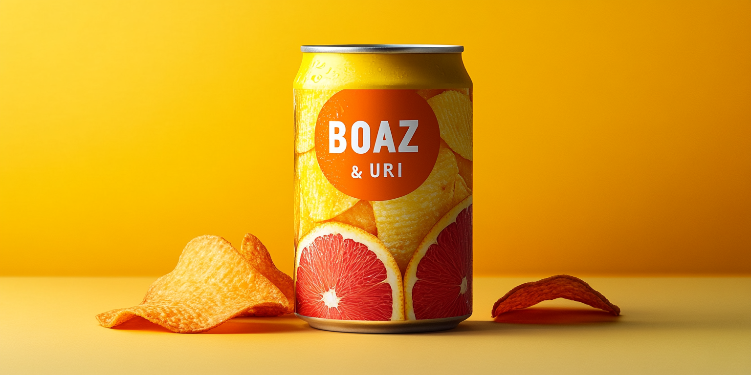
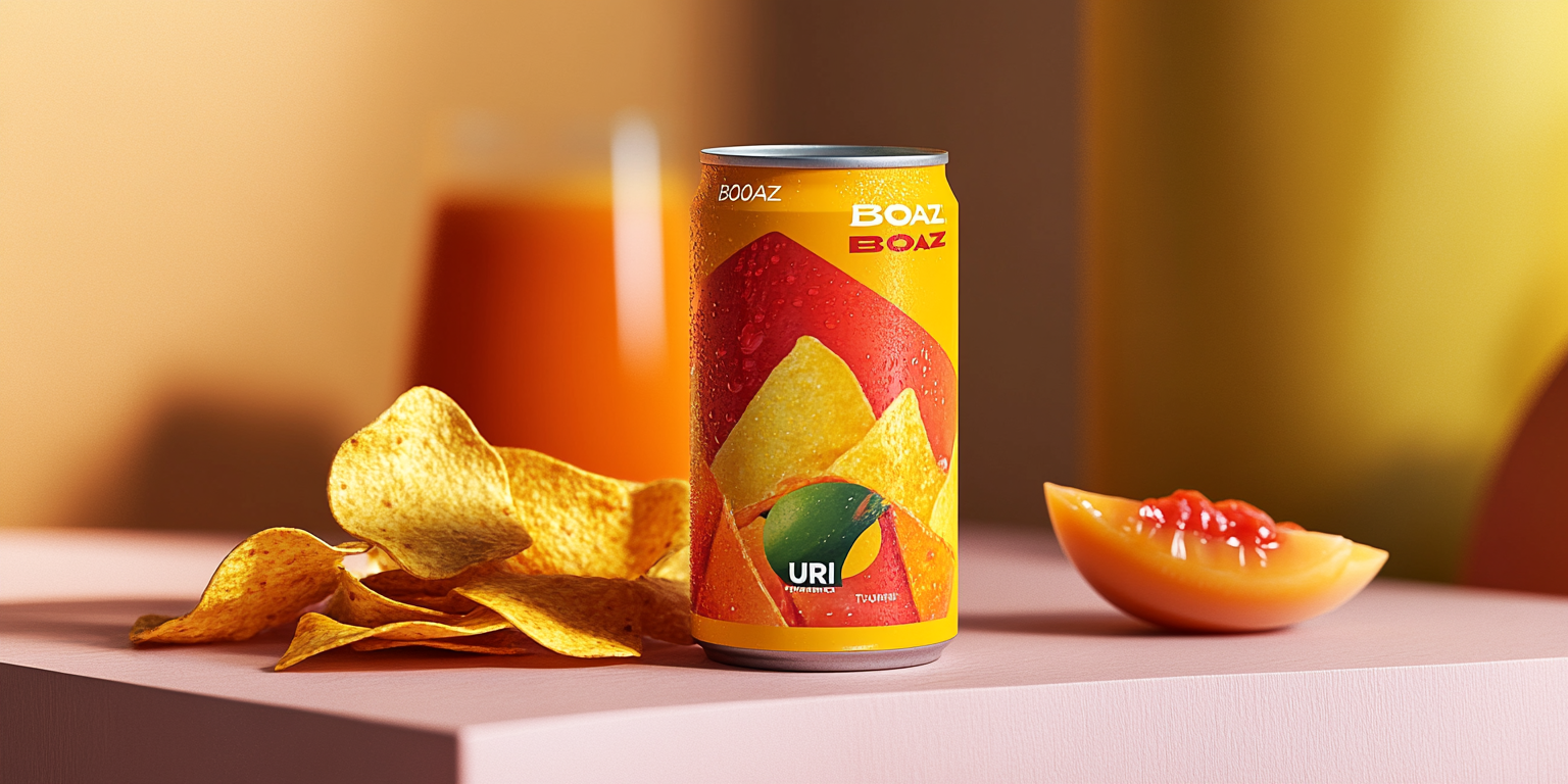
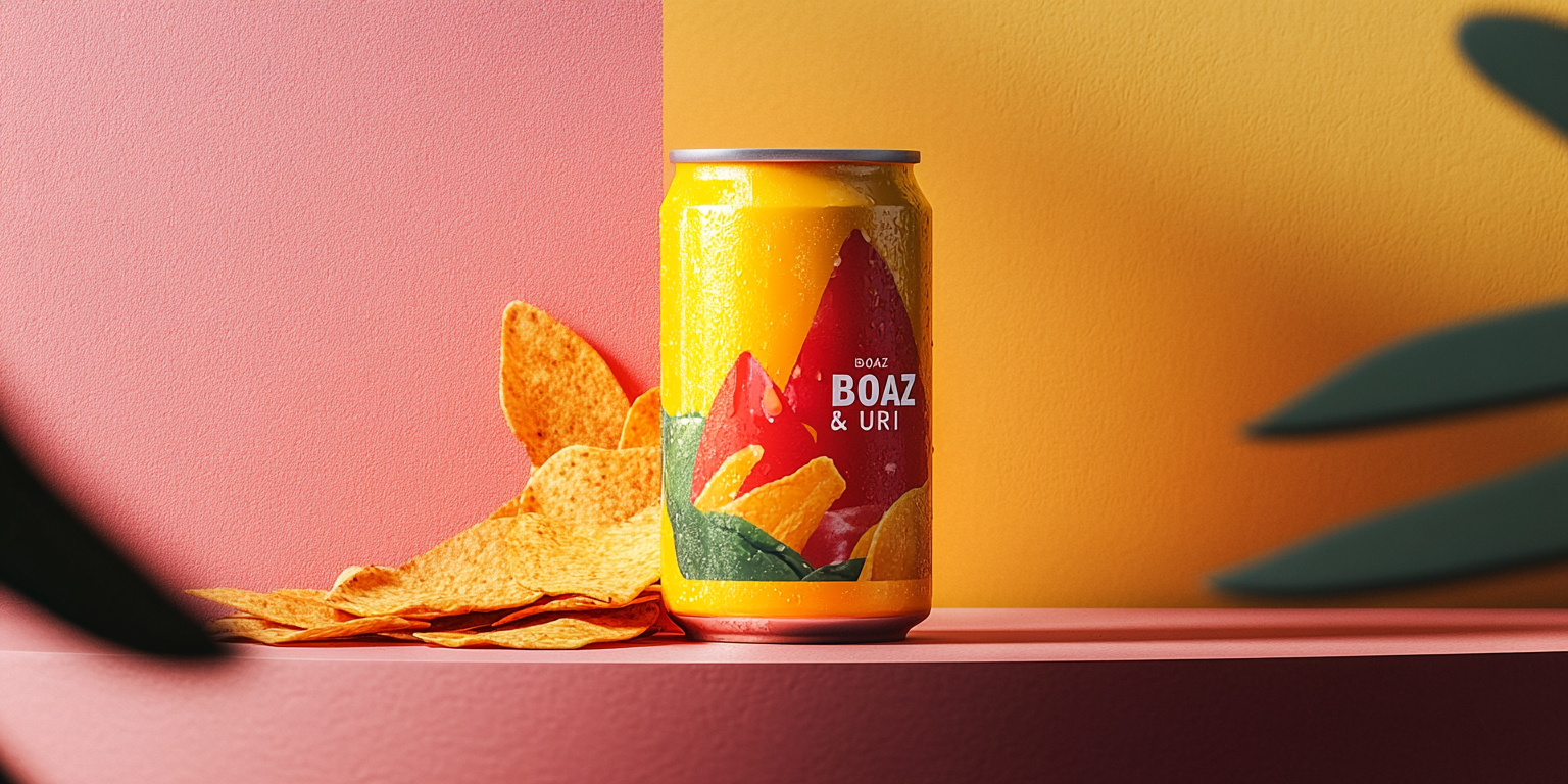
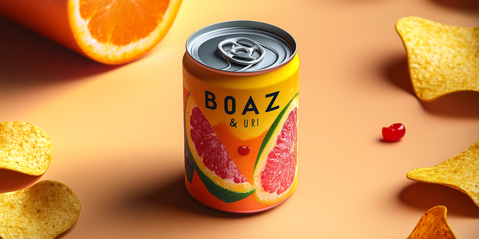
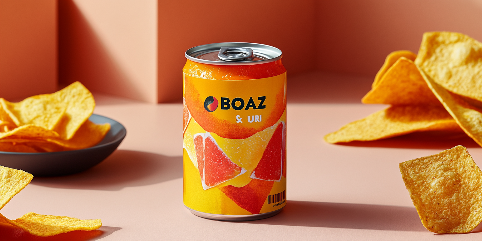
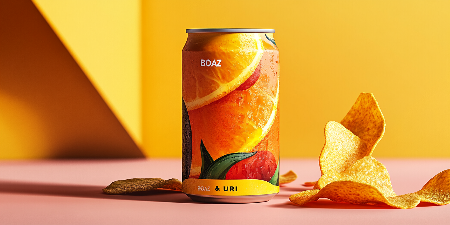
The Boaz & Uri Citrus Fusion Collection is a refreshing blend of bright, tangy citrus flavors and bold, dynamic packaging. Designed to stand out, this collection reflects the vibrant energy of summer with a mix of real fruit imagery, crisp typography, and a rich color palette.
- Year of Completion: 2019
- Status: Active
Design Concept
This collection captures the essence of citrus in a modern and playful way, creating an eye-catching visual identity that embodies freshness and energy.
Key Features:
- Realistic Fruit Graphics: High-resolution images of grapefruit, orange, pineapple, and watermelon create a fresh and juicy appeal.
- Bright, Contrasting Colors: Bold yellow, deep orange, and vibrant red evoke summer energy.
- Sleek, Minimalist Typography: The brand name “Boaz & Uri” is positioned prominently for instant recognition.
- Refreshing Beverage Appeal: Droplets and condensation effects enhance the thirst-quenching look.
- Integrated Snack Pairing: The packaging subtly hints at complementing flavors with visual elements like potato chips, making it an ideal pairing for snacks.
Deliverables
- Full packaging design for the Citrus Fusion drink line
- Marketing visuals optimized for digital and print
- 3D-rendered product mockups for promotional materials
- Seasonal and limited-edition packaging variations
Tools Used
- Adobe Illustrator (Label and typography design)
- Adobe Photoshop (Mockups and photo integration)
- Blender (3D rendering and photorealistic presentations)
Impact & Market Appeal
- Perfect for Summer & Refreshment-Driven Consumers: The beverage design aligns with seasonal trends, making it a go-to drink for warm weather.
- Premium and Playful Aesthetic: The balance between realism and design artistry positions the brand as modern and appealing.
- Shelf Visibility & Digital Engagement: The vibrant visuals create strong shelf presence and encourage social media sharing.
Challenges & Solutions
Challenges Encountered
- Merging real fruit images with a graphic design approach while maintaining visual harmony.
- Ensuring the design remained clean and premium despite the vibrant colors.
Solutions Implemented
- Developed a well-structured layout that balanced graphic elements with text placement.
- Used subtle shading and highlights to create depth and a natural look without overwhelming the design.