As technology continues to evolve, the boundaries of user experience (UX) design are being pushed…

In the competitive world of business, your logo serves as the face of your brand. It is the first thing people will see when they encounter your business, and it plays a key role in establishing your company’s identity. A logo is not just a simple graphic; it is a visual representation of your brand’s values, message, and vision. In this article, we’ll explore the importance of logo design, the process of creating an effective logo, and how it can create a lasting impression on your audience.
Why is Logo Design Important?
A logo is far more than just an image—it’s the visual cornerstone of your brand. It is used across all forms of media, from business cards and websites to packaging and advertisements. Your logo is essentially the face of your business, and as such, it should be designed with care and consideration. Here are a few reasons why logo design is crucial:
- Brand Identity: A logo is often the first thing people see when they come across your business. It serves as an introduction to your brand and helps set the tone for the perception of your company. A well-designed logo helps create a strong and consistent brand identity.
- Recognition: Logos are essential for brand recognition. A memorable and distinctive logo helps your customers instantly recognize your business among competitors. Think about the iconic logos of companies like Apple, Nike, or McDonald’s; each one is immediately recognizable.
- Professionalism: A thoughtfully designed logo conveys professionalism. It gives your business a polished appearance, which builds trust with potential customers. A poorly designed logo, on the other hand, may leave a negative impression and give the impression that your business is unprofessional or not trustworthy.
- Memorability: A unique and creative logo is easier for people to remember. A memorable logo helps people recall your business when they need your product or service. This can ultimately lead to more customers and more sales.
Elements of a Good Logo Design
Creating a logo that leaves a lasting impression requires an understanding of the key elements that make a logo effective. A good logo isn’t just about creating something that looks pretty—it’s about creating something meaningful and functional. Below are the essential components of a good logo design:
1. Simplicity
The best logos are often the simplest ones. Simplicity allows for easy recognition and versatility. A logo that is too complex can be difficult to reproduce at smaller sizes or become lost in busy designs. For instance, companies like Google and Coca-Cola have relatively simple logos that can be easily identified and recognized, no matter where they appear.
When designing your logo, focus on clarity and simplicity. Avoid adding unnecessary details that might confuse or distract from the core message of your brand.
2. Relevance
Your logo should be relevant to your industry and audience. The design should align with your brand’s values, vision, and target demographic. For example, a tech company might use sleek, modern typography and minimalistic graphics, while a children’s brand might opt for playful, colorful elements.
Incorporating elements that reflect your business’s purpose will help strengthen your brand message. If your brand is eco-friendly, for example, using natural elements or earthy colors in your logo can help communicate your commitment to sustainability.
3. Scalability
A logo needs to work across different mediums and at different sizes. Whether it’s on a business card, a website, or a billboard, your logo should maintain its impact. This means designing it in a way that it remains recognizable and clear, even when scaled down for small applications like social media icons or favicons.
A scalable logo is one that works well at any size. To achieve this, avoid overly intricate designs that may lose their clarity when reduced in size.
4. Timelessness
A great logo should stand the test of time. It should not be based on fleeting trends or design fads. Instead, aim for a design that will remain relevant for years to come. While trends may influence design styles to some degree, the best logos are those that don’t feel dated after a few years.
Think of logos like Nike’s swoosh or the Mercedes-Benz logo—they’ve been around for decades and are still relevant today. When designing a logo, ask yourself if it will still look good and work well in 10, 20, or even 50 years.
5. Versatility
Your logo will appear in a variety of contexts, from digital to print, so it needs to be versatile. A good logo should look just as good in black and white as it does in color. Additionally, it should work on different backgrounds, whether it’s a white page or a colorful, textured backdrop.
Creating a logo that works in both full color and monochrome will ensure that it retains its impact no matter how or where it is displayed.
The Logo Design Process
Creating a logo is not a one-step task. It’s a process that requires careful planning, creative thinking, and refinement. Here are the basic steps involved in designing a logo:
1. Research and Discovery
Before you begin sketching or designing, it’s important to do some research. Understanding your brand, your audience, and your industry will help guide your design choices. Take time to look at competitors’ logos, industry trends, and any insights that can help inform your design.
During this stage, consider questions such as:
- What are the core values of your brand?
- Who is your target audience?
- What emotions do you want your logo to evoke?
- What logos inspire you, and why?
2. Sketch and Conceptualize
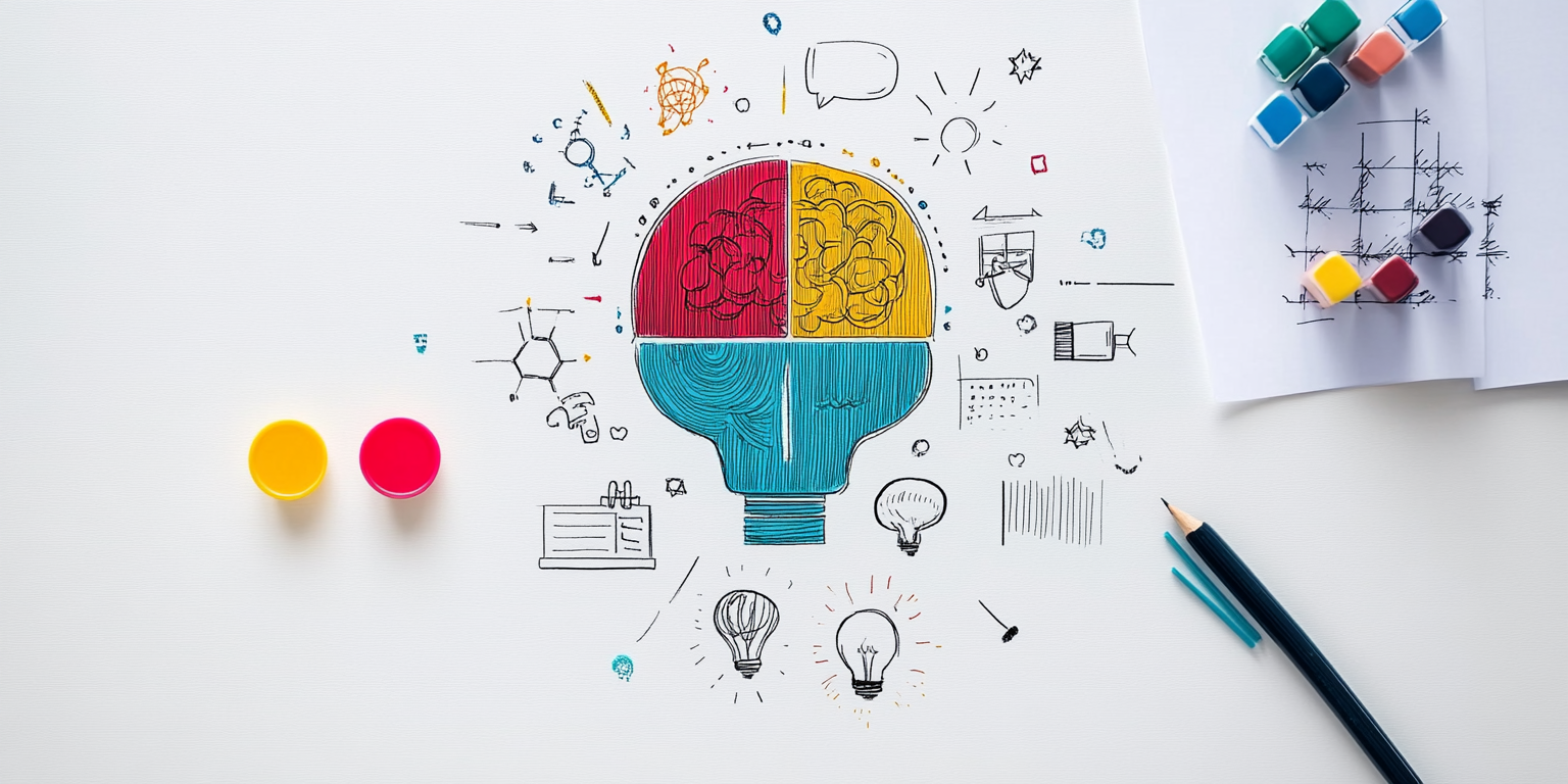
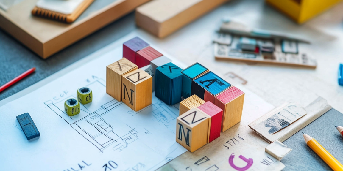
Once you have a good understanding of your brand, start brainstorming and sketching out different concepts. Don’t be afraid to experiment with different shapes, symbols, and typography. Sketching allows you to explore a variety of ideas before narrowing down the design.
At this stage, focus on coming up with several logo concepts. Don’t worry about perfection—just explore different directions that might align with your brand message.
3. Refinement and Digitalization
After finalizing a concept you like, it’s time to refine it and bring it to life digitally. Use design software like Adobe Illustrator to create clean, vector-based versions of your logo. This ensures that your logo will be scalable and can be used across various applications.
At this stage, it’s important to pay attention to details like spacing, alignment, and balance. Make sure that the logo is harmonious and visually appealing.
4. Feedback and Revision
Once your logo is in a polished state, gather feedback from others. Whether it’s from colleagues, clients, or your target audience, feedback is invaluable. It can help you identify areas for improvement and refine your logo even further.
Use the feedback to make any necessary adjustments, whether it’s simplifying the design, adjusting colors, or changing the typography. Sometimes, small tweaks can make a big difference in how effective a logo is.
5. Finalization and Delivery
After all revisions have been made, finalize your logo and prepare it for delivery. Create different versions of your logo to ensure it works in various contexts, including:
- Full-color version
- Black and white version
- Logo with a transparent background
- Scalable vector files (SVG, EPS)
You may also want to provide a style guide that outlines how your logo should be used, including color codes, fonts, and spacing requirements.
Common Mistakes to Avoid in Logo Design
Designing a logo can be a challenging task, and many businesses fall into certain traps when creating their logos. Here are some common mistakes to avoid:
1. Overcomplicating the Design
A logo that’s too complex or intricate can confuse people and lose its impact. Focus on simplicity, and avoid adding too many elements. The best logos are often the simplest.
2. Following Trends Too Closely
While it’s tempting to follow design trends, relying too heavily on them can lead to a logo that feels outdated quickly. Instead, aim for a timeless design that will last for years.
3. Ignoring Scalability
A logo that looks great on a website but loses clarity when reduced to a smaller size is not effective. Always test your logo at various sizes to ensure it works well in different formats.
4. Using Clip Art or Stock Images
Using generic clip art or stock images can make your logo look unoriginal. Create a logo that is unique to your brand to help you stand out.
Conclusion
Logo design is an essential aspect of branding that can make a significant impact on how your business is perceived. A well-designed logo creates a lasting impression and serves as the cornerstone of your brand identity. By focusing on simplicity, relevance, scalability, and timelessness, you can create a logo that will not only look good but also help your business thrive. Remember, a logo isn’t just a picture—it’s the embodiment of your brand’s values and mission, and it deserves to be treated with the care and attention it deserves.


