Project Overview
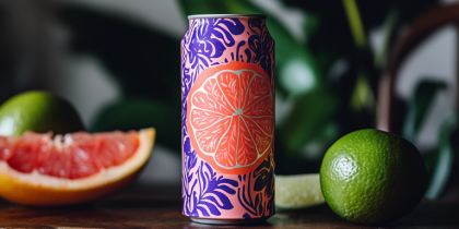
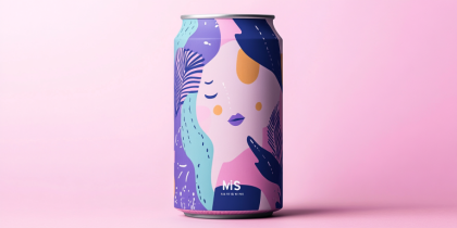
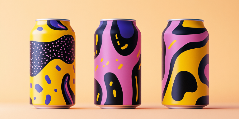
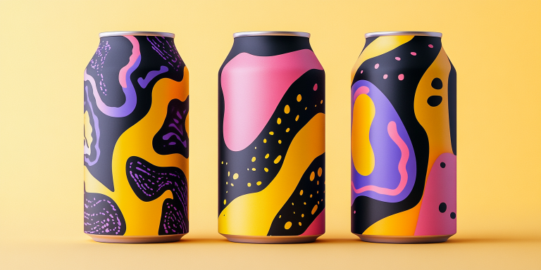
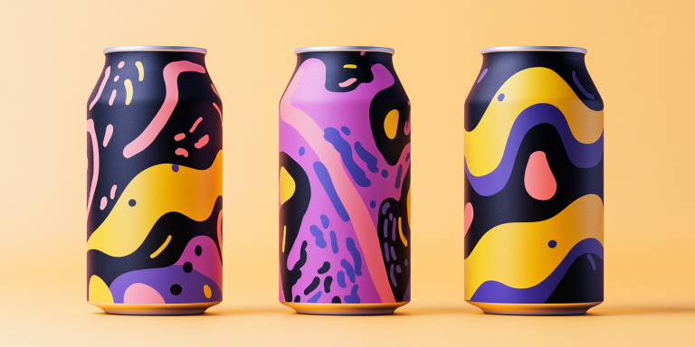
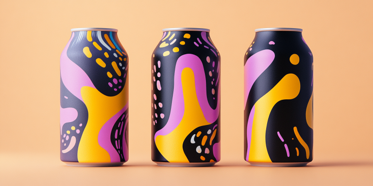
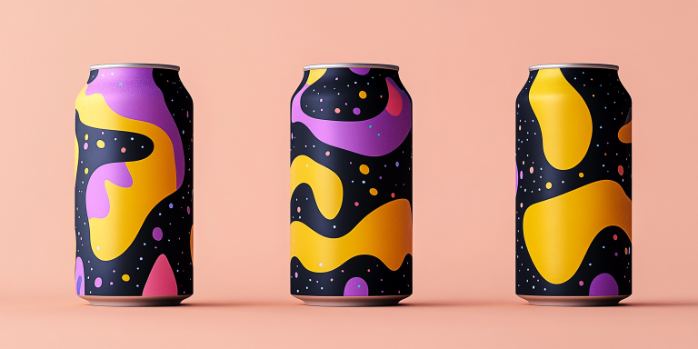
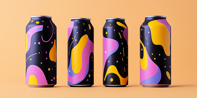
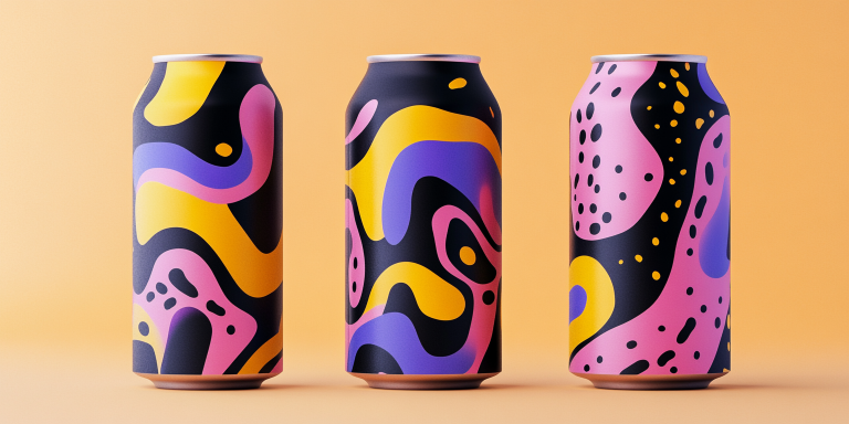
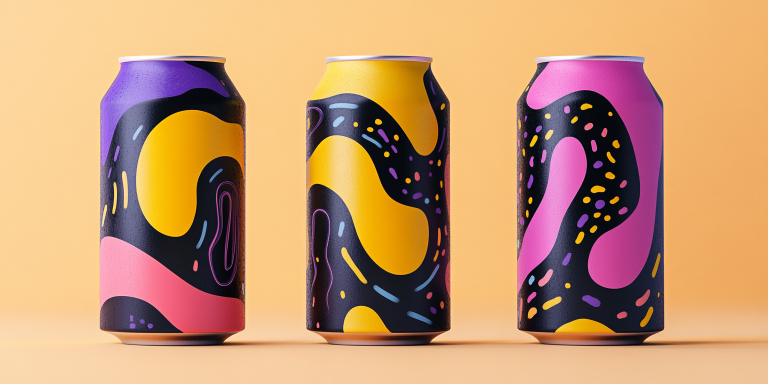
The Abstract Energy Can Design Collection presents a striking fusion of bold colors, fluid shapes, and dynamic compositions. Inspired by modern abstract art, this collection is designed for contemporary beverage brands seeking a vibrant and engaging visual identity. The energetic patterns create a sense of movement and excitement, making the packaging stand out on shelves and social media.
- Year of Completion: 2023
- Status: Active
Design Concept
This collection embraces a high-contrast color palette featuring deep purples, rich pinks, bright yellows, and striking black elements. The free-flowing organic shapes and layered textures give the cans a unique identity that appeals to a younger, trend-conscious audience. The interplay of fluidity and structured elements reflects the dynamism of modern energy drinks and artistic expression.
Key Features:
- Bold Abstract Aesthetic: High-energy patterns with a fluid, artistic appeal.
- Vibrant Color Palette: Deep purples, bright pinks, and striking yellows for maximum visual impact.
- Versatile Design Elements: Adaptable to various beverage flavors and product extensions.
- Minimalist Branding Integration: Clean, modern typography complements the energetic graphics.
- Premium Printing Techniques: Matte and gloss finishes enhance depth and texture.
Deliverables
- Complete beverage can packaging design
- Digital assets for promotional materials
- Adaptations for different flavors and product variations
- Social media and marketing visuals
Tools Used
- Adobe Illustrator (Vector-Based Artwork)
- Adobe Photoshop (Mockups and Presentation)
- Procreate (Handcrafted Abstract Elements)
Impact & Market Appeal
- High Shelf Visibility: The dynamic color combinations and artistic flow attract attention in retail environments.
- Target Audience Connection: Designed for modern, design-forward consumers who appreciate unique packaging.
- Brand Differentiation: Provides a distinct and recognizable visual identity that stands out from traditional beverage packaging.
Challenges & Solutions
Challenges Encountered
- Balancing bold, artistic graphics with clean branding elements.
- Ensuring visual cohesion across multiple product variations.
Solutions Implemented
- Developed a structured yet fluid composition strategy to maintain consistency.
- Applied strategic color blocking to differentiate flavors while preserving a unified brand identity.