Project Overview
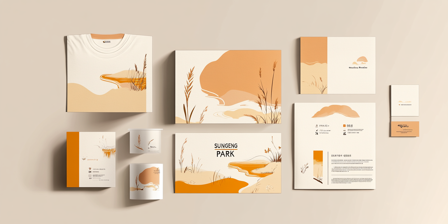
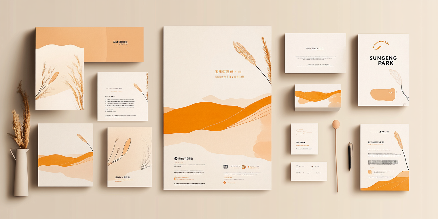
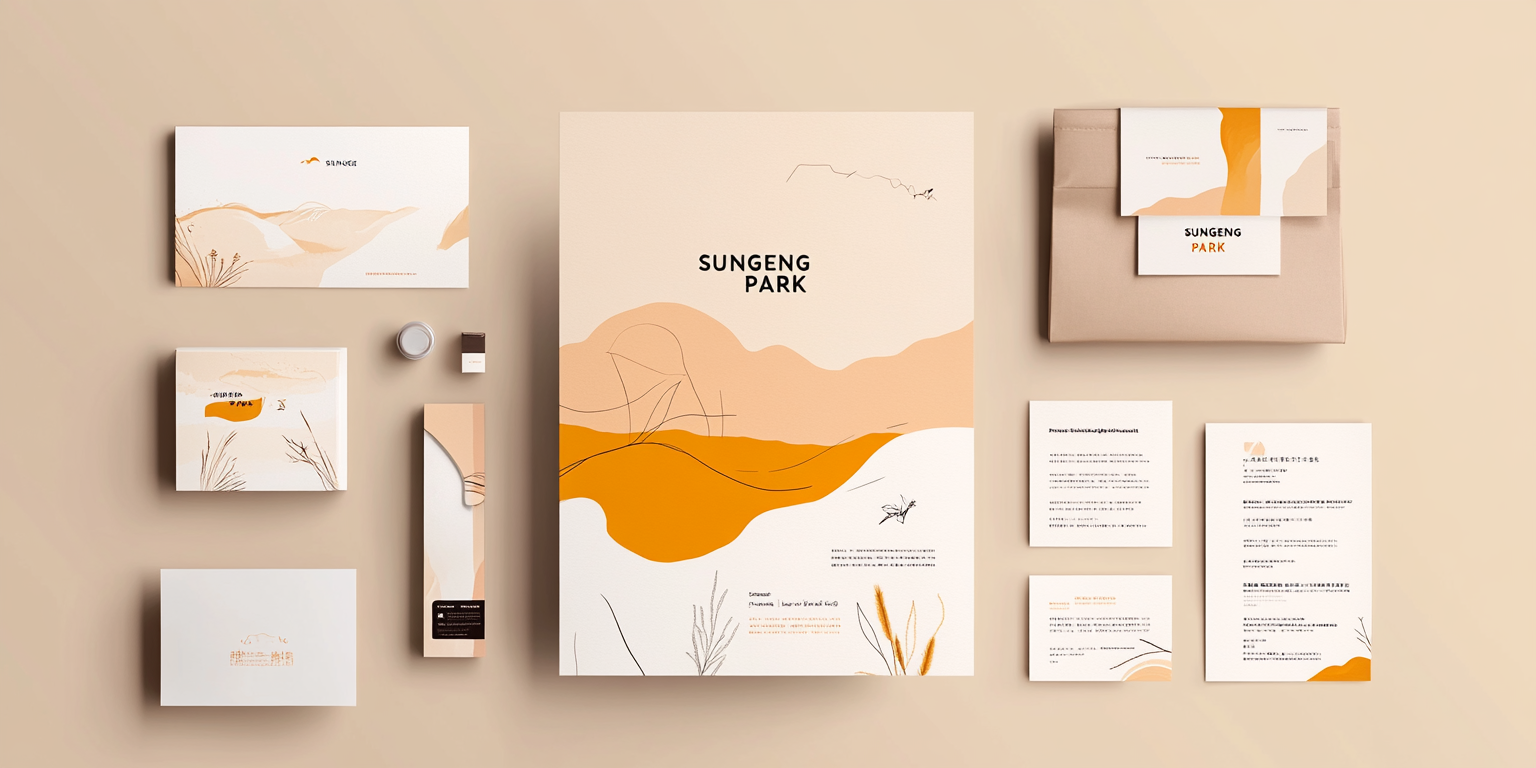
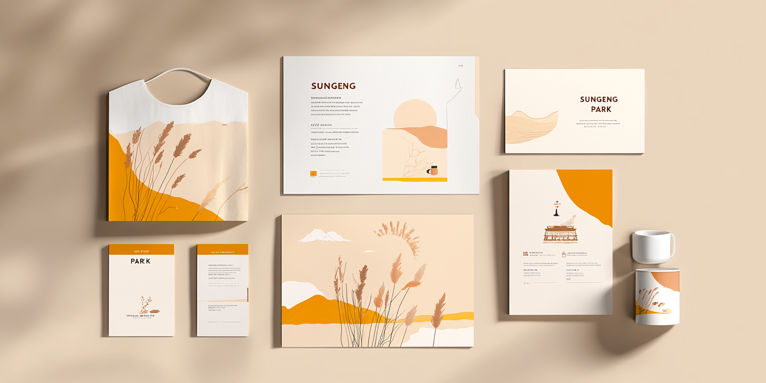
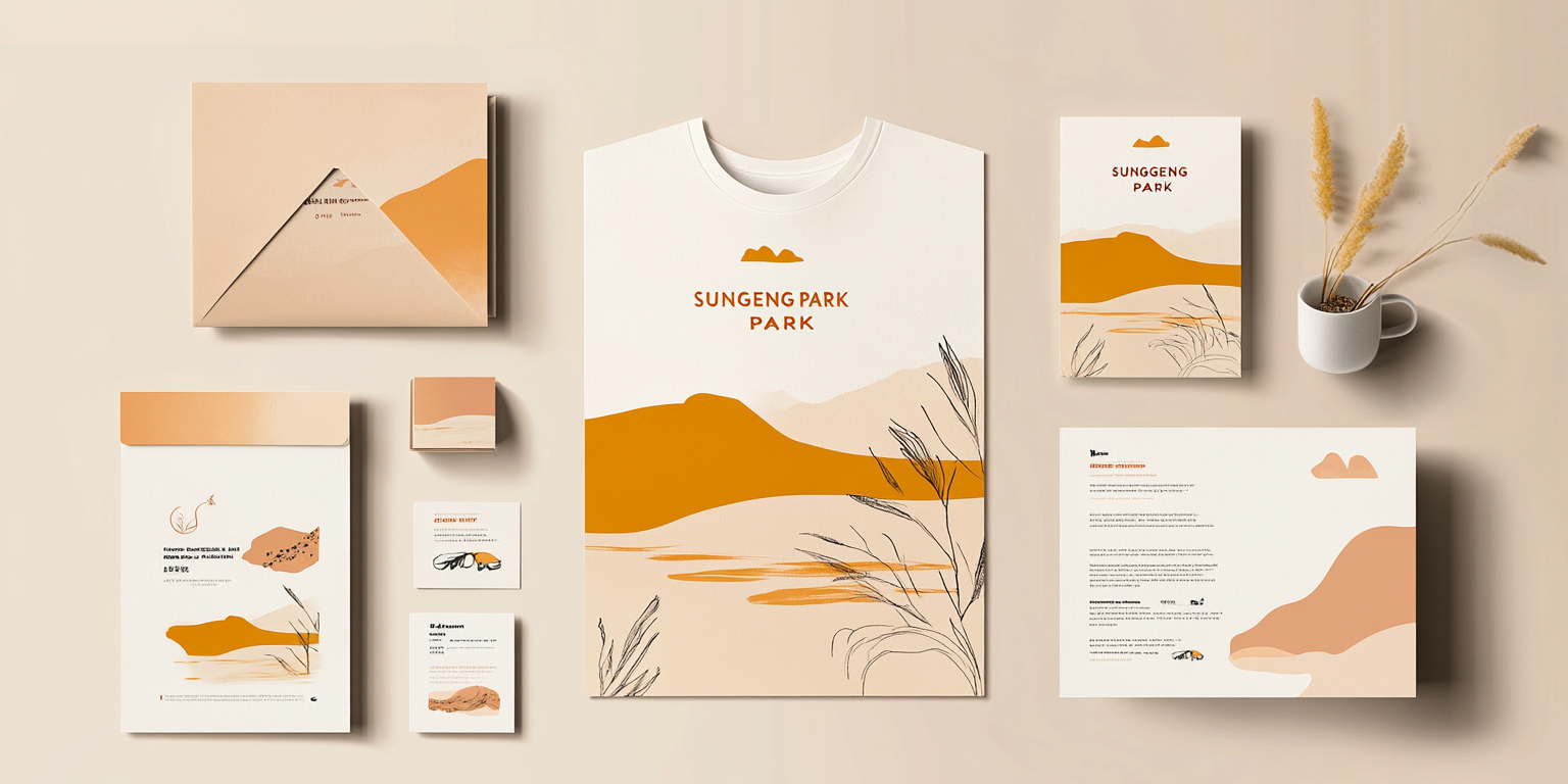
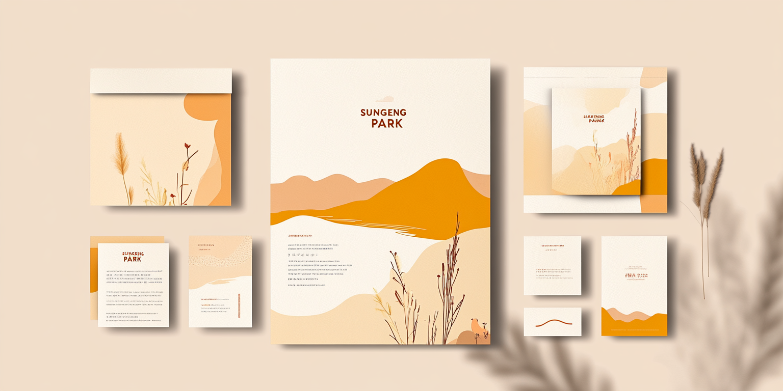
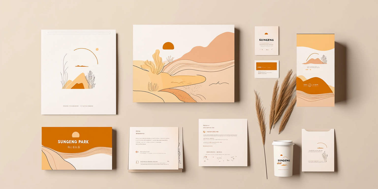
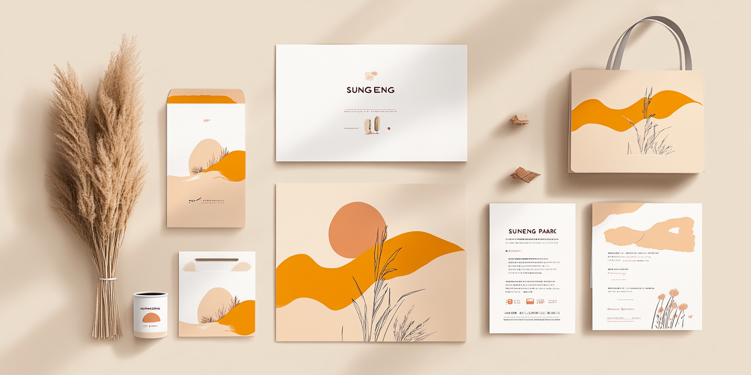
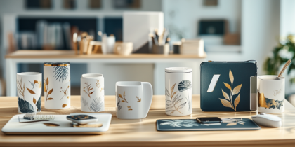
The Sungeng Park Brand Identity Collection embodies a harmonious blend of nature, culture, and elegant minimalism. Designed for an environmentally conscious brand, this identity system features soft, earthy tones and hand-drawn landscape illustrations, creating a sense of tranquility and connection to nature.
- Year of Completion: 2025
- Status: Active
Design Concept
This branding system captures the serene beauty of natural landscapes with warm, muted colors and fluid line work. The visual elements convey a sense of organic elegance, making the identity suitable for eco-friendly brands, parks, resorts, or cultural institutions.
Key Features:
- Nature-Inspired Aesthetic: Soft desert hues, delicate brushstrokes, and minimalistic scenery.
- Versatile Branding Elements: Applied across stationery, packaging, apparel, and marketing materials.
- Sustainable Design: Simple, elegant layouts that emphasize eco-conscious values.
- Typography & Color Palette: A refined mix of warm beige, soft orange, and natural brown tones, complemented by modern typography.
- High-Quality Print Techniques: Textured paper and eco-friendly ink enhance the organic feel.
Deliverables
- Complete brand identity package
- Business cards, letterheads, envelopes, and marketing collateral
- Apparel and merchandise design
- Packaging design for eco-conscious products
- Digital brand assets for web and social media
Tools Used
- Adobe Illustrator (Vector Graphics & Branding Elements)
- Adobe Photoshop (Mockups & Visual Identity Development)
- Procreate (Hand-Drawn Illustrations)
Impact & Market Appeal
- Sustainable Brand Presence: Appeals to eco-conscious consumers and organizations.
- Cultural & Natural Relevance: Ideal for national parks, organic brands, and lifestyle-oriented businesses.
- Memorable & Timeless Identity: Aesthetic balance between tradition and modernity.
Challenges & Solutions
Challenges Encountered
- Creating an identity that seamlessly integrates with nature-inspired themes.
- Ensuring a high-end, premium look while maintaining an organic, earthy feel.
Solutions Implemented
- Developed a muted, natural color palette with subtle gradients to mimic natural textures.
- Incorporated delicate line art to reflect handcrafted elegance.

