Project Overview
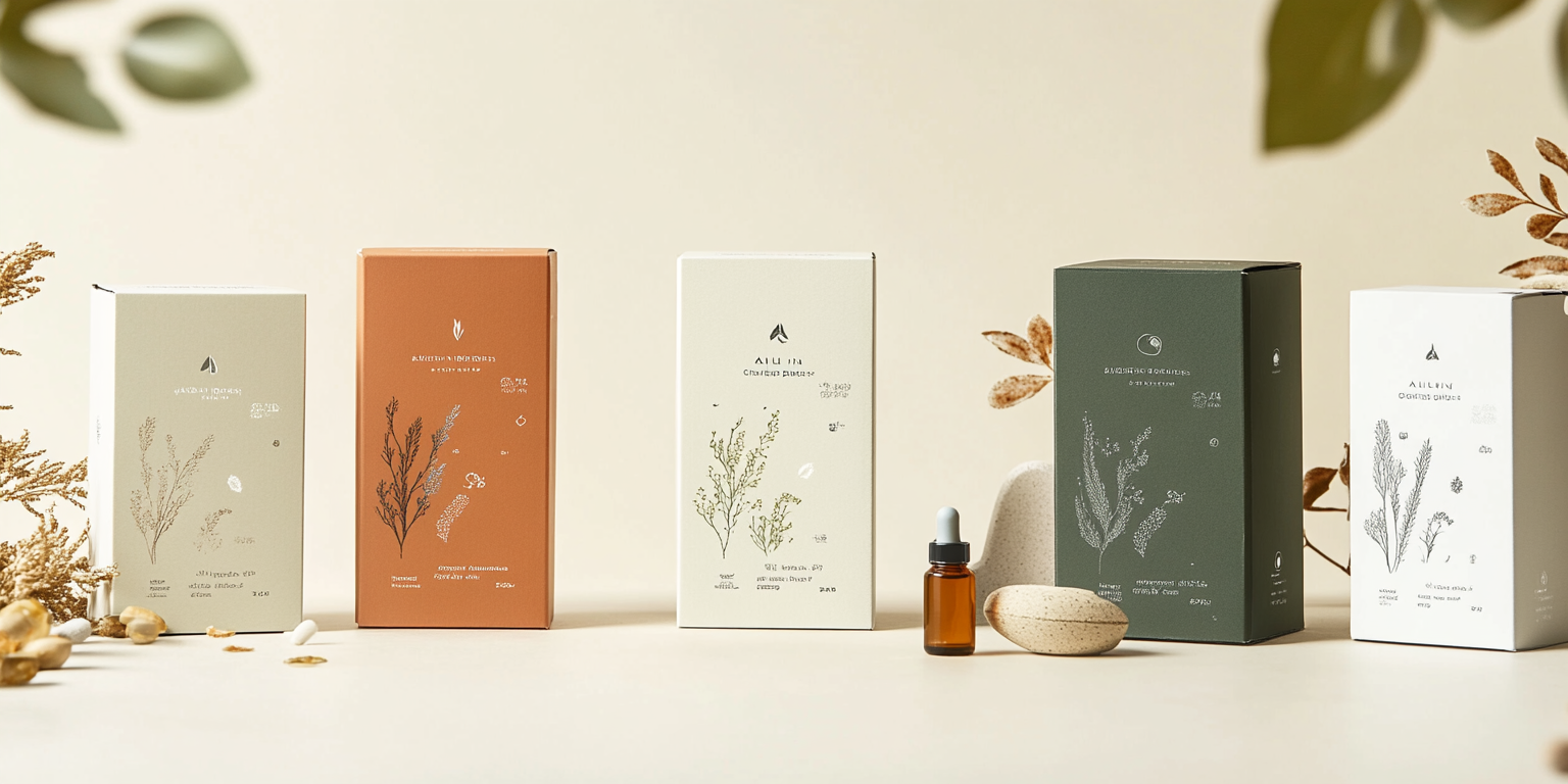
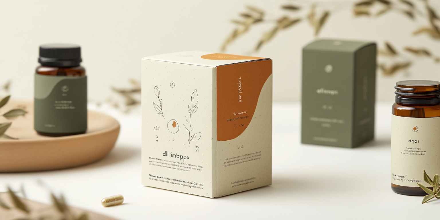
The Botanical Wellness Packaging Collection is a sophisticated series designed for premium herbal supplements and organic health products. The collection emphasizes a minimalistic and nature-inspired aesthetic, reflecting the purity and essence of natural remedies.
- Year of Completion: 2022
- Status: Active
Design Concept
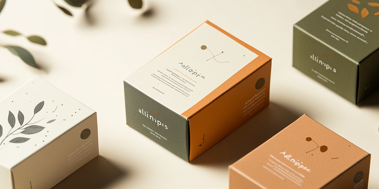
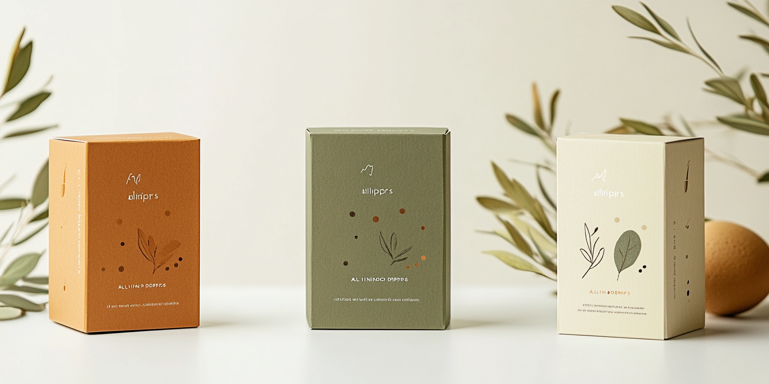
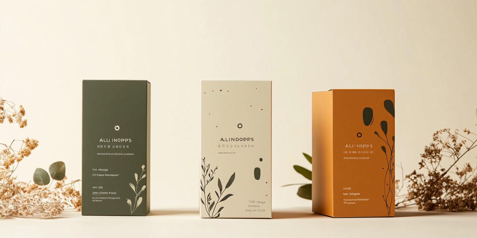
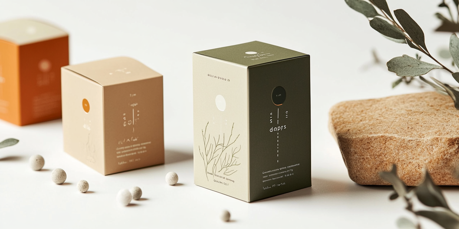
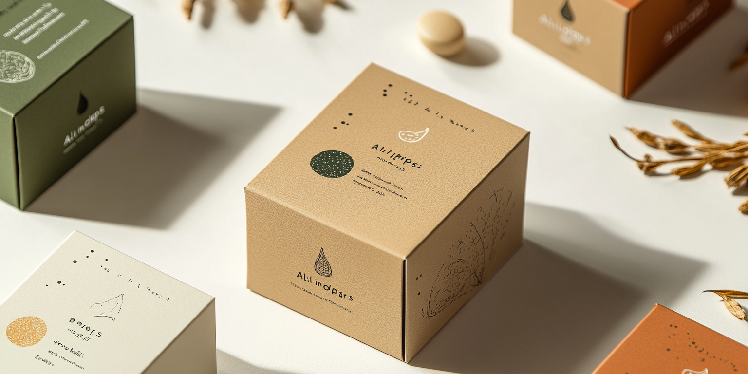
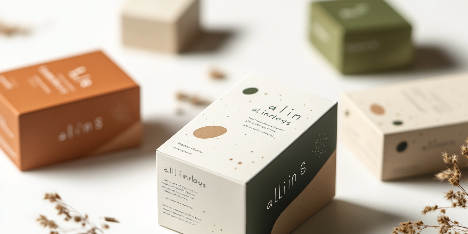
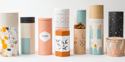
This packaging collection integrates subtle organic illustrations, muted earth tones, and elegant typography to establish a sense of calm, trust, and authenticity. Each box features delicate botanical sketches, symbolizing the natural ingredients and benefits of the product.
Key Features:
- Minimalist Elegance: Clean layouts with refined typefaces for a premium yet approachable look.
- Earth-Toned Palette: A combination of warm beige, terracotta, deep green, and off-white for a harmonious and organic feel.
- Hand-Drawn Illustrations: Detailed botanical line art representing the core ingredients of each product.
- Sustainable Materials: Eco-friendly, biodegradable packaging that aligns with the brand’s ethical vision.
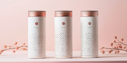
- Foil & Embossing Details: Subtle gold or silver embossing to highlight the luxury aspect of the wellness industry.
Deliverables
- Full packaging suite for herbal supplements and wellness products
- Custom botanical illustrations and label designs
- High-resolution mockups for digital and print branding
- Brand identity integration with nature-inspired themes
Tools Used
- Adobe Illustrator & Photoshop (Packaging & Illustration)
- Procreate (Hand-drawn botanical artwork)
- Pantone & CMYK Color Grading (Print Optimization)
Impact & Market Appeal
- Target Audience: Health-conscious consumers, organic wellness brands, and herbal supplement retailers.
- Emotional Connection: Evokes a sense of purity, balance, and trust in natural healing.
- Retail Presence: The refined and nature-driven design ensures visibility and credibility in premium health stores.
Challenges & Solutions
Challenges Encountered
- Achieving a balance between minimalism and informative design.
- Ensuring legibility of fine details on eco-friendly textured materials.
Solutions Implemented
- Adopted a structured layout with strategic whitespace for clarity.
- Used high-resolution printing techniques to maintain the integrity of intricate details.

