Project Overview
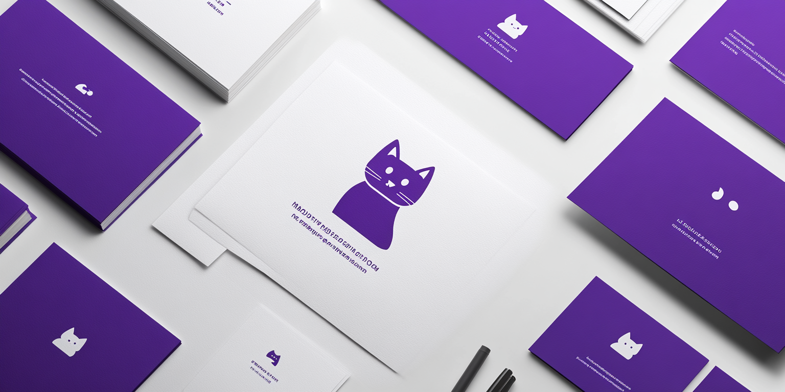
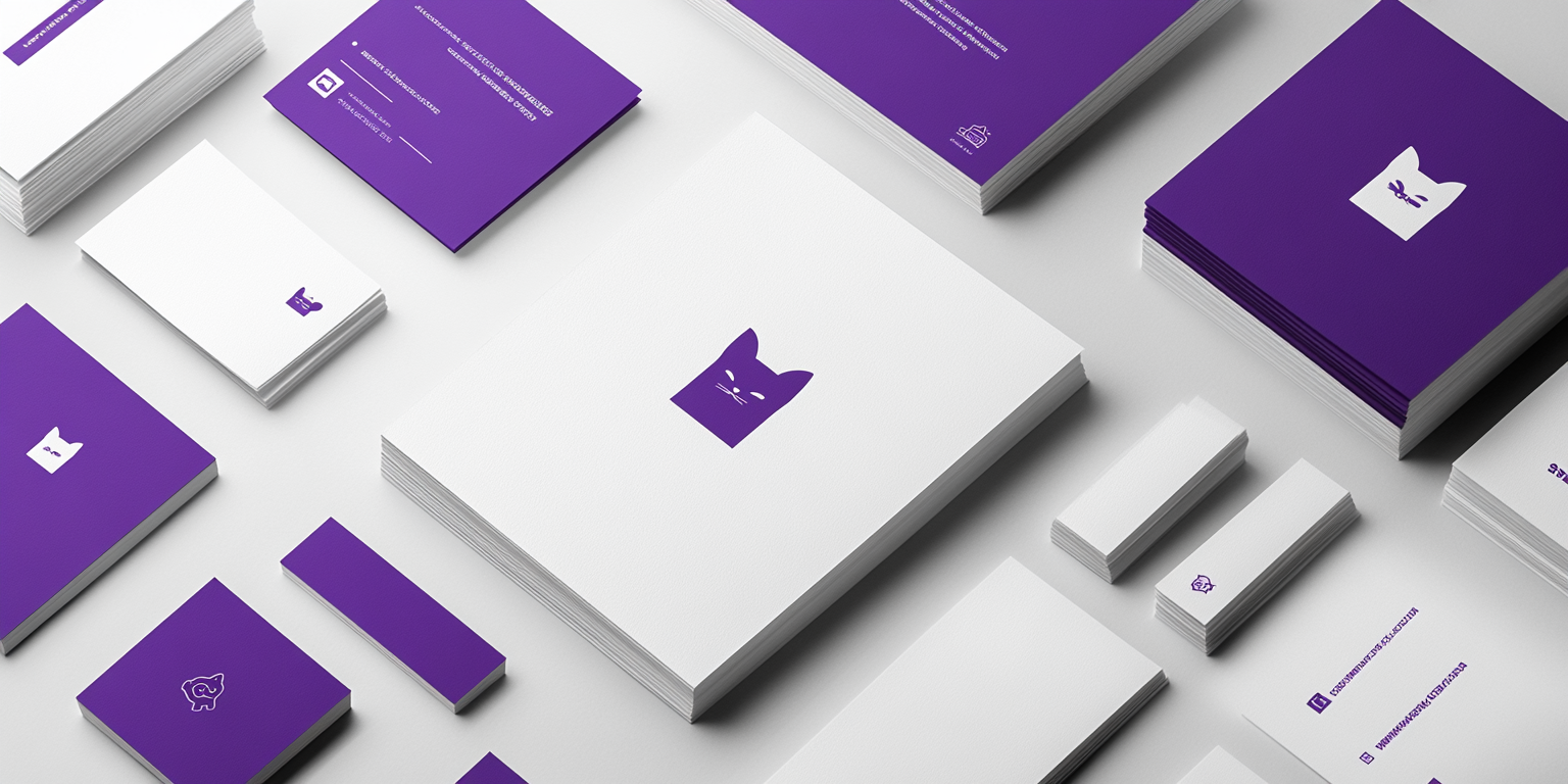
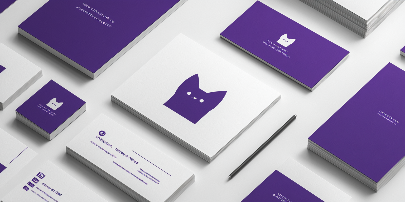
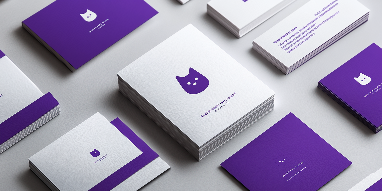
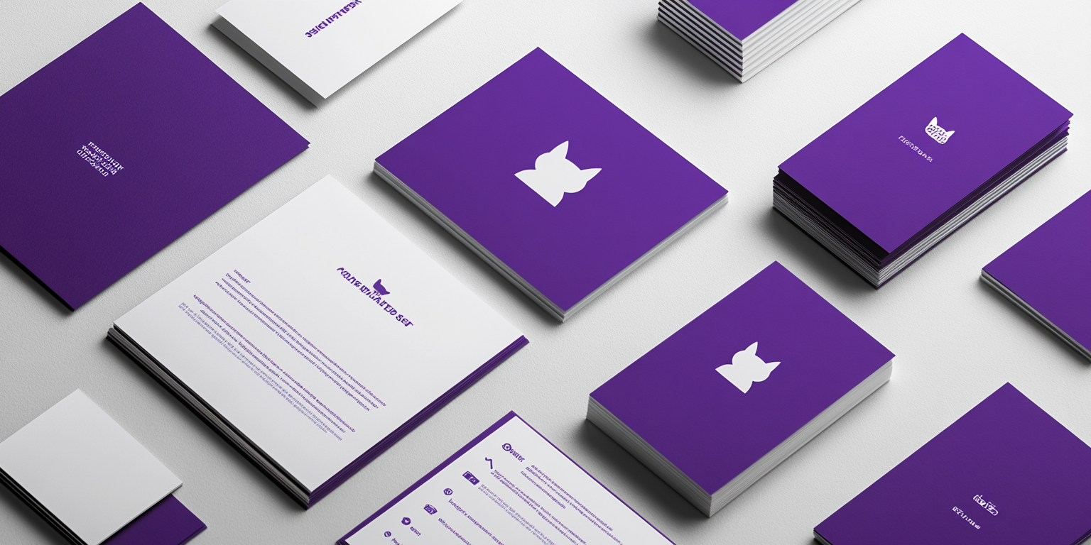
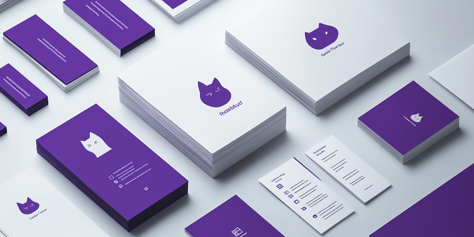
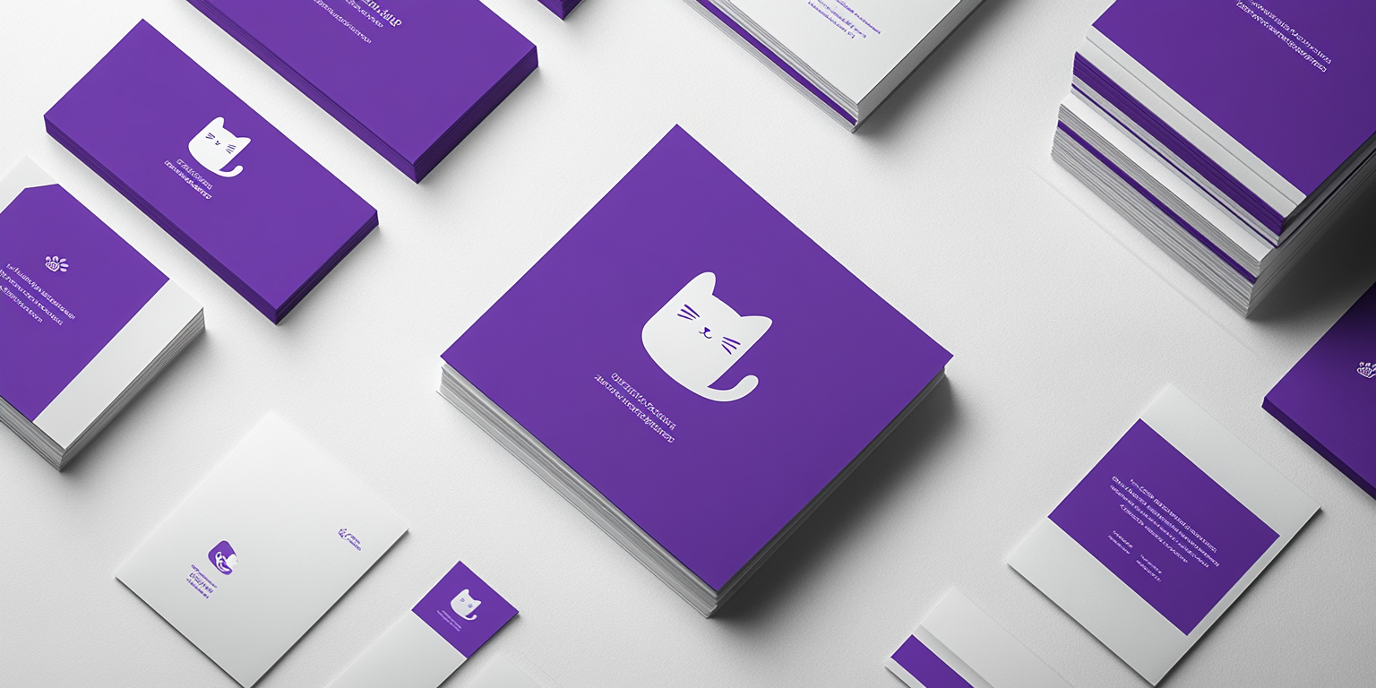
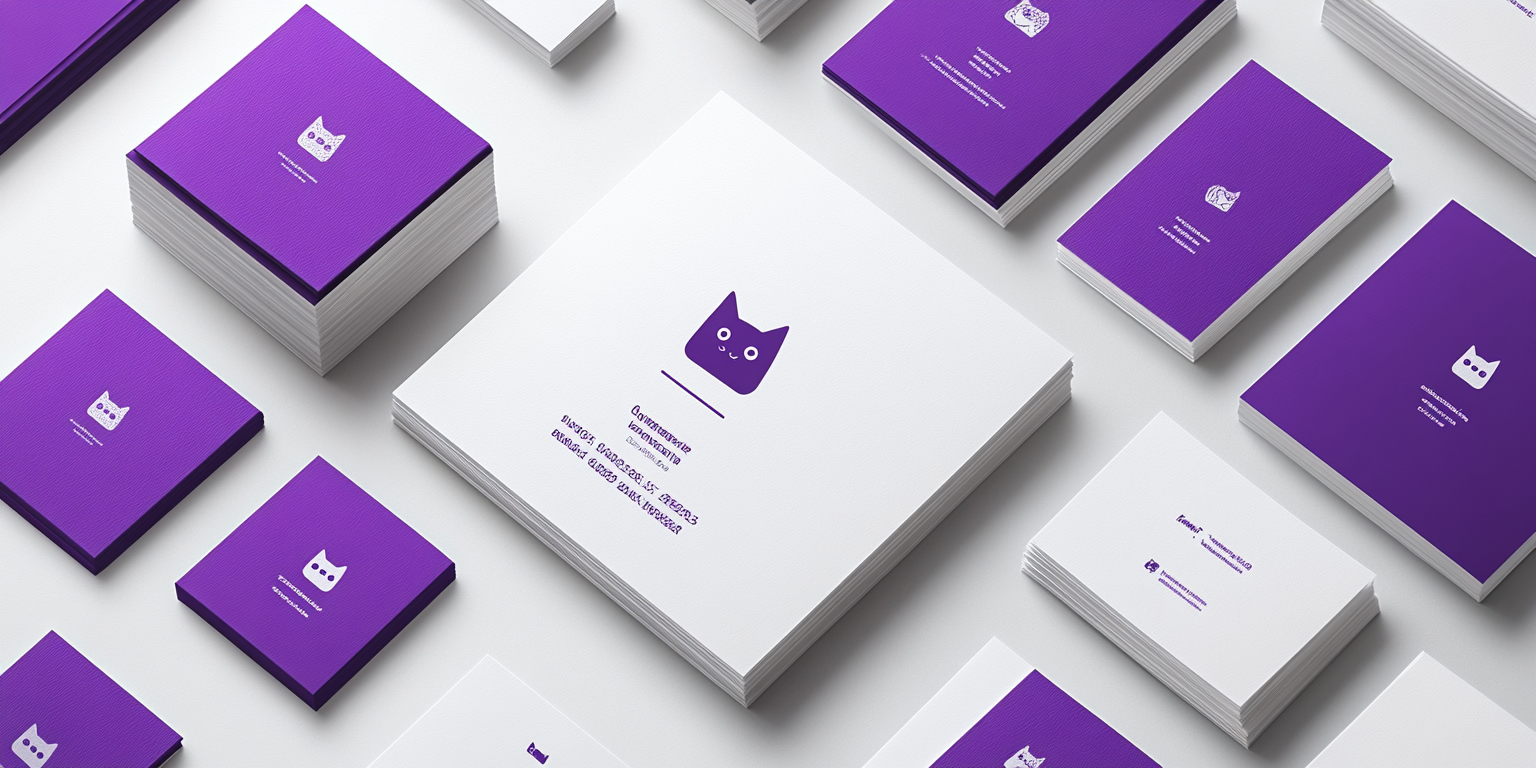
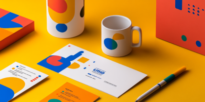
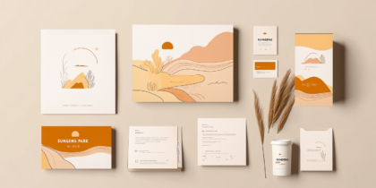
The Pawfect Identity Collection is a modern and fun branding system inspired by feline aesthetics. Designed for pet-related businesses, creative agencies, and lifestyle brands, this collection uses a bold purple and white color scheme to create a unique, memorable, and engaging brand identity. The minimalist cat-themed iconography enhances brand recognition and appeals to both playful and professional audiences.
- Year of Completion: 2021
- Status: Active
Design Concept
This collection brings together whimsical cat-inspired illustrations, clean typography, and vibrant color choices to craft a visually striking identity. The balance between playfulness and sleek modernism makes it perfect for brands that want to stand out while maintaining an air of professionalism.
Key Features:
- Cat-Themed Iconography: Minimalist yet expressive cat illustrations tailored for branding.
- Bold Purple & White Color Scheme: Represents creativity, trust, and uniqueness.
- Modern Typography: Clean sans-serif fonts combined with a touch of playful script styles.
- Dynamic Layouts: A well-structured yet visually engaging presentation for business cards, letterheads, and corporate materials.
- High-Quality Print Finishes: Smooth matte textures, embossed logos, and minimalistic foil accents.
Deliverables
- Complete brand identity package with logo, typography, and color guidelines.
- Stationery Set – business cards, letterheads, envelopes, and notebooks.
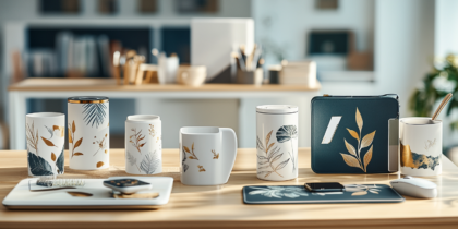
- Custom Packaging & Merchandising for pet brands, influencers, and creative entrepreneurs.
- Digital Branding Assets optimized for web, social media, and digital marketing campaigns.
Tools Used
- Adobe Illustrator & Photoshop (for vector illustrations and branding layouts).
- Illustration Software (to create stylized cat designs and playful iconography).
- Premium Printing Techniques (high-quality embossing, spot UV, and minimalistic foil stamping).
Impact & Market Appeal
- Unique & Recognizable: Perfect for brands looking for a distinct and approachable identity.
- Versatile & Playful: Works well for pet-related businesses, creative agencies, and modern lifestyle brands.
- Bold Yet Professional: Combines creativity with a structured aesthetic, ensuring appeal to both corporate and casual audiences.
Challenges & Solutions
Challenges Encountered
- Maintaining a fun and quirky look while keeping it sleek and professional.
- Ensuring legibility and versatility of the cat icons across different mediums.
Solutions Implemented
- Designed a flexible branding system with multiple logo variations to adapt to different applications.
- Kept a minimalist approach to colors and typography to balance fun and professionalism.

